


.jpg?cropw=4096&croph=2654.2479700187387&cropx=9.695217308093677e-13&cropy=76.7520299812622&cropmode=pixel#)


.tif?cropw=4036.303976681241&croph=2705.4159900062464&cropx=59.69602331875912&cropy=25.584009993753906&cropmode=pixel#)
.jpg?cropw=4096&croph=2978.1919633562356&cropx=0&cropy=93.80803664376384&cropmode=pixel#)


.jpg?cropw=2733&croph=2733&cropx=636.5439718837721&cropy=0&cropmode=pixel#)


Find out what color you are and choose the tiles that best suit your space.

Trend
Design with color
11 June 2021
From the "Theory of Colors," a famous essay by the great German author Goethe published in 1810, to the captivating Chromophobia by the Scottish artist and writer David Batchelor pub-lished in 2001, color has always been a central focus of artists, scientists, professionals, and amateurs alike. The whole world around us is colored by many nuances with very precise mean-ings that change – even radically – depending on the cultural context or geographical location. Over time conflicting theories have been developed to try to outline and synthesize the very complex process of visual perception where physics, technique, psychology, and emotions come into play. In fact, it is important to remember that the component of subjectivity generates and conveys sensations to the brain that are then translated into psychological emotions that can influence the psychophysical well-being of the individual.
Color in interior design
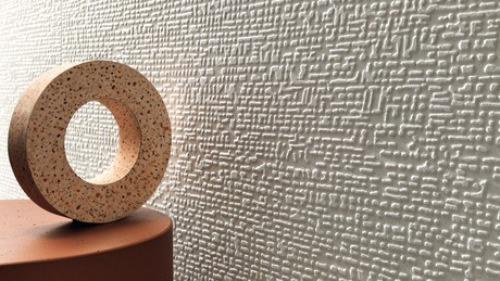
“Color is intimately linked to our being; everyone has his or her own color. While we may not realize it, our instincts, they don't err," noted Le Corbusier, rationalist architect par excellence, in Polycromie architecturale in 1932.With its strong expressive power, color remains a primary and universal means of communication, having its roots in our childhood experiences and evoking memories and feelings. Precisely for this reason, it is essential to study its correct use in interior design to add quality, originality, and creativity to the environments. Applying color theory to ceramic tiles allows changing the perception of spaces, whether in a home or in public/commercial spaces. Playing with tone-on-tone tiles or bold color combinations, or combining the different finishes available in the same color palette, allows you to customize every room, from the kitchen to the bathroom and beyond.“Color must be used wisely," Le Corbusier observed. “Setting rules would be dangerous, but a classification into two broad categories, warm tones, cool tones, creates some order: each color (tone and value) is oriented either towards light (warmth, happiness, joy, violence) or towards shadow (freshness, serenity, melancholy, sadness).”Atlas Concorde has always been attentive to the topic of color, studying its trends and proposing solutions that are always aligned with living styles: from classic to contemporary or for special optical effects. In addition to porcelain tiles for floors, the collections of white body (or single-fired) wall tiles, which thanks to the glassy and transparent composition of the glaze convey a much brighter and more vibrant color, offer a wide range of shades for walls, even available in three-dimensional versions and accompanied by a wide range of decorations. Multifaceted and esthetically appealing, with their constantly updated palettes ceramic tiles offer designers maximum creative expression along with the guarantee of superior technical performance.


The colors and their influence
Green. This is the most common color in nature, the one we are most used to and that scientifically we are able to perceive most easily. Normally it's associated with positive concepts like hope, the plant world, and eco-sustainability, and has strong calming and rebalancing effects on the human psyche.The Moss and Emerald resin-effect wall tiles from the Prism collection color the bathroom with calm, delicate shades of green in a progressive gradient that underline the three-dimensionality of the space. The soft-touch surface gives the environment an easy, welcoming ambiance.

The Boost Sage wall tile decorates a bathroom with its delicate, calm green color. Combined with the soft-touch concrete texture, the hue gives the environment a contemporary, relaxing look.


The green-blue shades of the Gemstone color combined with the Sage color of the Arkshade collection bring to mind the colors of precious stones. An elegant, sophisticated color palette of nuances that allows you to create depth in the space.
Red. This is the color that remains most deeply impressed in the human perceptual spectrum. For this reason it's often used to signal dangerous situations, attracting immediate attention. The strong stimuli and impulses that this color is able to create generate a great flow of energy and vitality in the body, as well as stimulating creativity.
Conveying energy and vibrancy in the bathroom of a commercial space is the purpose of the Boost Red wall tiling. Combined with the neutral tones of the concrete effect, it adds character and personality to the environment.

Elegant contrasts for a restaurant where the use of color is not just an exercise in style, but ra-ther helps to better perceive the space and how it's used thanks to lively Arkshade Red tiles.
Yellow. A symbol of sunlight, this color stimulates the body's neural receptors, inspiring feelings of well-being and generating a sense of joy. The rooms become charged with positive, vibrant energy.
The liveliness of Arkshade Yellow combined with the warm, neutral tones of the collection visu-ally expands the spaces and defines the identity of a hotel room. The perfectly matching 3D Star wall tiles help to create a balance between colors and surfaces.
Blue. This color calms and relaxes the body, regulating its temperature and pulse. It evokes calmness, serenity, peace, and the beauty of blue skies and open seas. Historically associated with wisdom and fidelity, it suggests elegance, tranquility, and confidence in interiors, conveying comfort and relaxation.
The sophisticated shades of Dusk and Midnight in the Prism collection, combined with the deli-cate blue shades of the Gradient decor, give the bathroom an esthetic and sensory balance while maintaining a decisive, personal character.

The delicate tone of the Powder Blue color from the Boost Pro collection elegantly adorns a re-laxing bathroom environment and perfectly harmonizes the modern concrete effect with the natural character of oak.
The elegant contrast between Raw White and Raw Blue for a timeless bathroom environment with textured surfaces. The environment is further embellished by captivating mosaics featur-ing a mix of empty and full spaces made of ceramic and plaster to create a particular and con-temporary color composition.
The original blue shade of oxidized copper is captured in Blaze Verdigris, which expands the range of the metal effect for an urban and lively look with an elegant color.
Pink. This color takes on different meanings depending on the culture. In the West it's a symbol of femininity, while in Japan it has a masculine connotation because it's said that the pink blossoms of cherry trees represent young Samurai warriors who have fallen in battle.
Scientific studies assert that the various shades of pink are able to remove negativity and instill feelings of optimism, serenity, and contemplation.
The sophisticated combination of warm colors and the pink hue of Prism's Bloom enriches the environment with delicacy and softness, creating a welcoming space where the coordinated de-cor accompanies the colors of the environment with elegant, delicate light effects.
Raw Rose is an antique pink with a delicate earthy surface and an elegant, refined tone. When combined with contrasting black and white elements it expresses a stylistic balance somewhere between delicacy and contemporary.
A timeless, sophisticated setting for relaxing, where the iridescent pink surface of Mek Rose perfectly matches the eternal appeal of white marble.
To explore the full range of Atlas Concorde tile colors visit the Color section of the website.