


.jpg?cropw=4096&croph=2654.2479700187387&cropx=9.695217308093677e-13&cropy=76.7520299812622&cropmode=pixel#)


.tif?cropw=4036.303976681241&croph=2705.4159900062464&cropx=59.69602331875912&cropy=25.584009993753906&cropmode=pixel#)
.jpg?cropw=4096&croph=2978.1919633562356&cropx=0&cropy=93.80803664376384&cropmode=pixel#)


.jpg?cropw=2733&croph=2733&cropx=636.5439718837721&cropy=0&cropmode=pixel#)


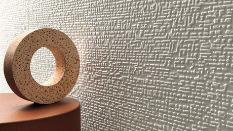
With the contribution of Piero Lissoni, Atlas Concorde colors the world of the resin effect with Prism, a collection of 13 soft tones where color becomes the distinguishing element of spaces, a tool to enhance the style and architectural design of interiors.

Prism: between colors and materials
18 November 2020
The original palette was specially selected by the Lissoni Associati studio led by Piero Lissoni, an exceptional color consultant who described the design process in the following way: “We based the concept on the effect of light through a prism. These colors are what we imagined would be the result of prism light transformed into a rainbow. We then worked on this refracted light to try to reproduce it on the tile surface, a palette modified to become domestic colors or architectural colors.”
The rich range of sizes allows you to employ the resin effect in any interior design, covering walls and floors, with all the advantages of porcelain floor tiles and the beauty of white body wall tiles.