


.jpg?cropw=4096&croph=2654.2479700187387&cropx=9.695217308093677e-13&cropy=76.7520299812622&cropmode=pixel&quality=75#)



.tif?cropw=4036.303976681241&croph=2705.4159900062464&cropx=59.69602331875912&cropy=25.584009993753906&cropmode=pixel&quality=75#)
.jpg?cropw=4096&croph=2978.1919633562356&cropx=0&cropy=93.80803664376384&cropmode=pixel&quality=75#)
.jpg?cropw=2733&croph=2733&cropx=636.5439718837721&cropy=0&cropmode=pixel&quality=75#)
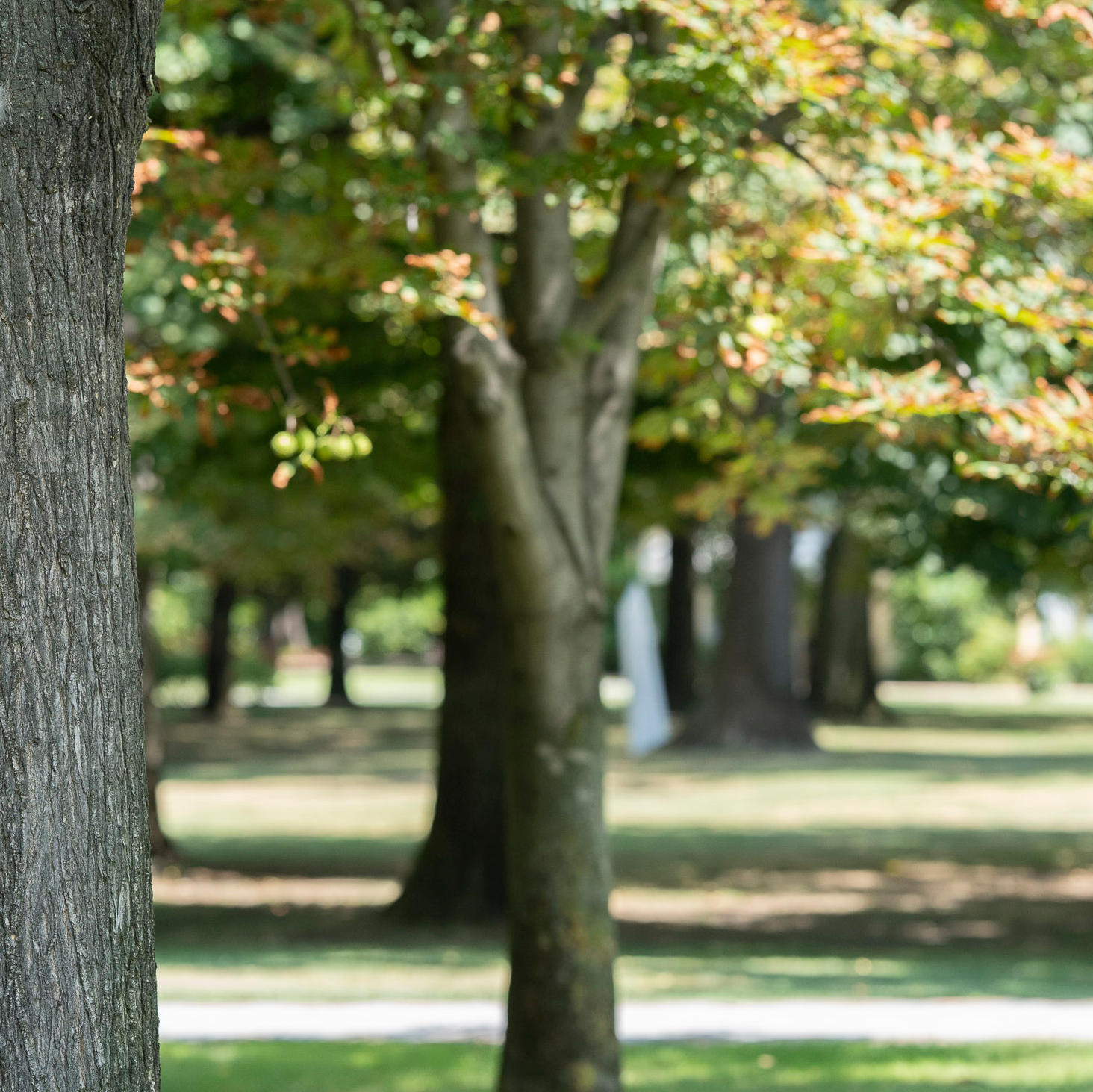
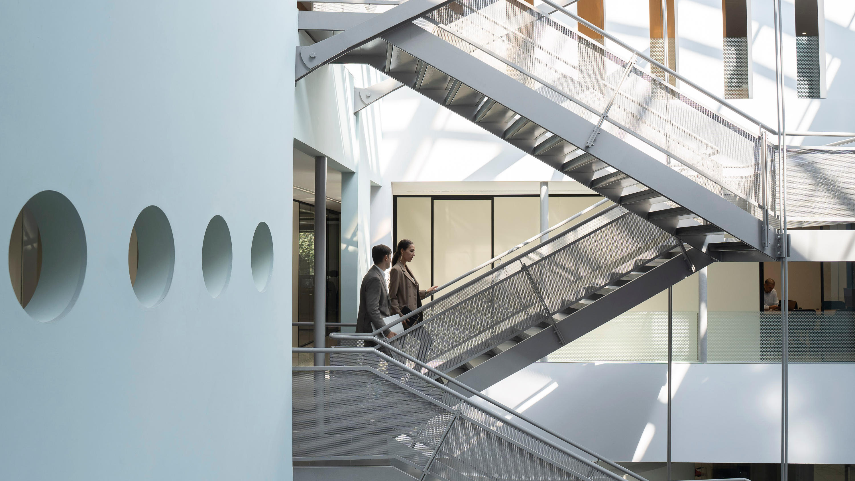
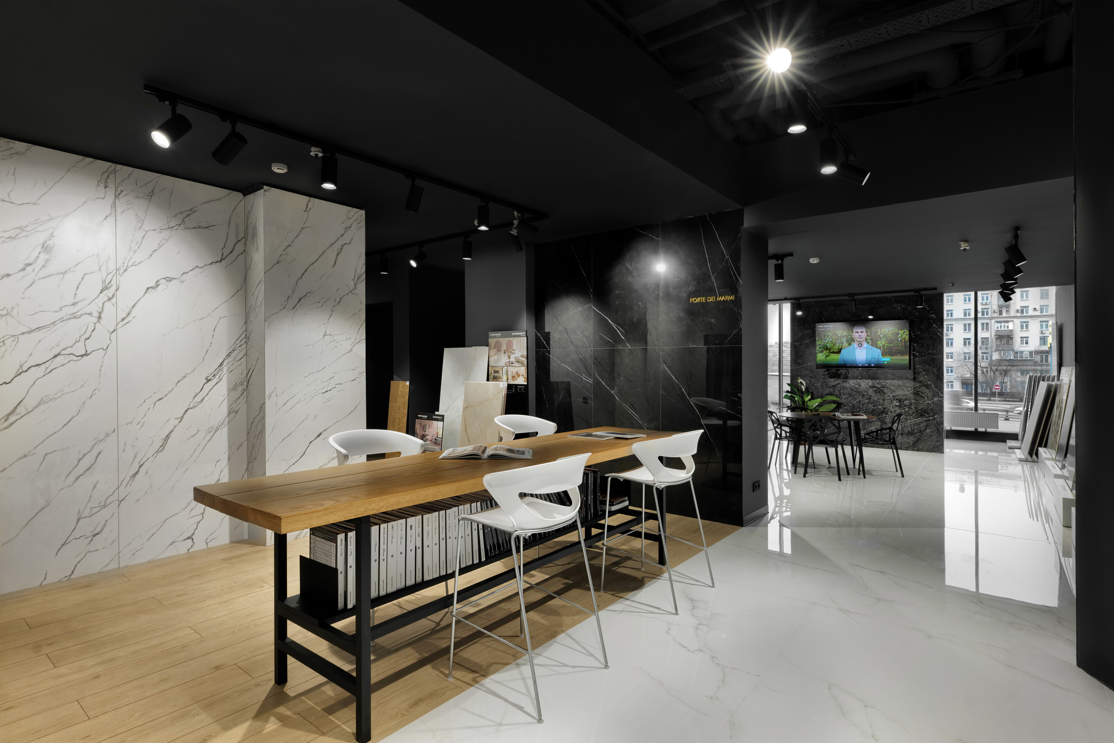
In 2026, designers are asked to read the material even before they read the space. The trends that define the year arise from a precise cultural intention: a return to physicality as a response to the excess of visual stimuli. Surfaces that are perceived through touch. Palettes that evoke sediment, stone dust and forests. An aesthetic of authenticity that the residential, retail, hospitality and contract markets are embracing with growing awareness. For architecture and interior design firms, understanding the trends means identifying finishes, formats, palettes and compositional languages in order to design spaces in line with new market demands. This article analyses the main directions of interior design 2026, with a focus on porcelain stoneware surfaces as design tools for contemporary environments.

Trend
Interior Design 2026
from trends to the project, through material
18 August 2026


The four 2026 trends for designing with material
The 2026 trends arise from the consolidation of cultural directions that increasingly shape the demands of clients and designers at international level. Four directions emerge with particular clarity:each with its own compositional language, its own palette and a precise response within the porcelain stoneware surface offering.
Material as geological memory: stone effect and three-dimensional textures
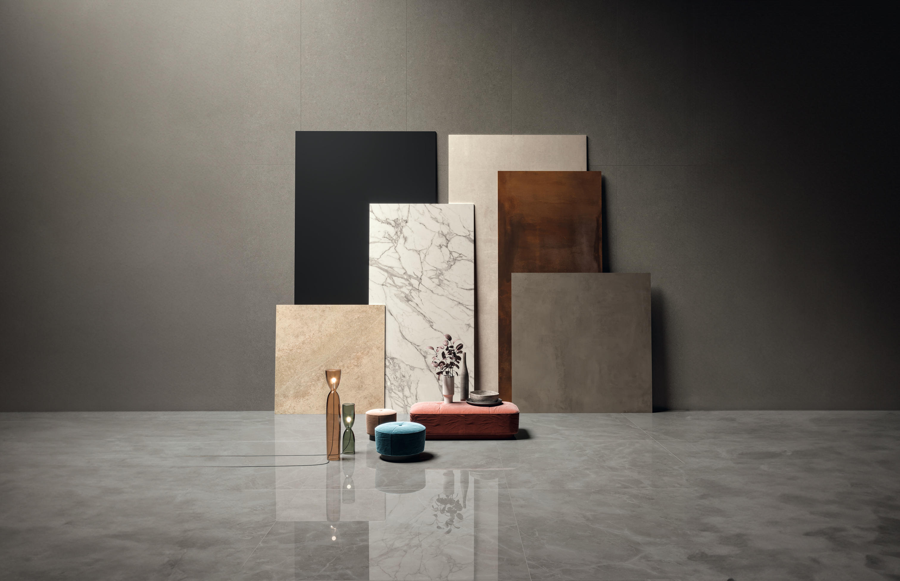
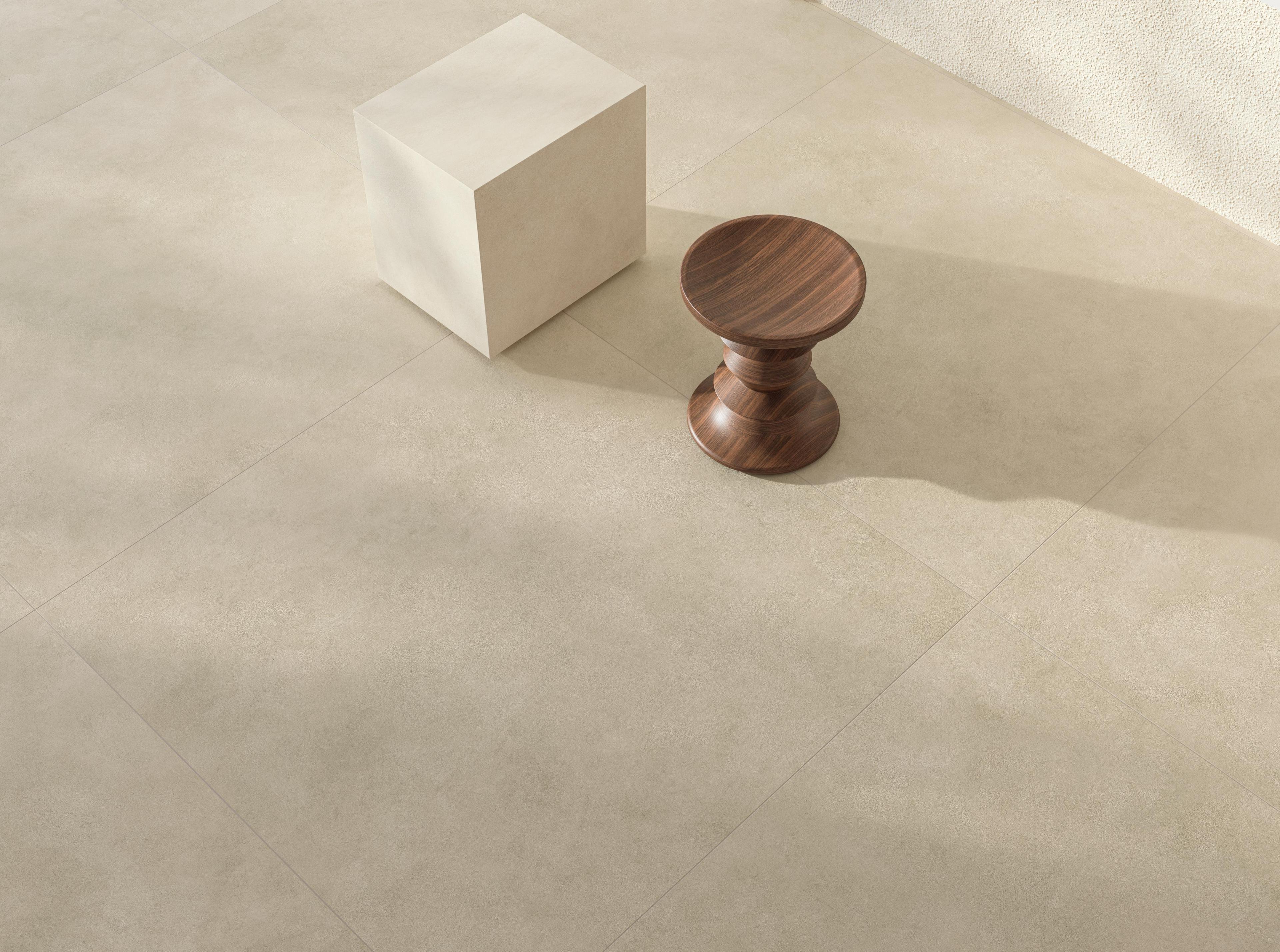
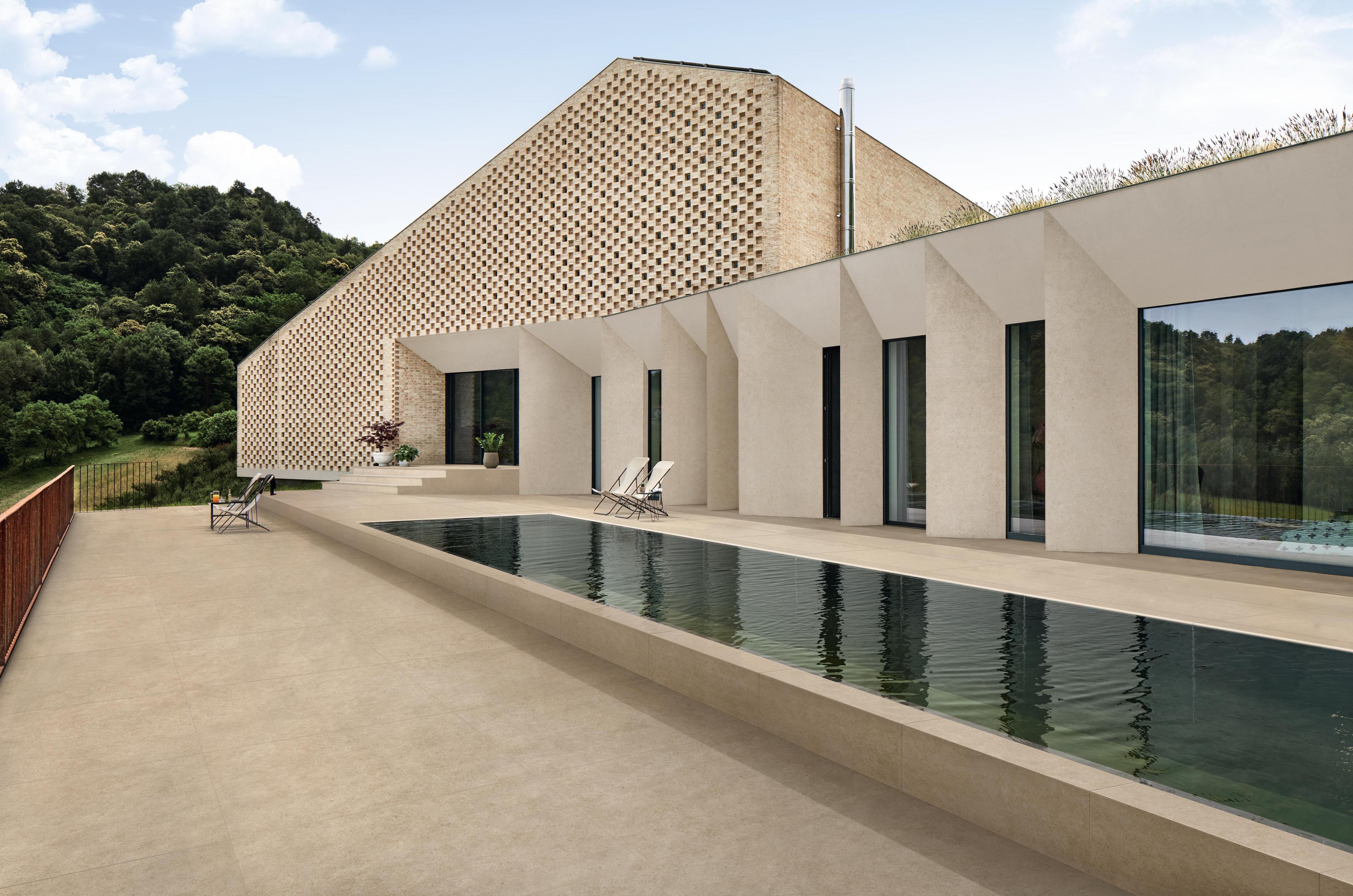
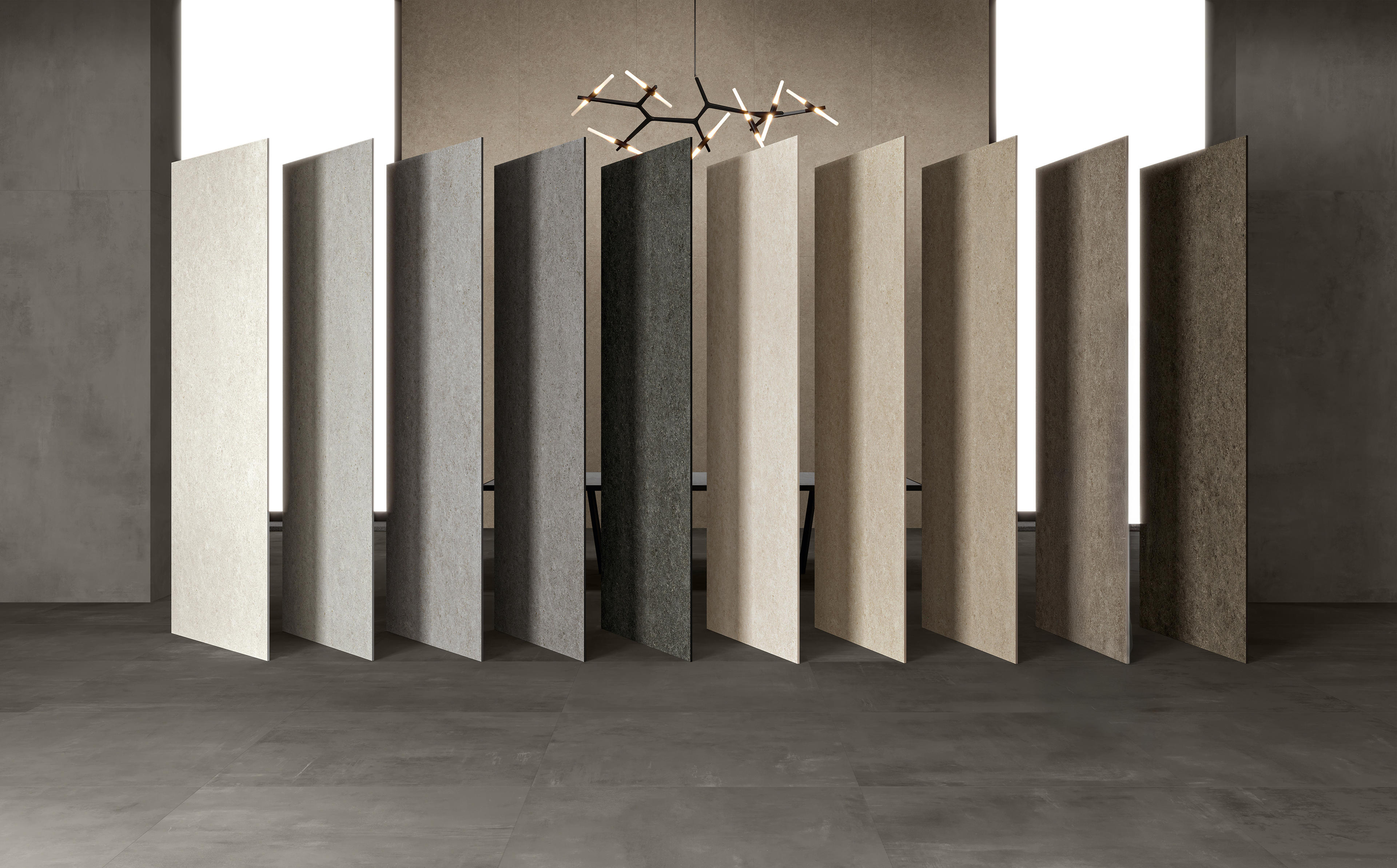
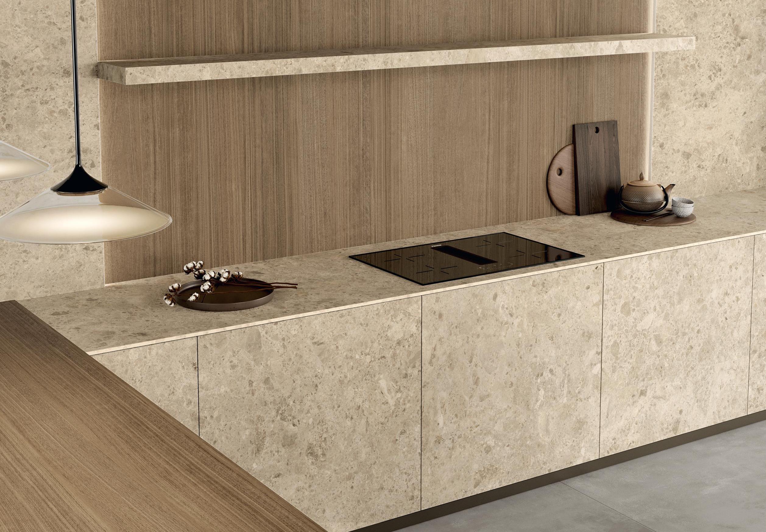
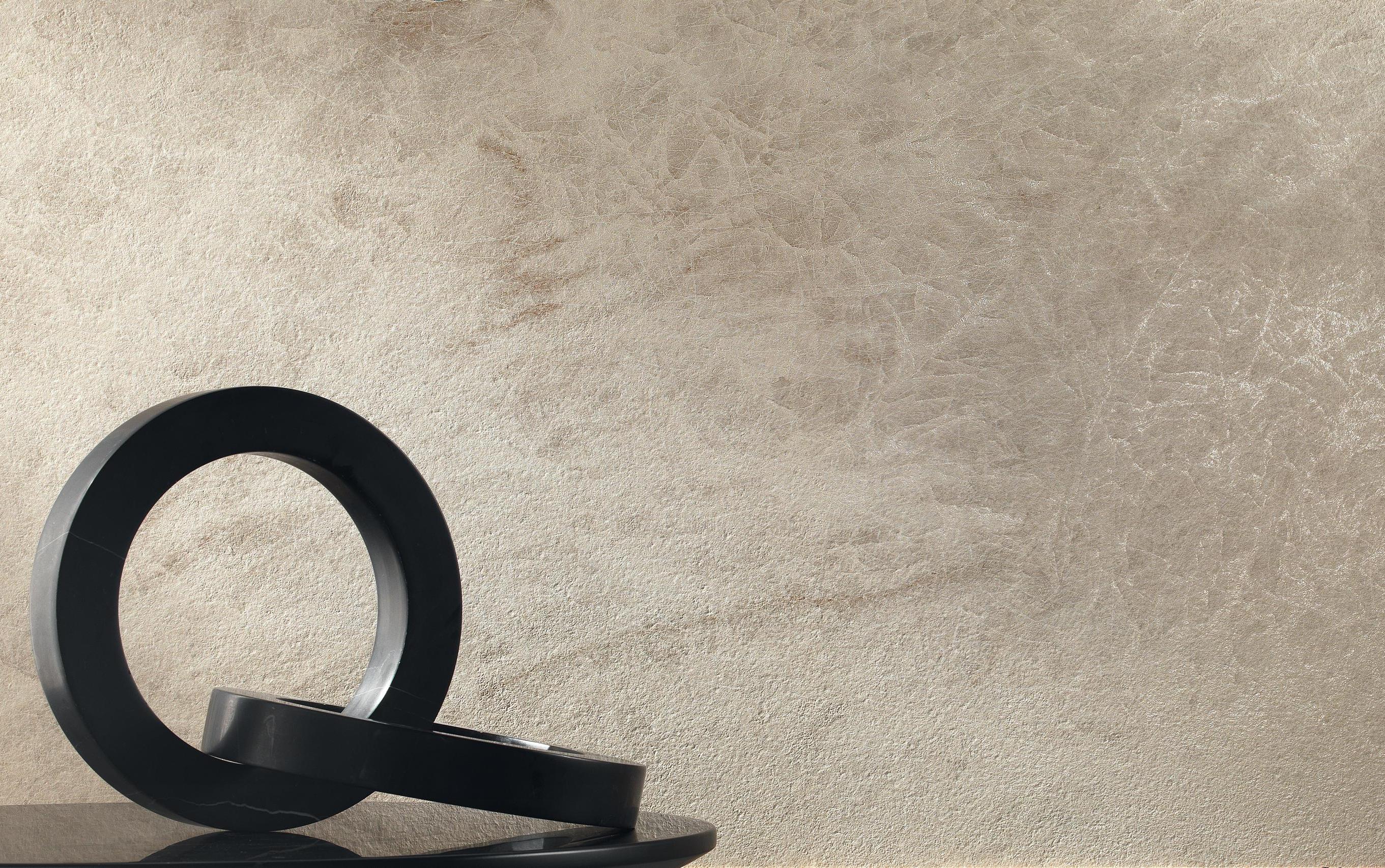
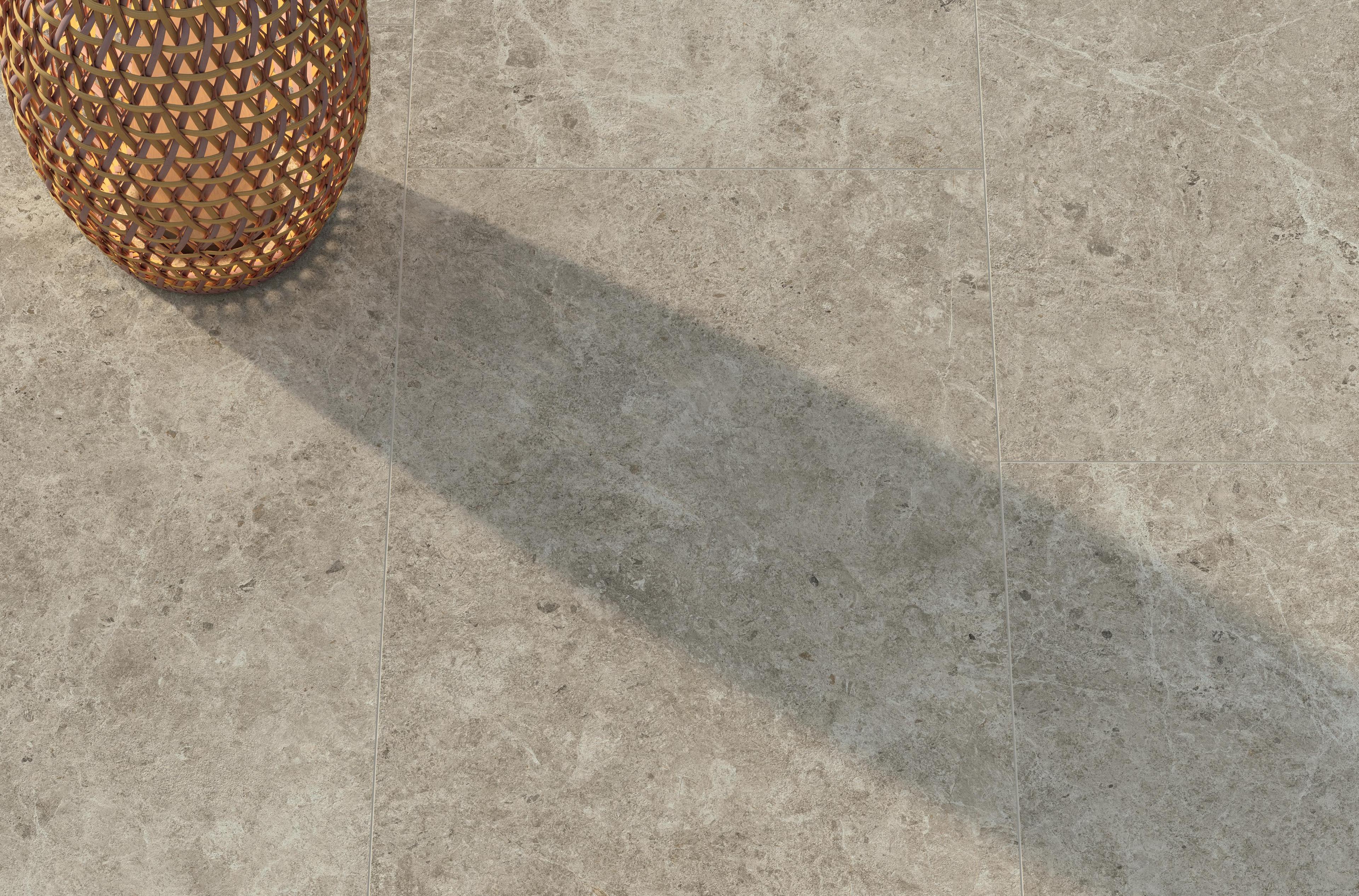
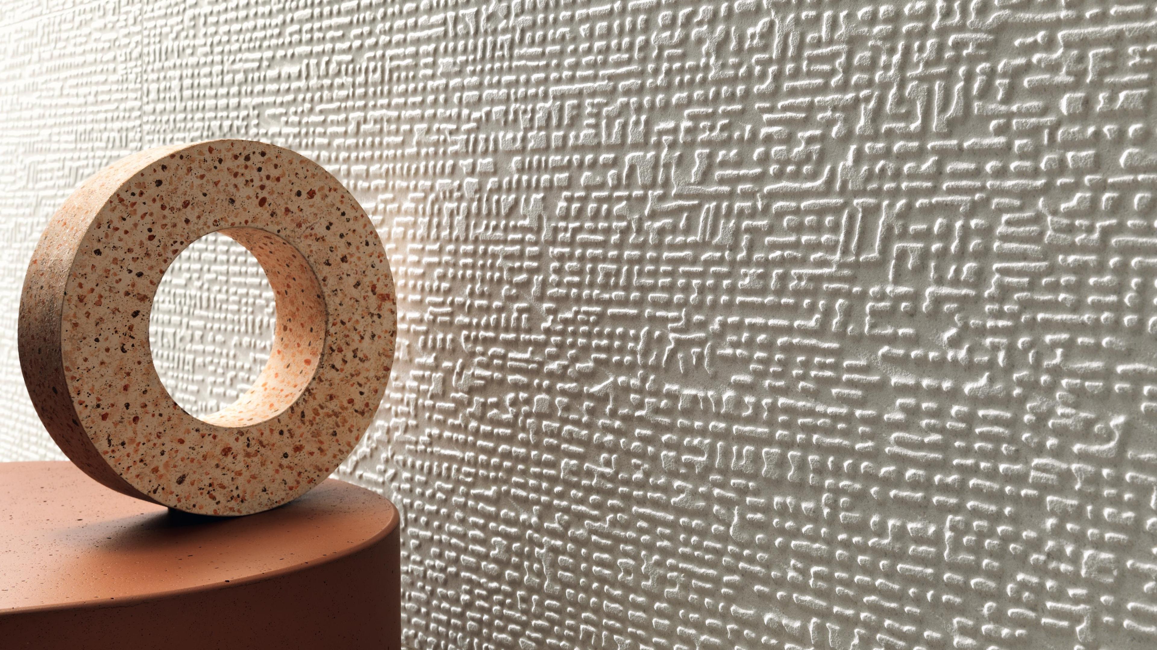
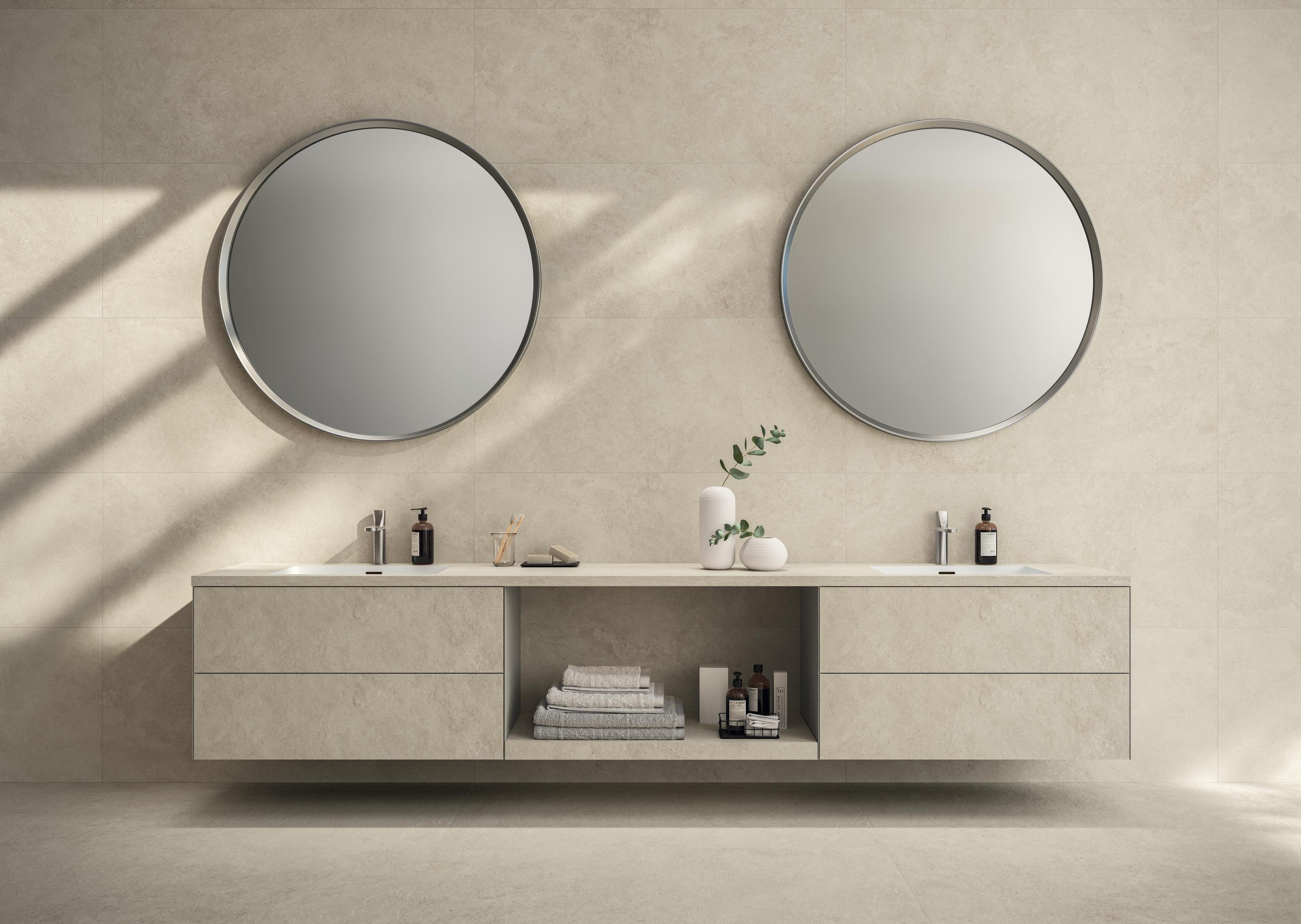
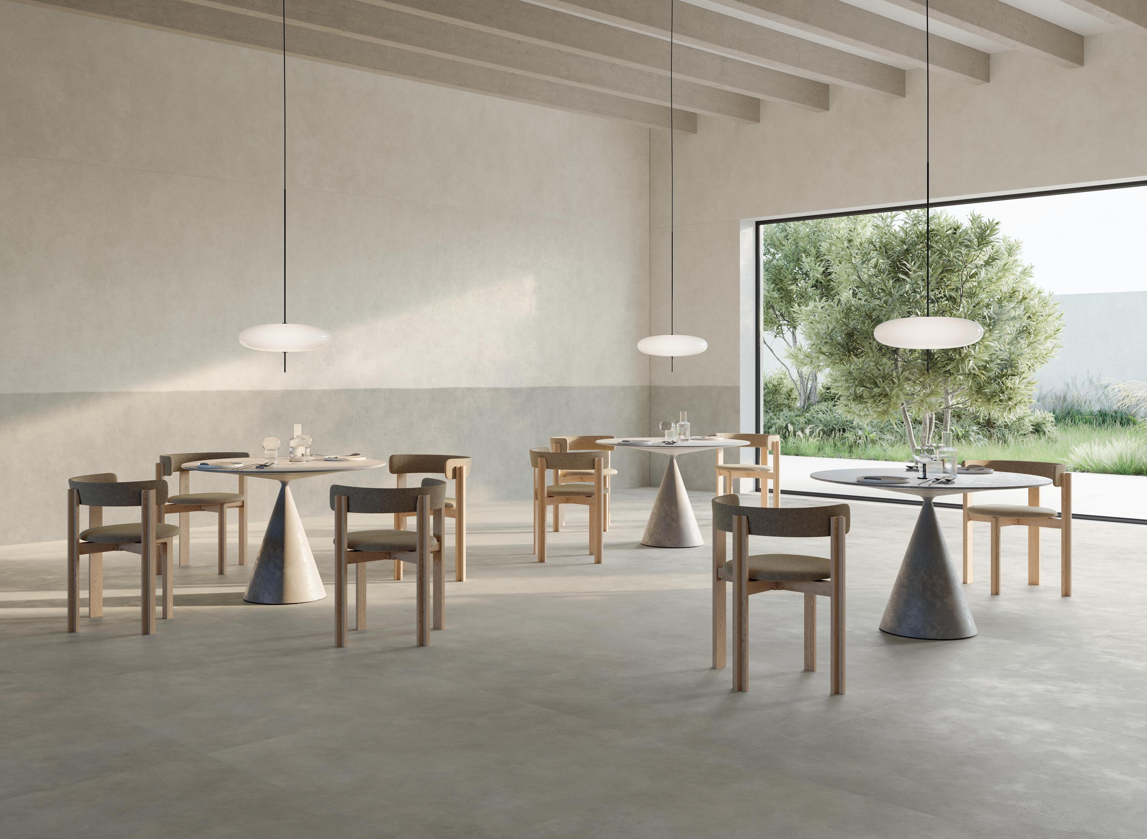
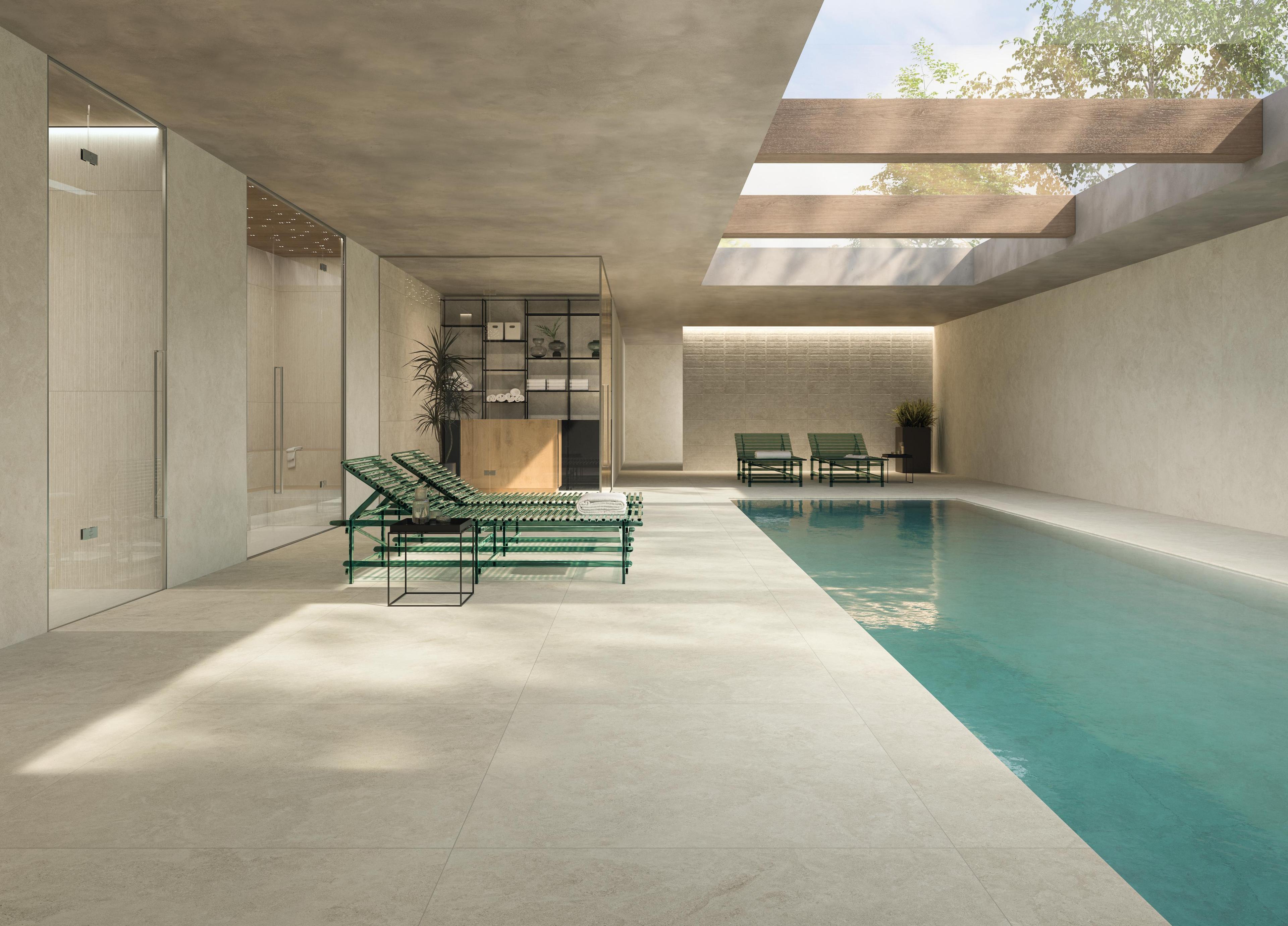
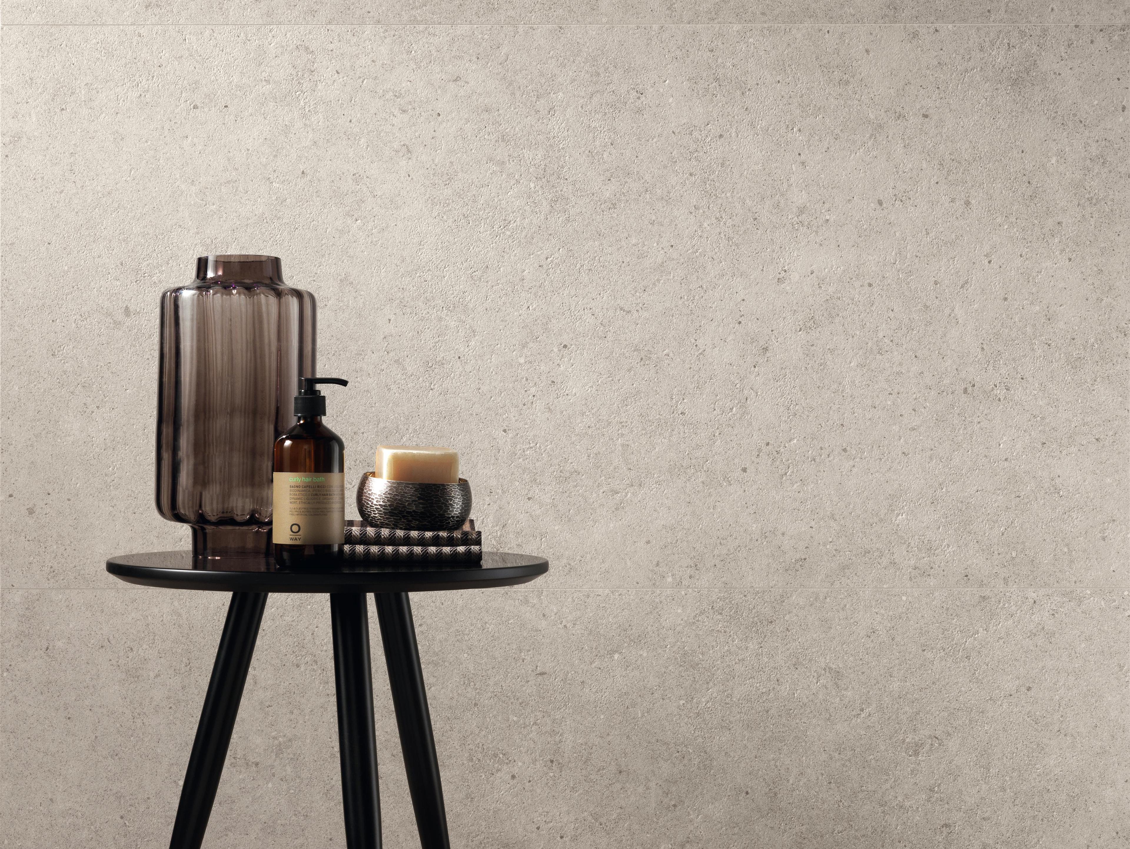
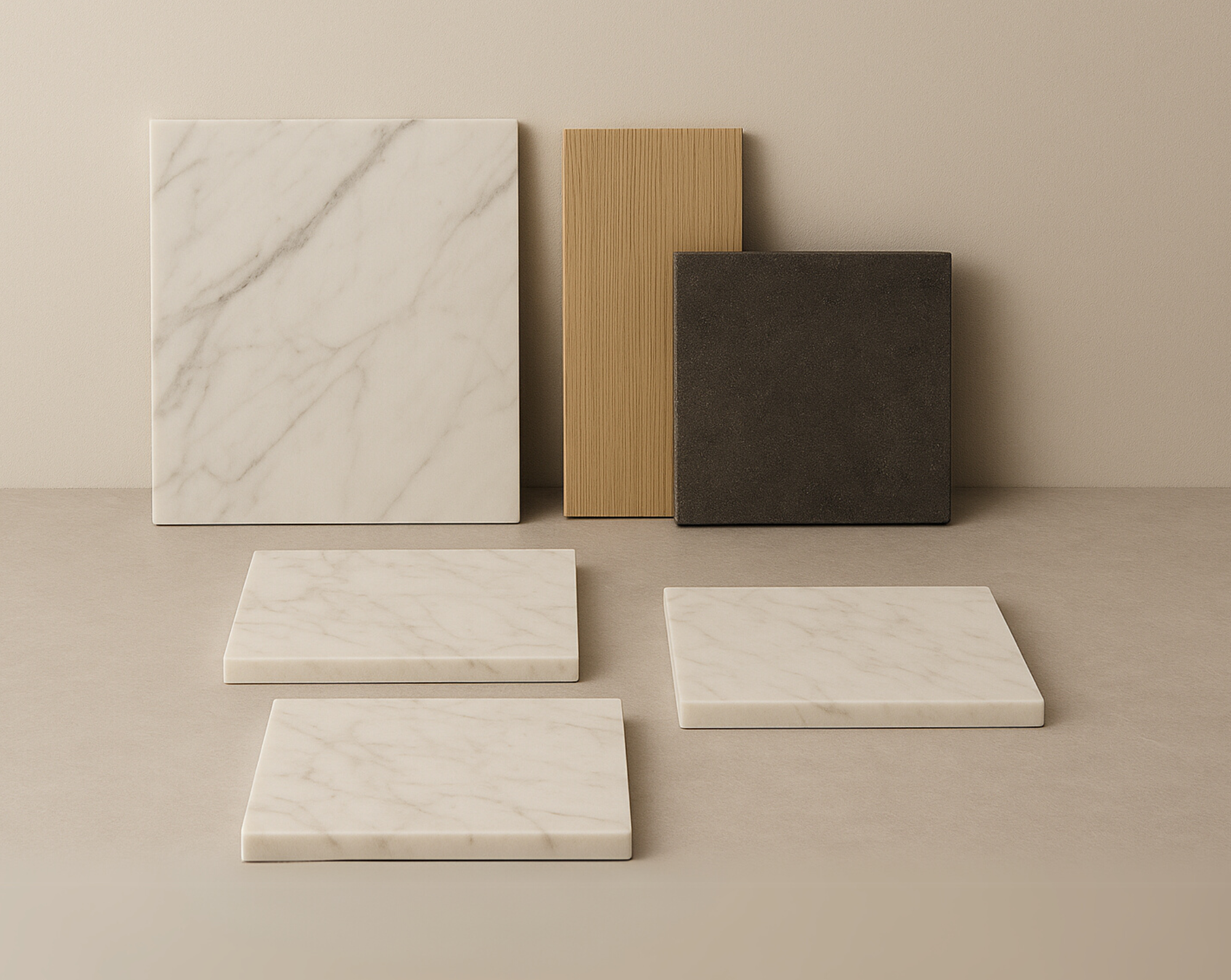
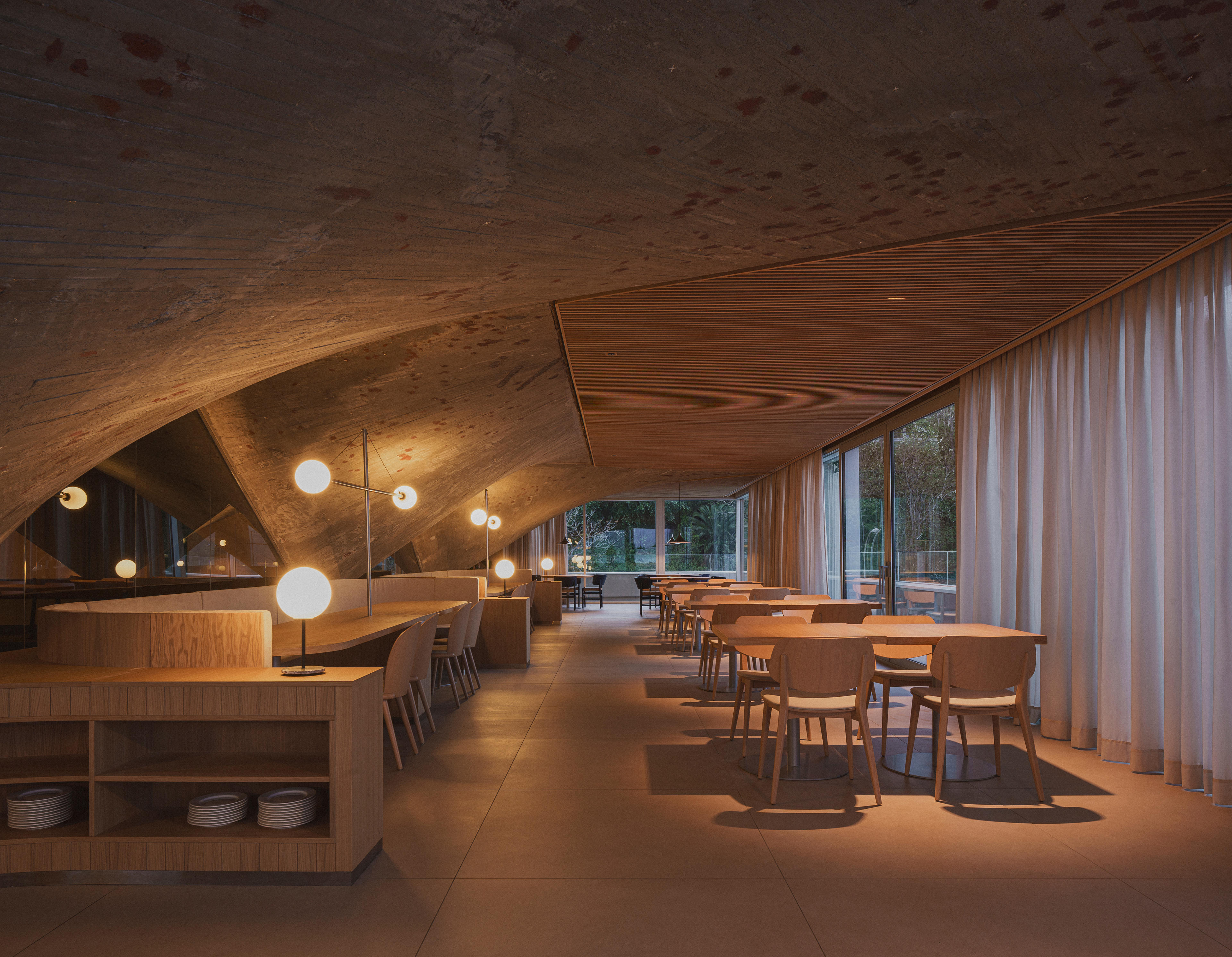
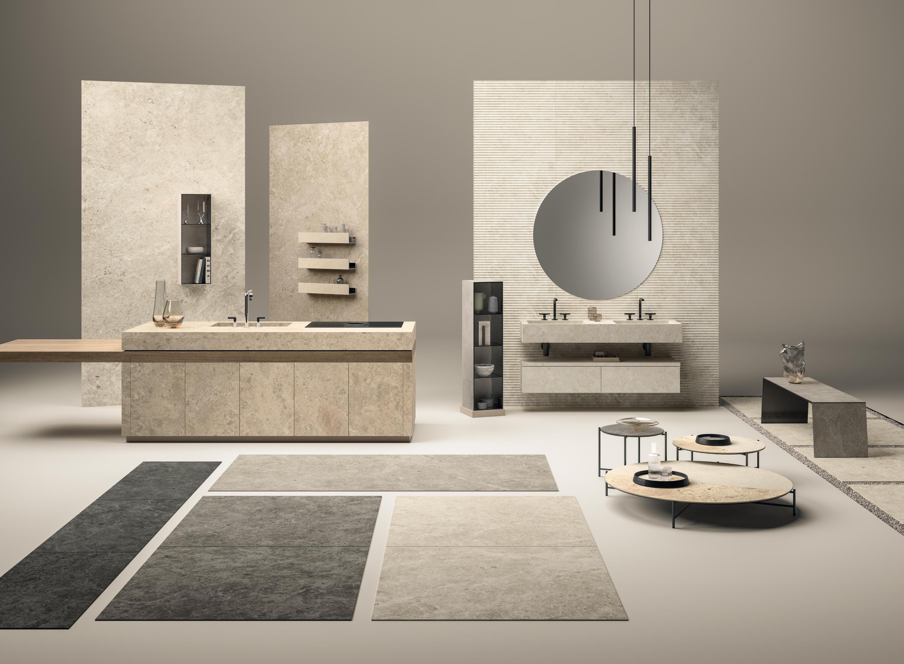
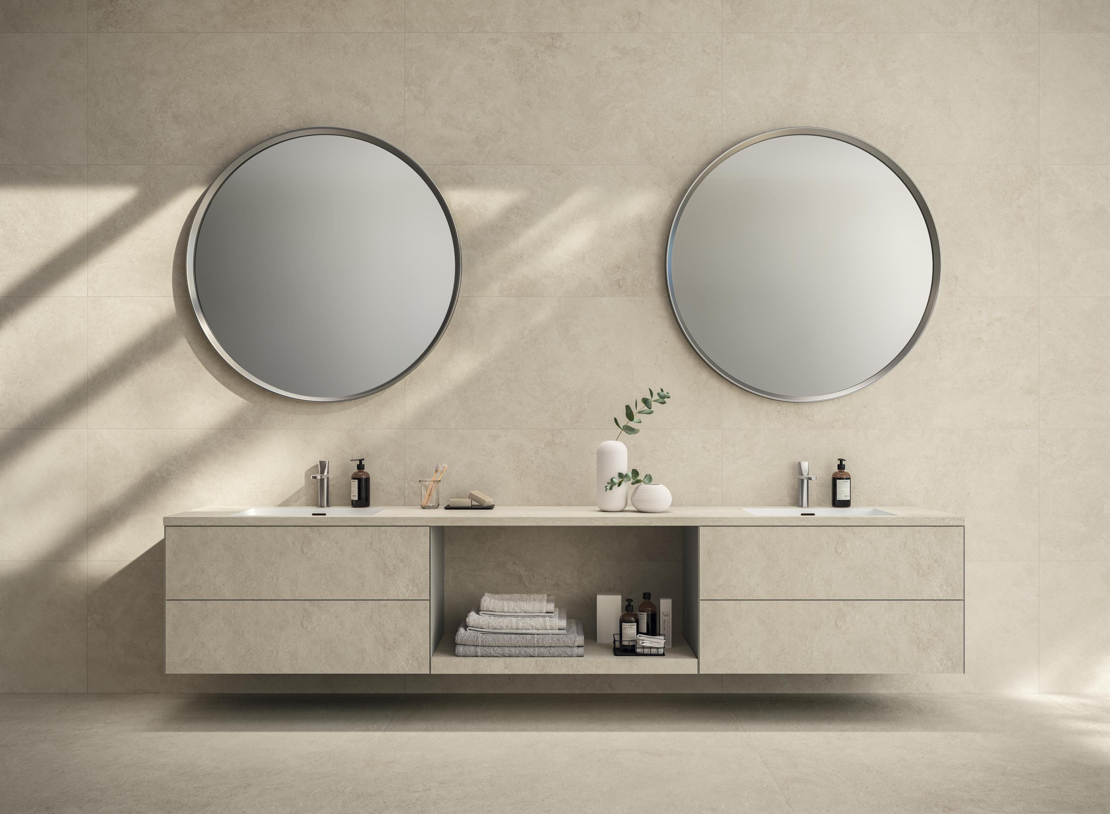
The first trend is thatof geological memory, which combines raw, imperfect textures with earthy palettes. In this context, the stone-effect porcelain stoneware draws on quartzite, basalt, sedimentary stone and porphyry as natural matrices, reinterpreting their identity and amplifying their aesthetic and design qualities. The palette moves from Nordic grey to Mediterranean beige, passing through oxides, sands and limestones.
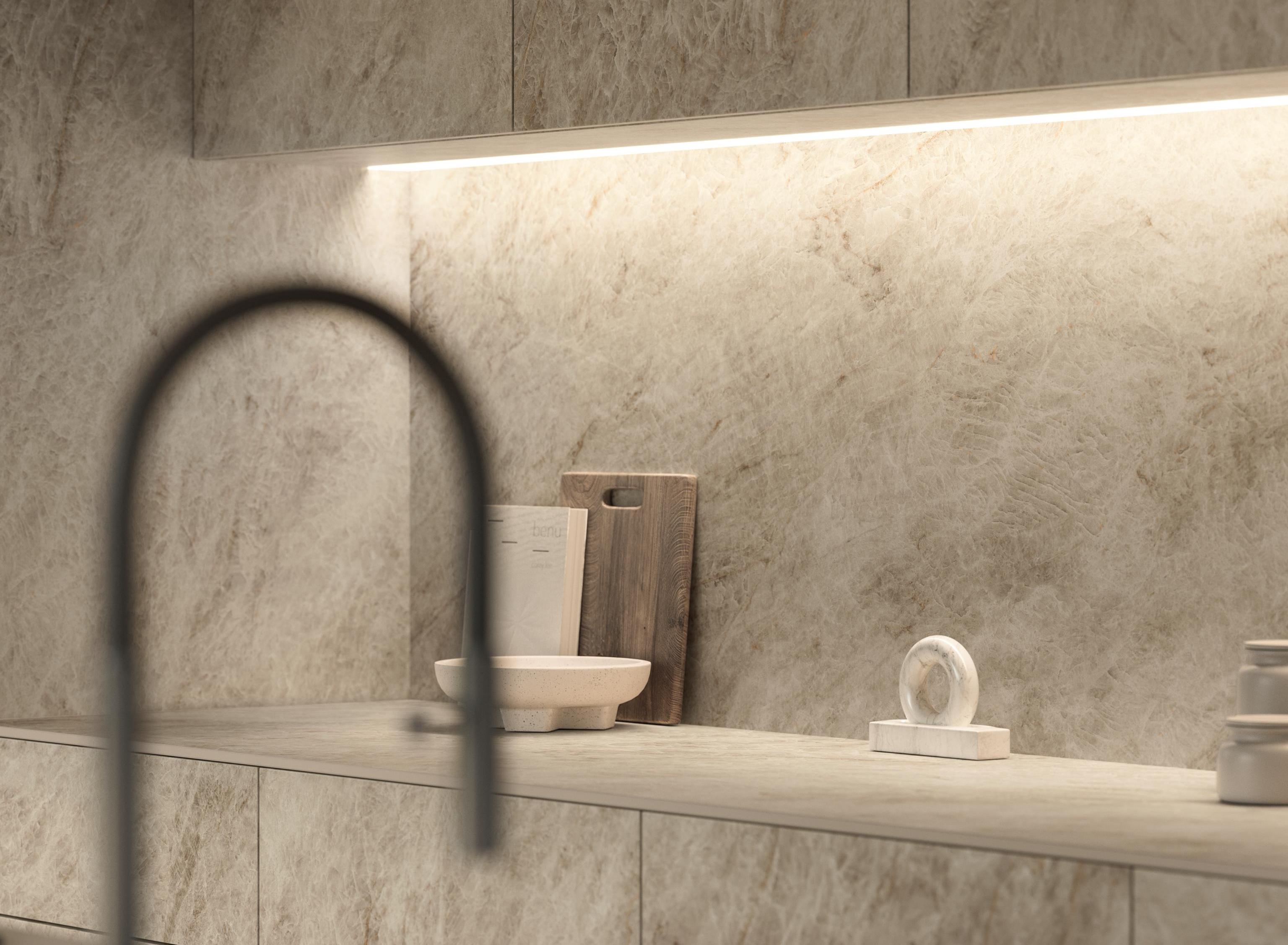
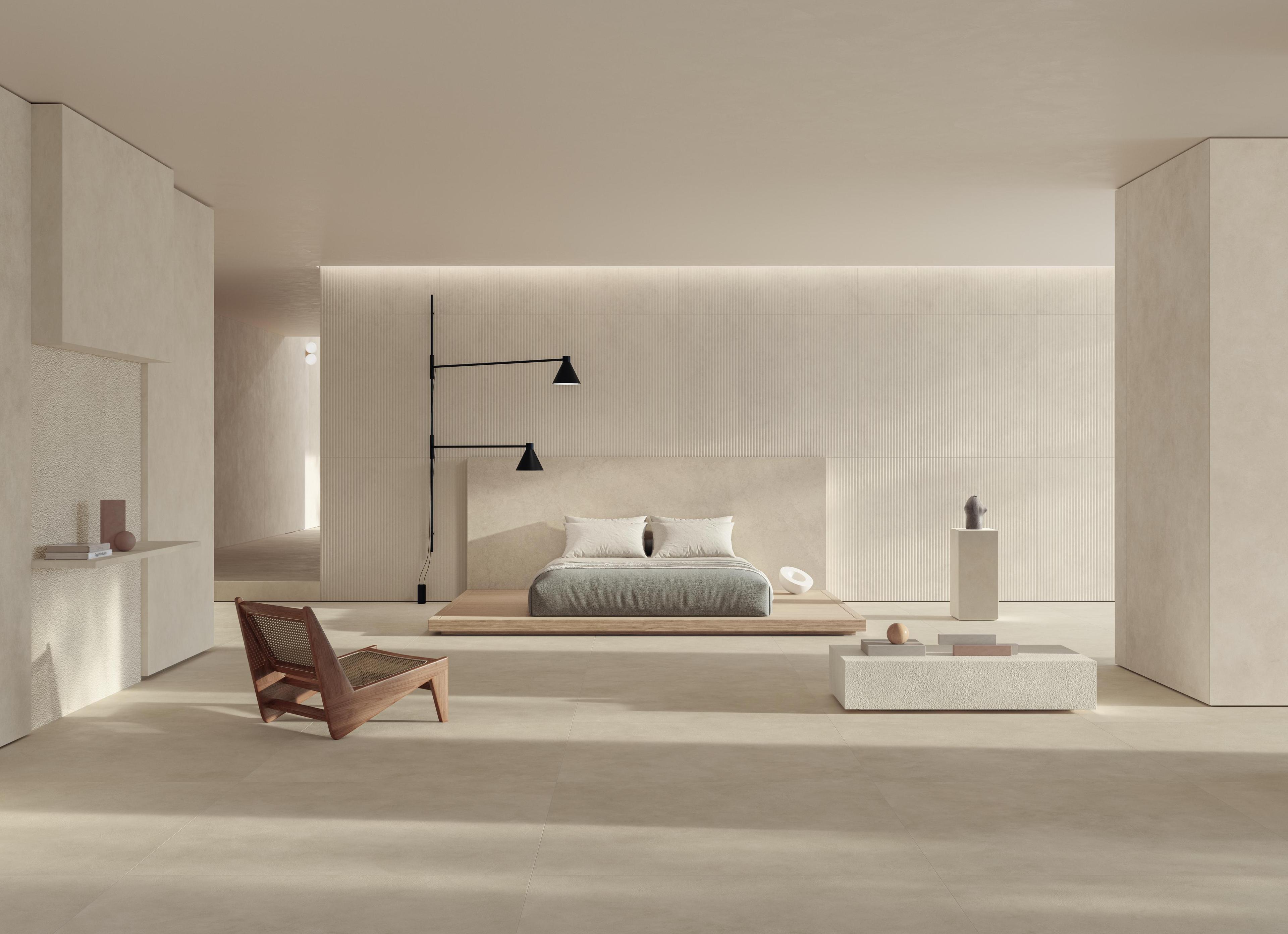
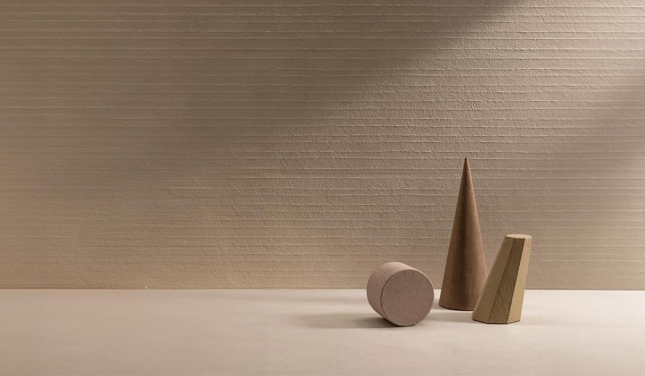
Three-dimensional textures — bush-hammered, chiselled, carved or split-face — recall an ancient culture of making, built on artisanal gestures, tools and techniques handed down through stone working. The ceramic surface gathers up that memory and translates it into a contemporary language, introducing rhythm, depth and luminous vibrations. In large formats, these treatments take on an almost architectural presence: the covering does not merely define space, it helps to build it.
Matt finishes and enveloping surfacesas a response to the excess of stimuli
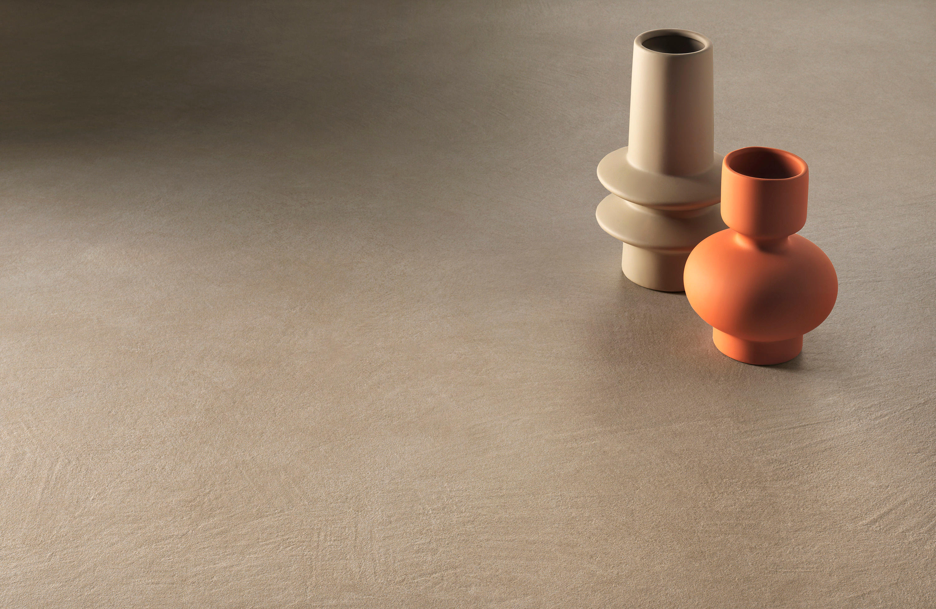
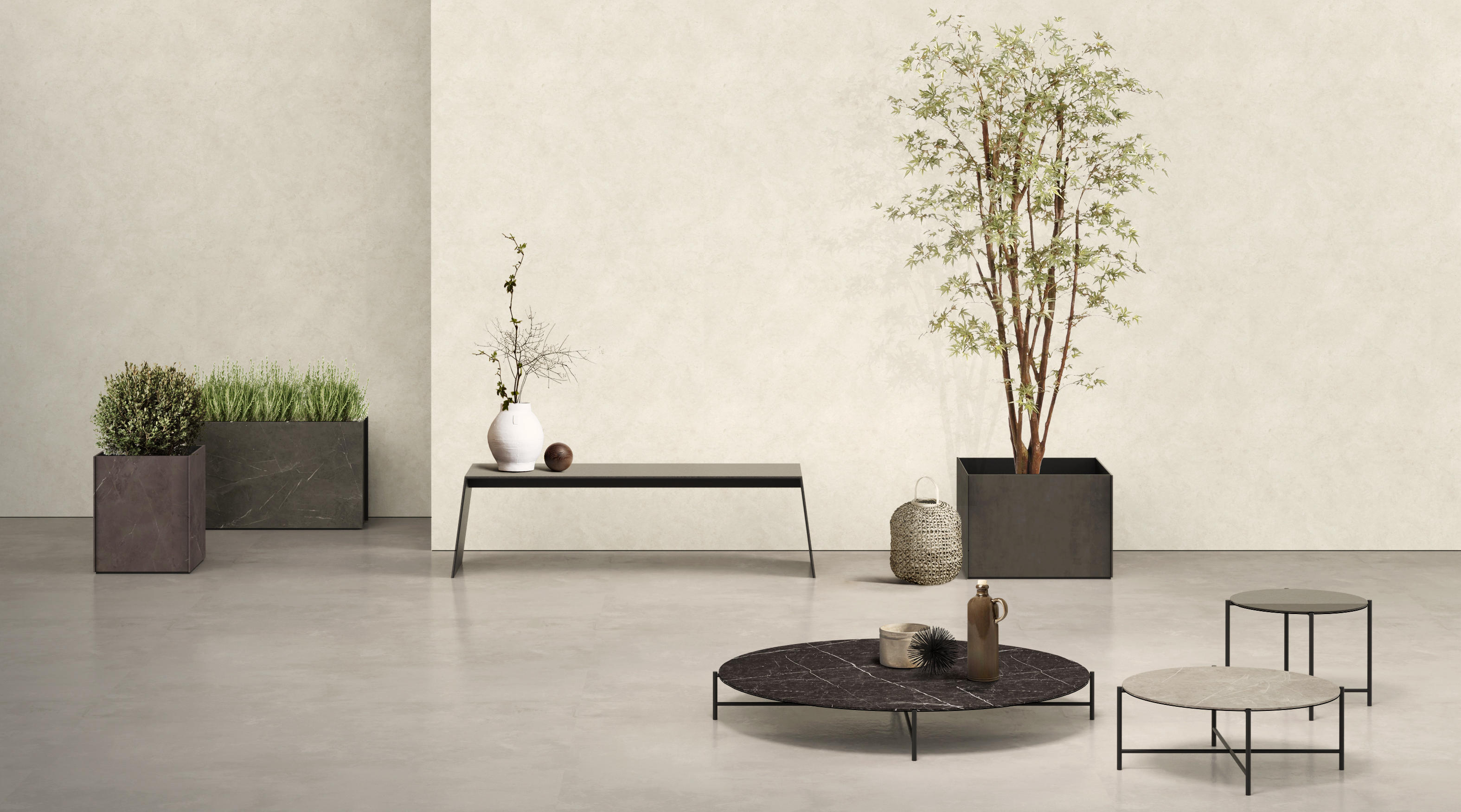
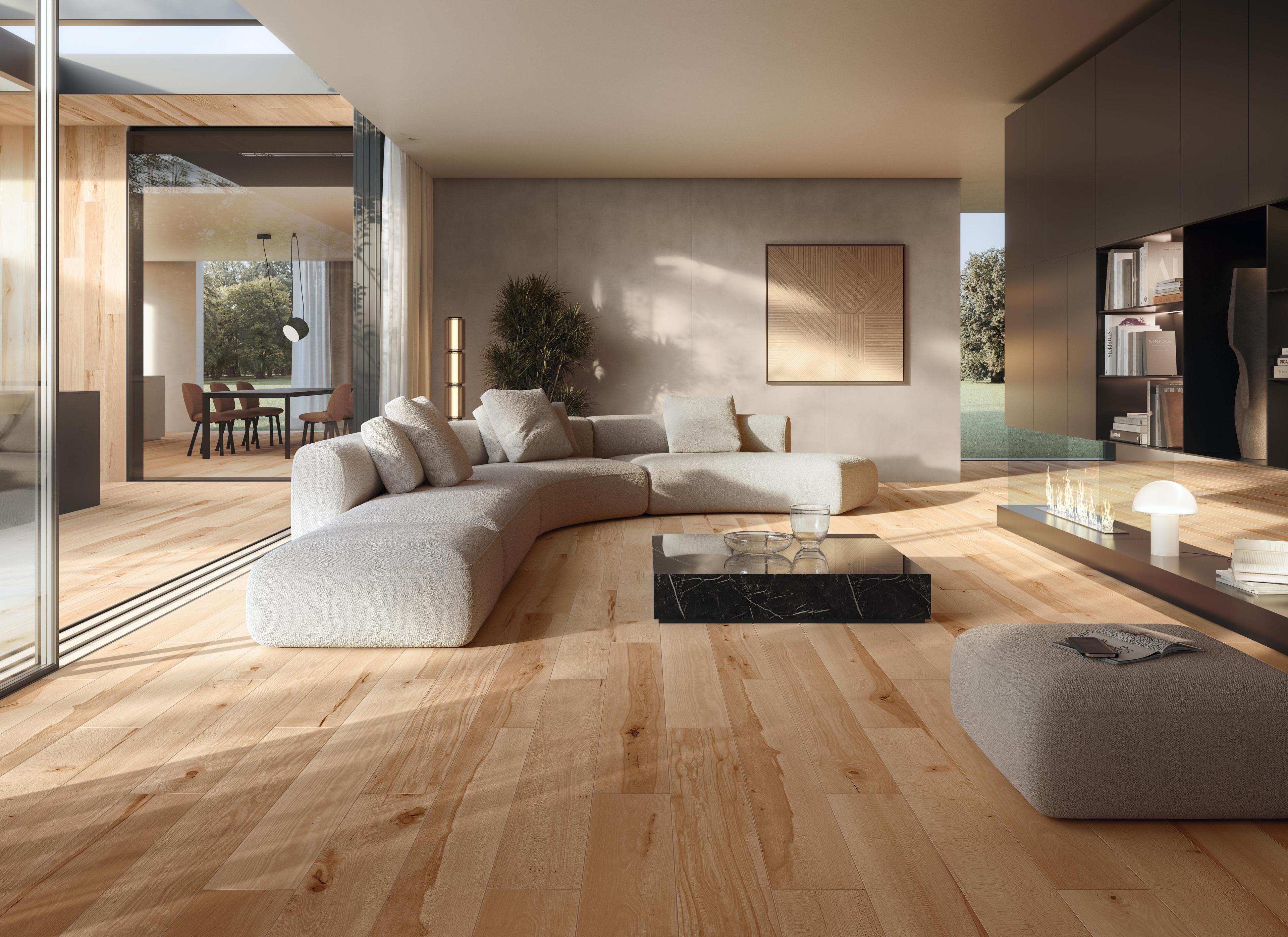
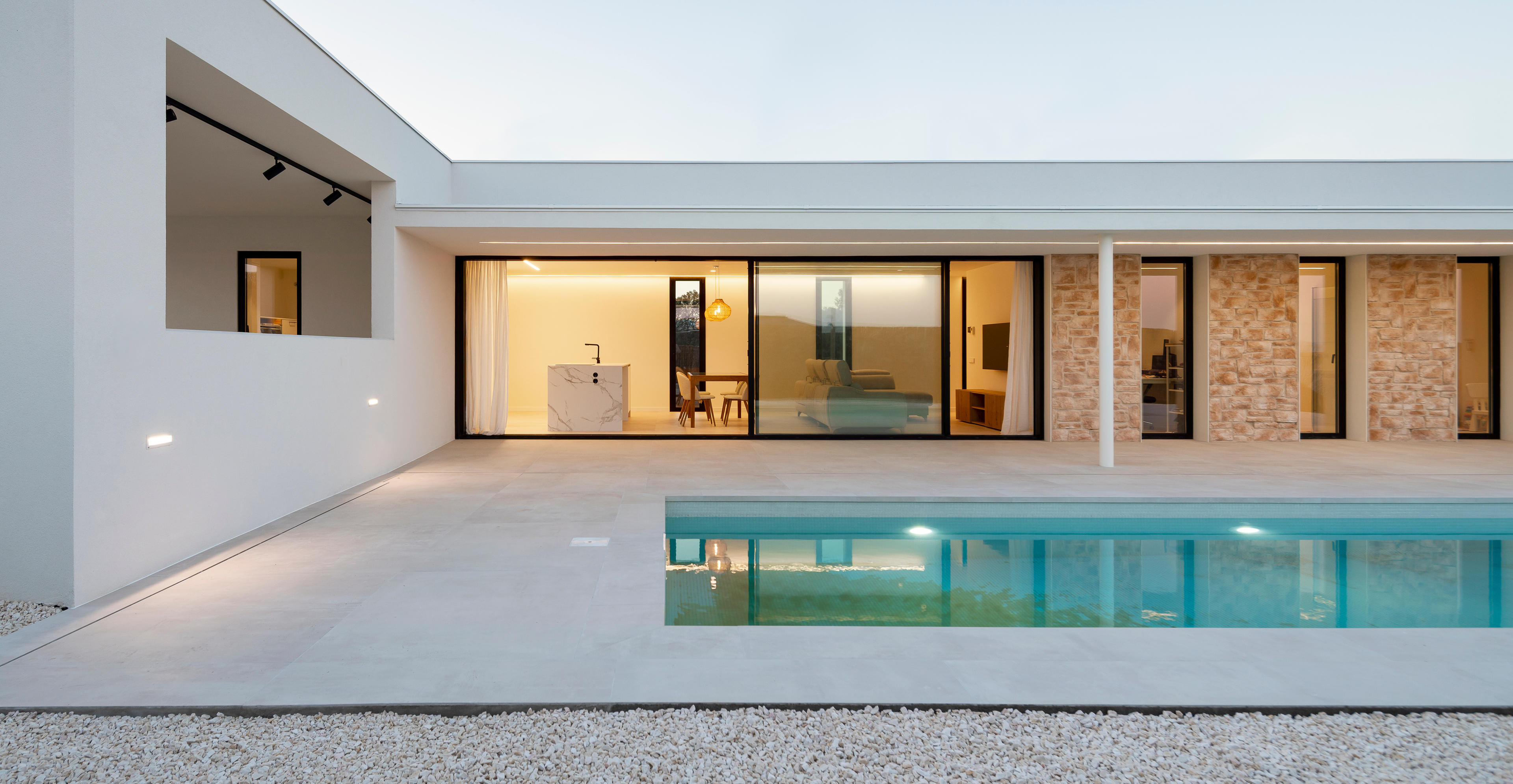
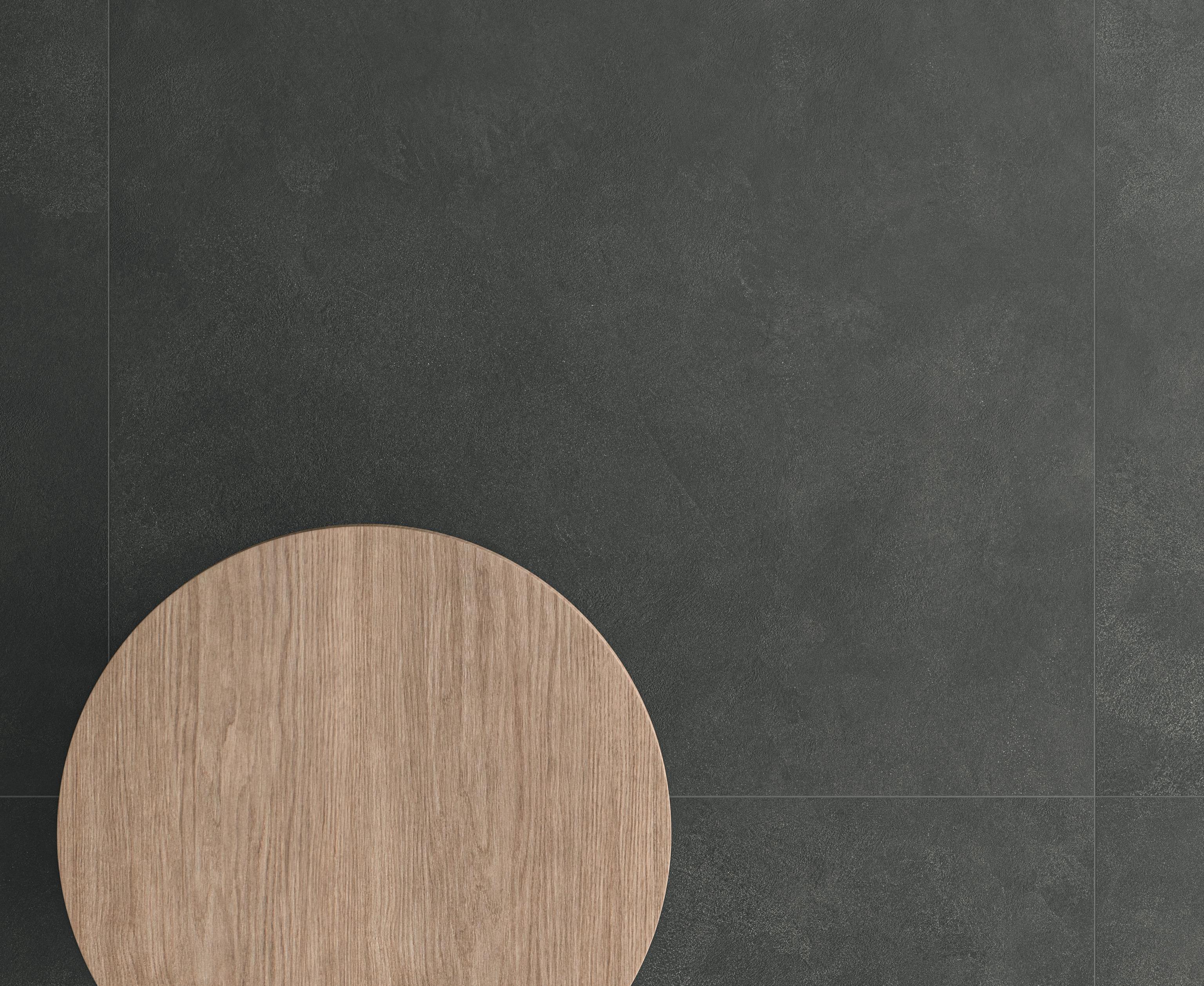
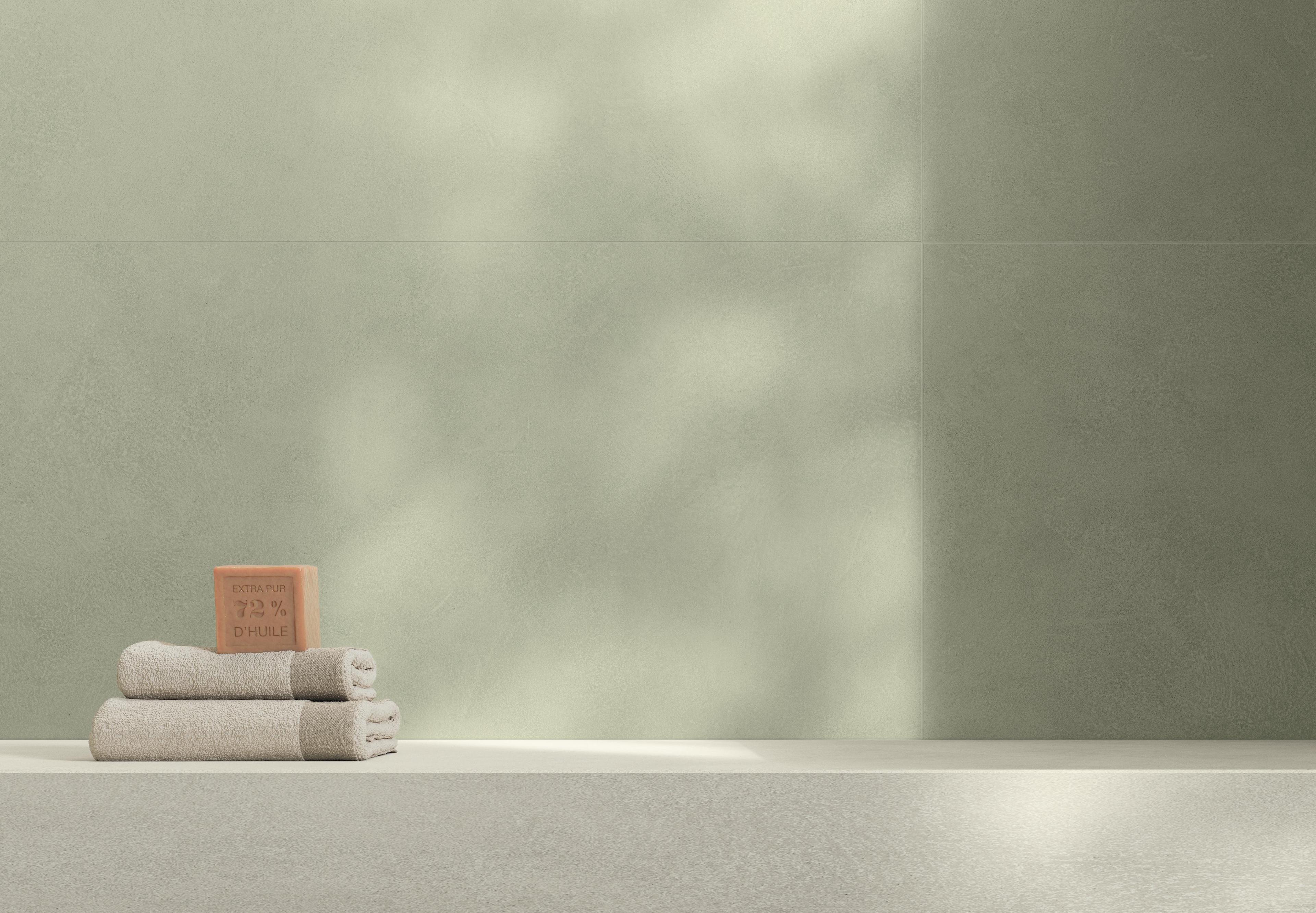
The second trend is that of the sensory refuge: enveloping colours, matt finishes, surfaces that invite you to slow down. Space becomes a place of wellbeing and the surface is chosen for its tactile quality as wellas for its visual impact. The matt finish absorbs light instead of reflecting it, building a perception of space that is intimate and present.In every field of application, it enhances the ability of the ceramic surface to interpret and perfect the material that inspires it, reproducing its appearance, depth and material authenticity with extreme fidelity. Tactile performance is particularly advanced: the surface feels natural, pleasant and soft to the touch, while at the same time remaining easy to clean without compromising its aesthetic quality.
The dialogue between tradition and contemporaneity: decorative surfaces and compositional identity
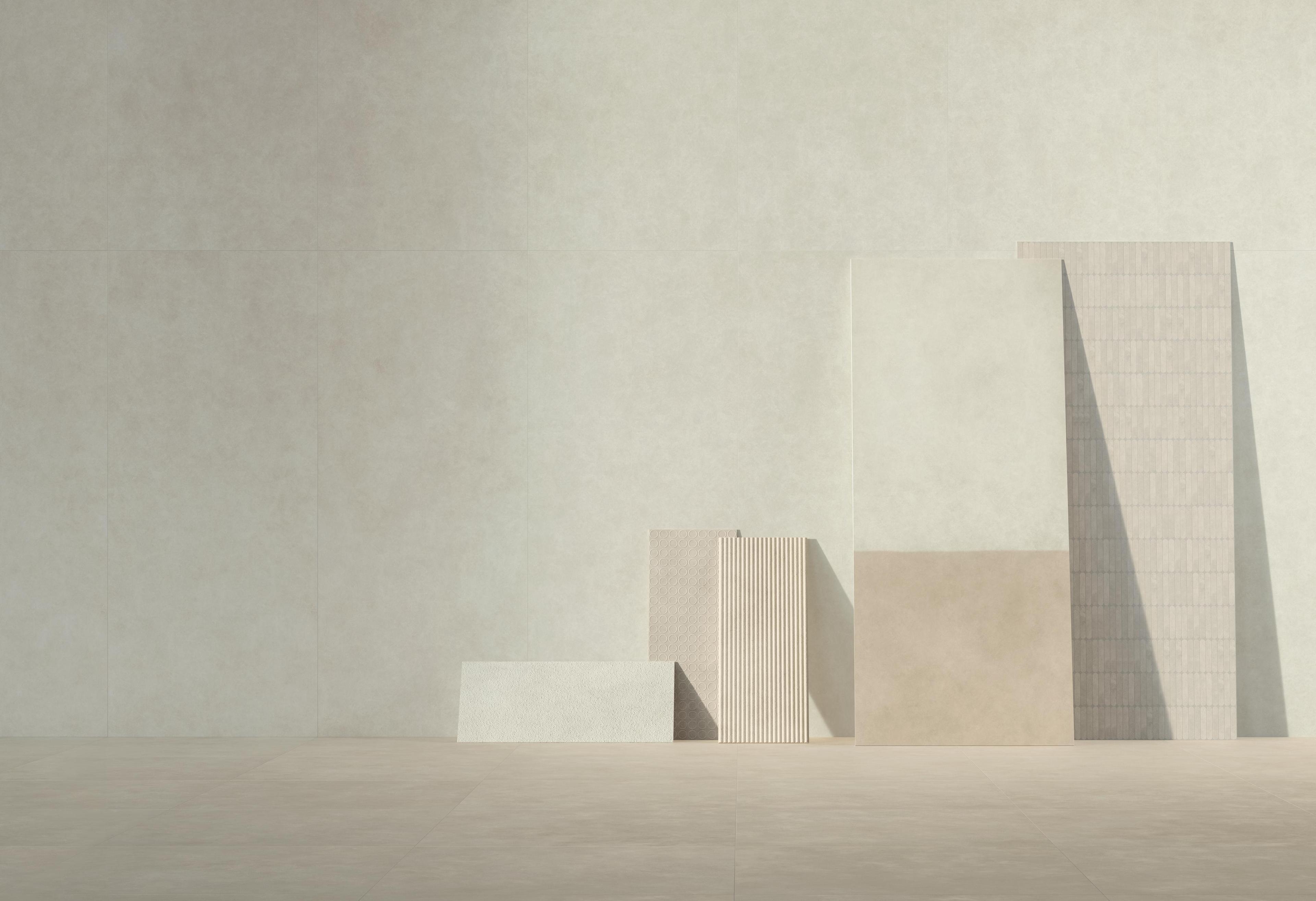
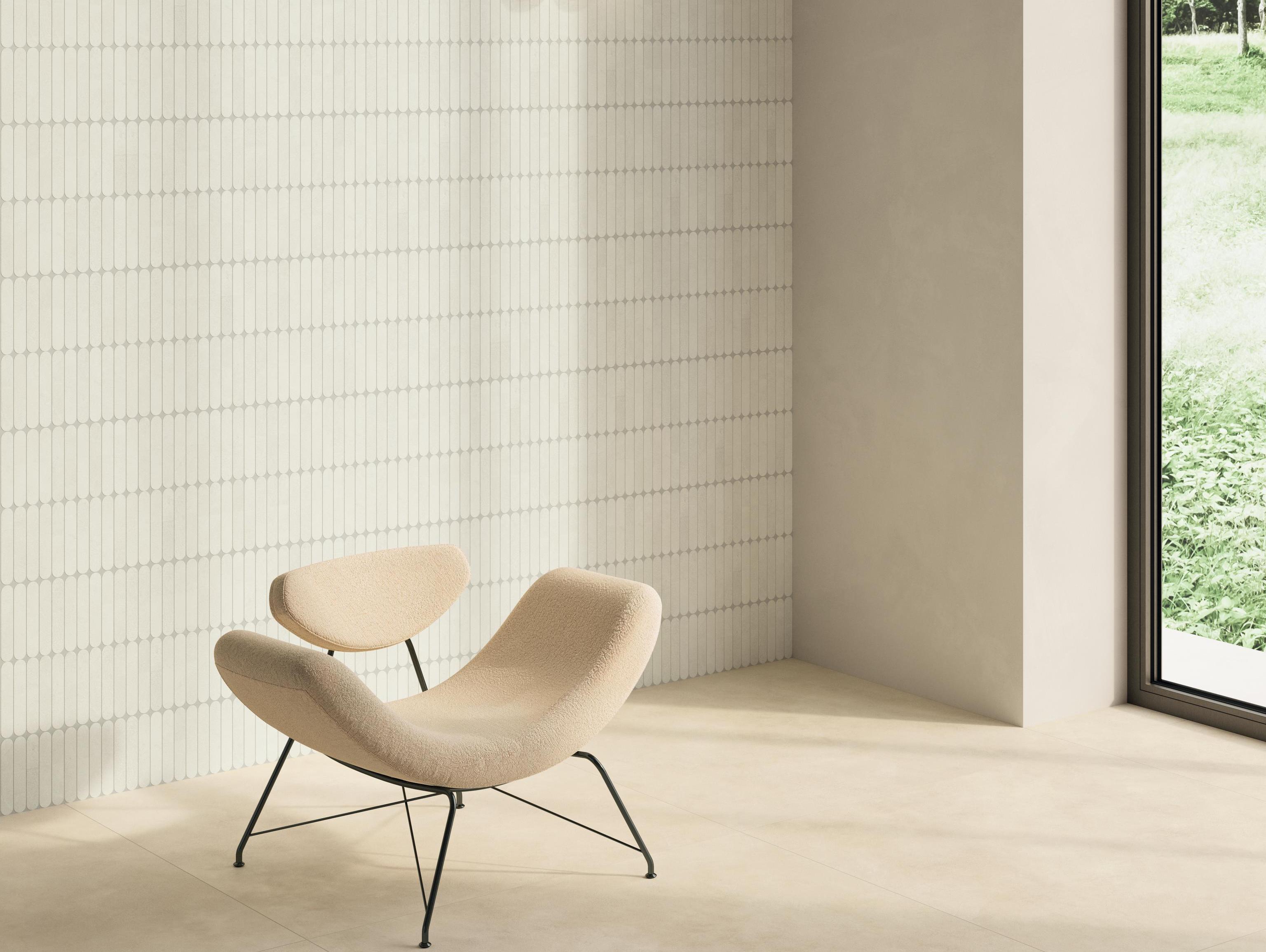
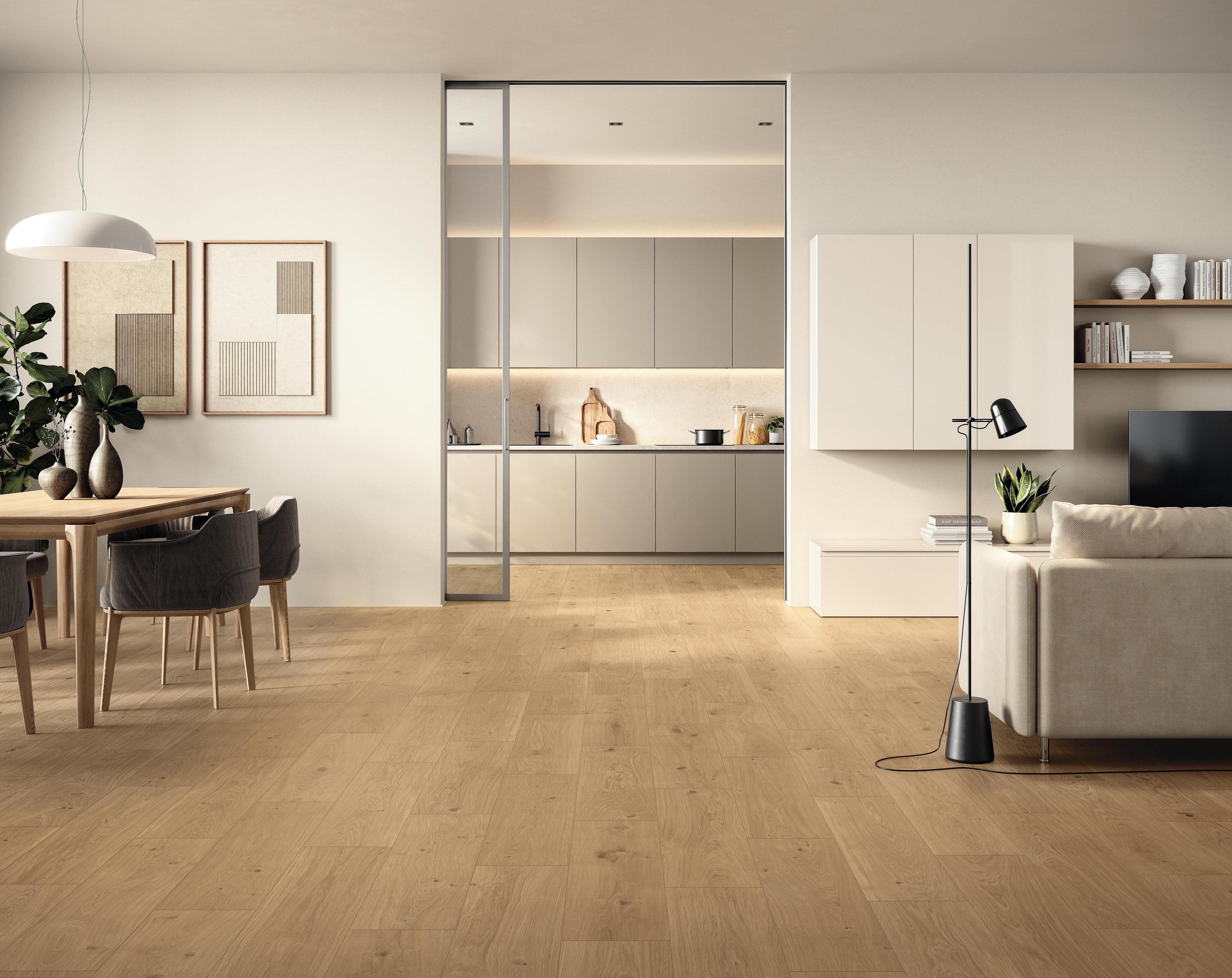
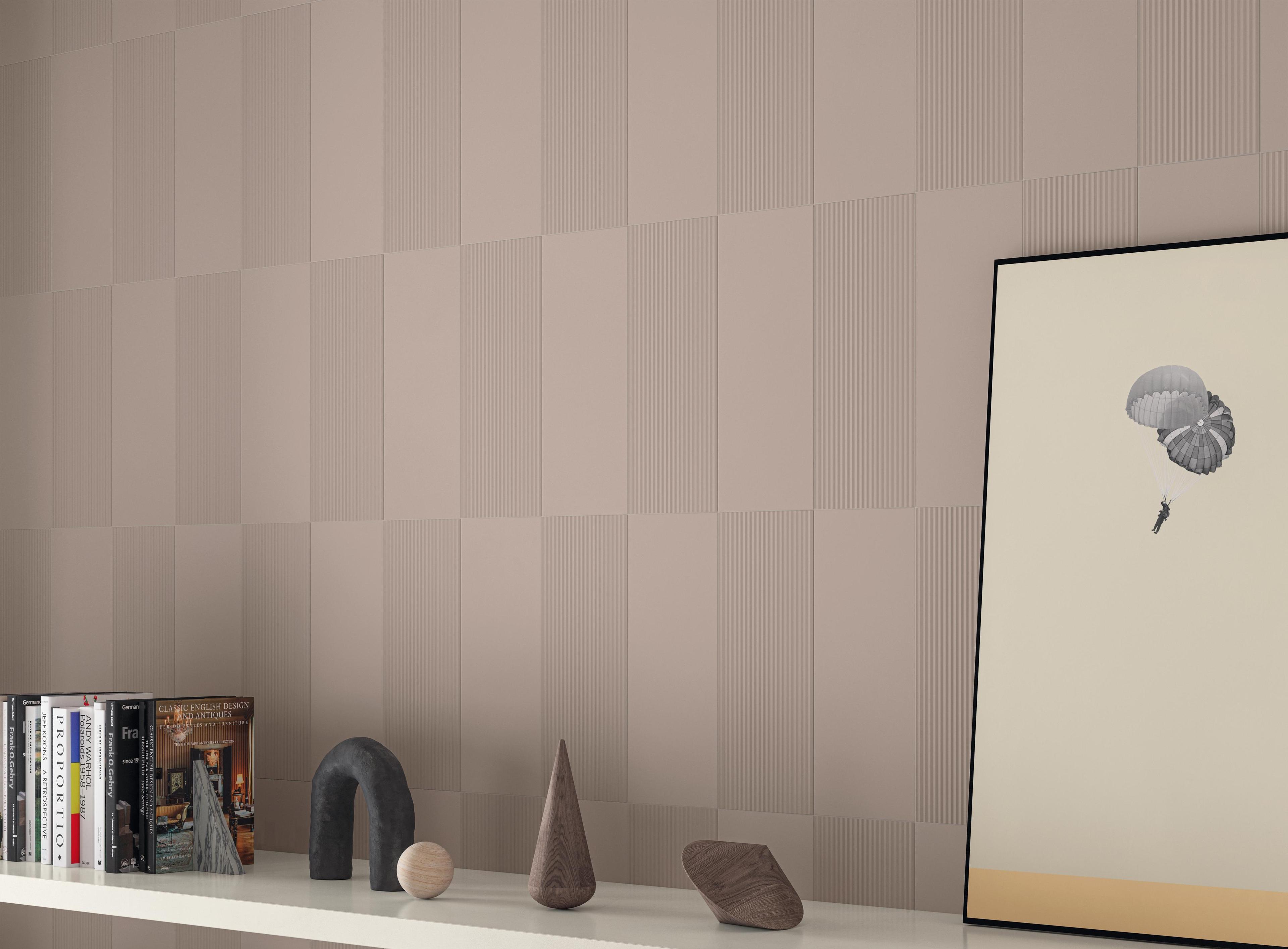
The third trend revives artisanal codes and historical patterns reinterpreted in a contemporary key: not nostalgia, but a strategy for creating spaces with a strong, recognisable identity. Decorated floors, mosaics, inserts and accent walls bring visual complexity without giving up the performance of porcelain stoneware. The extensive selection of Atlas Concorde stone-effect decors and mosaics — for interiors, bathrooms and representative spaces — offers the compositional freedom a project requires, with the durability that only porcelain stoneware can guarantee.
Sophisticated surfaces with high visual impact
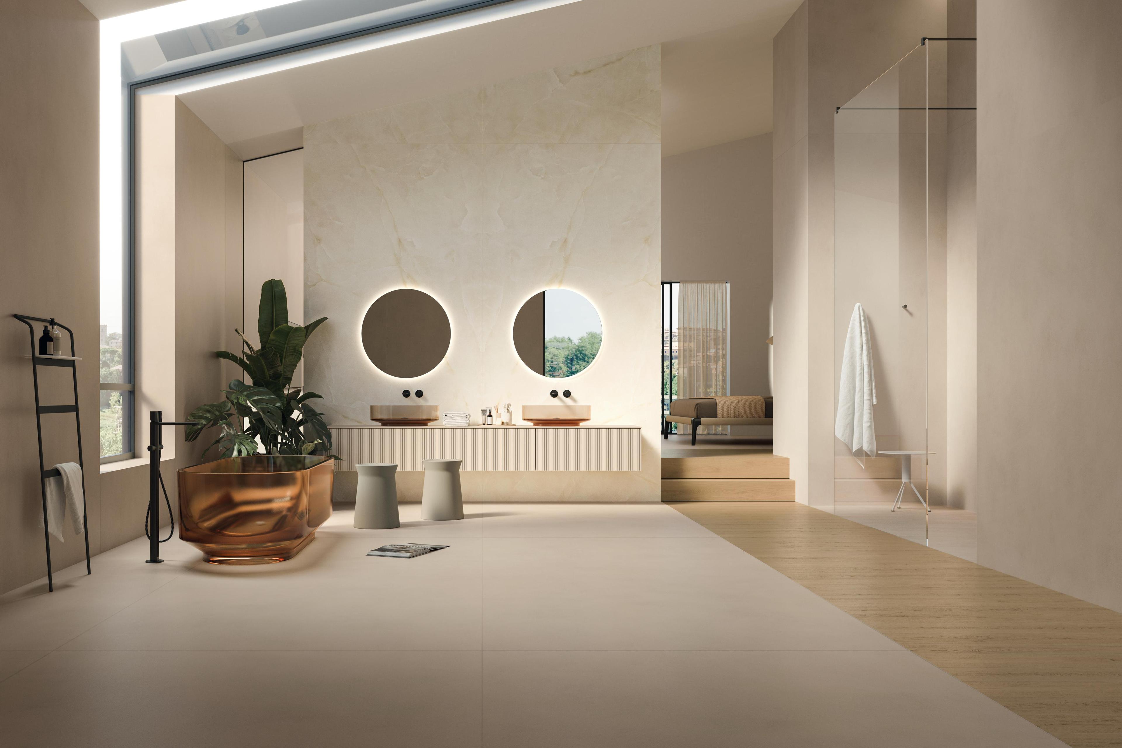
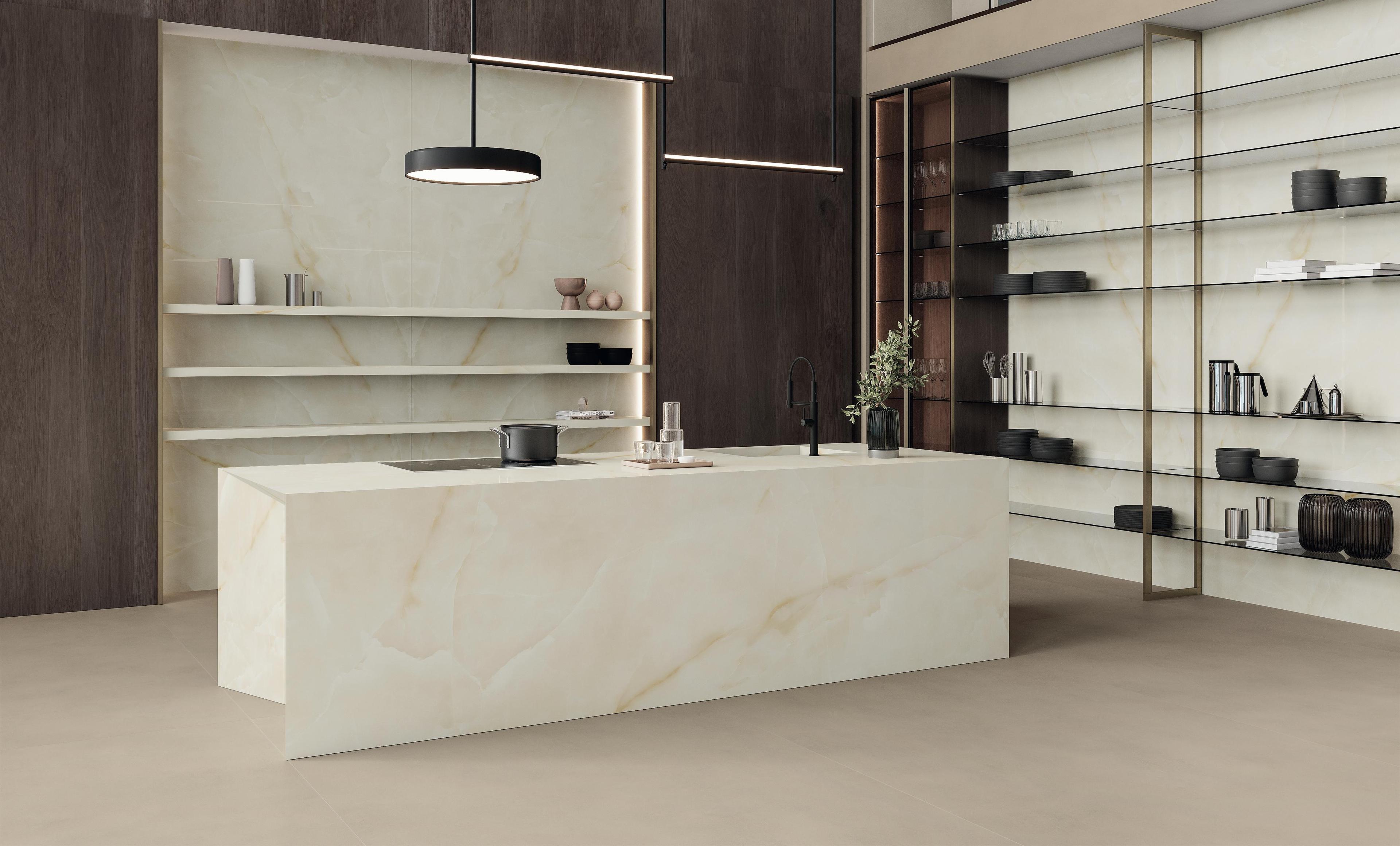
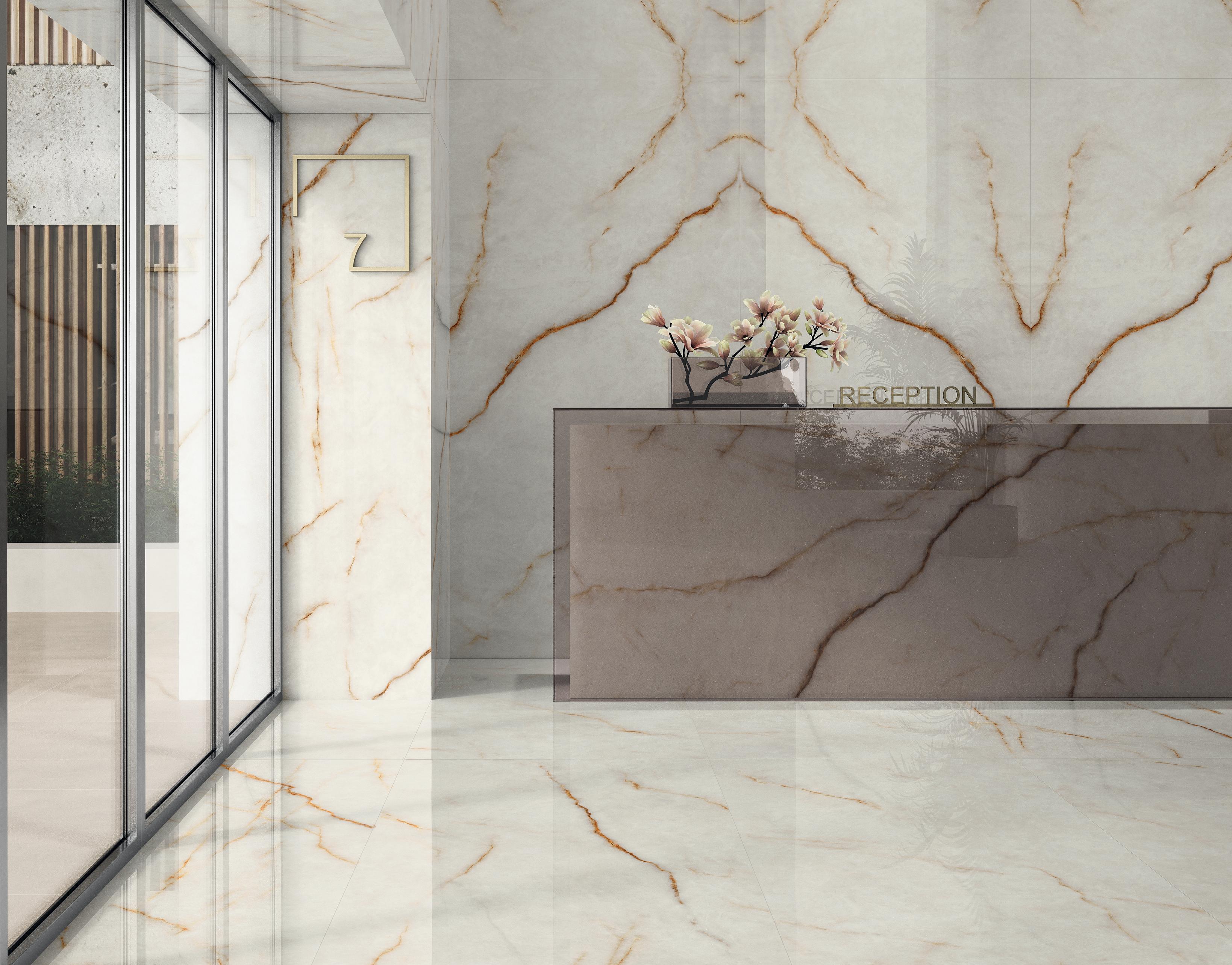
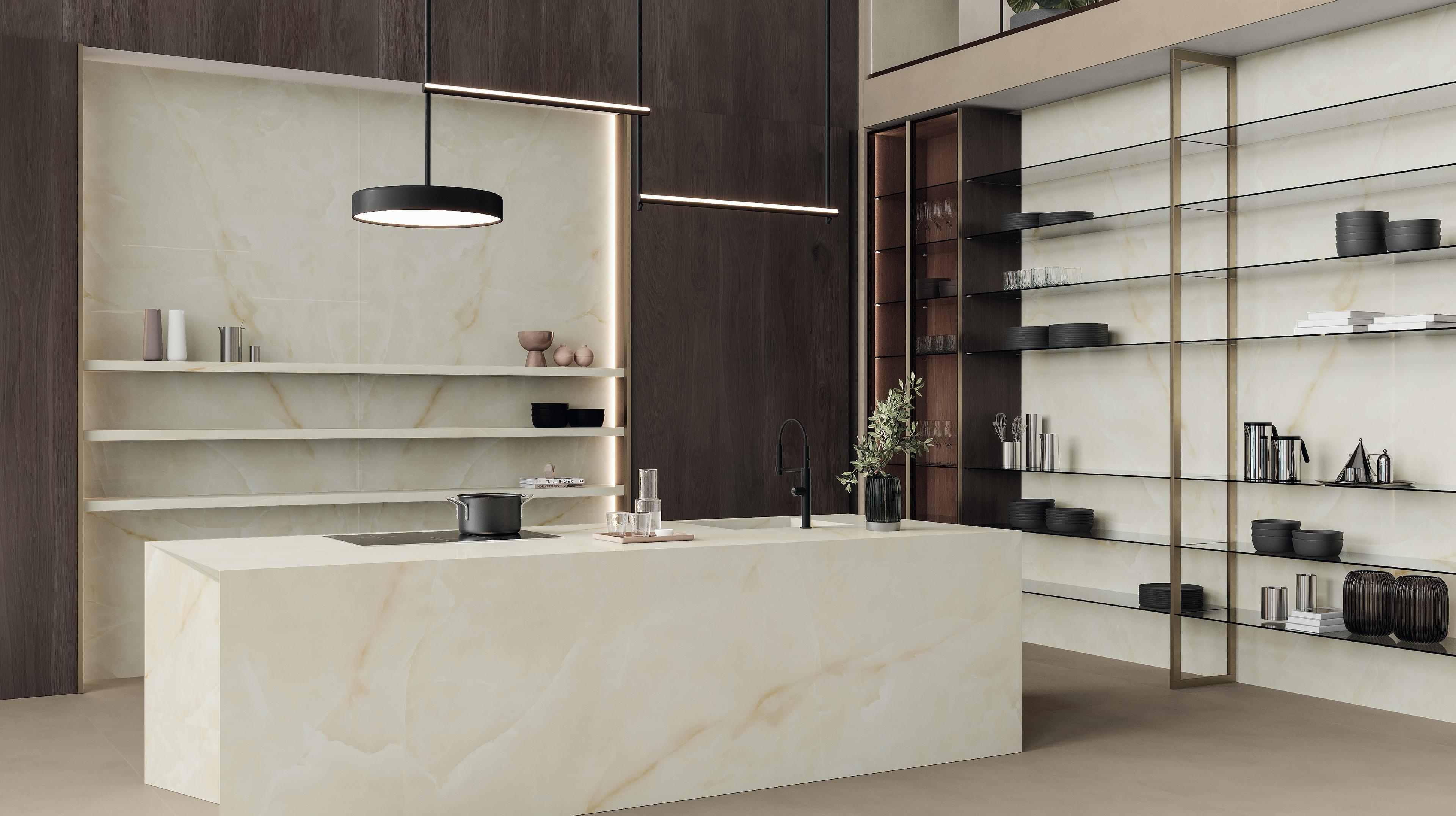
The fourth trend is that of material refinement: polished surfaces, chromatic depth and high visual impact finishes for spaces of great quality. It is a quality born of research into the material— of the ability of porcelain stoneware to reproduce depth and veining with a fidelity that natural material does not always guarantee consistently. Large slabs with a glossy surface amplify natural light and build spaces of dramatic quality, in residential settings as well as in contract and premium hospitality.


Interior design colour palette 2026
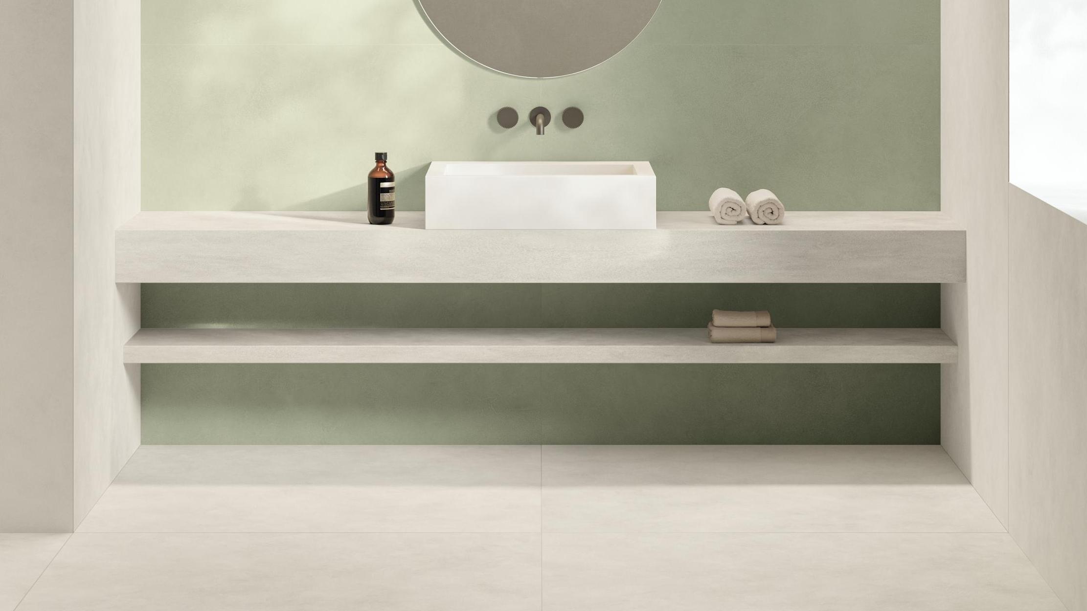
The interior design colour palette for 2026 moves between two poles: the deep, mineral tones of the earth on one side, and white as an active background on the other. A chromatic system that designers compose according to the character of the space and its intended use.
Terracotta, rust, sage green and ochre
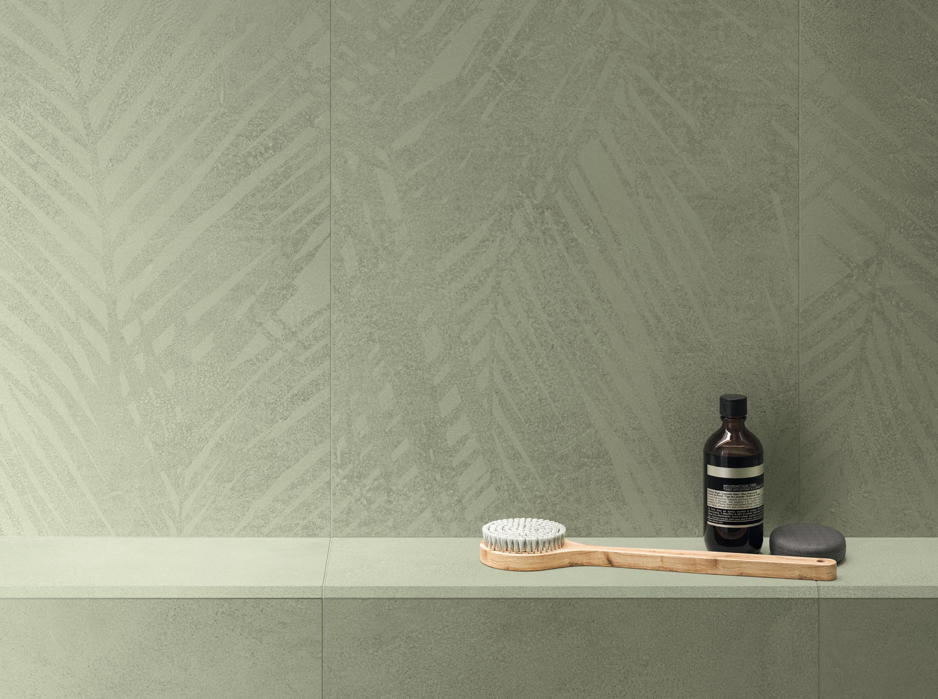
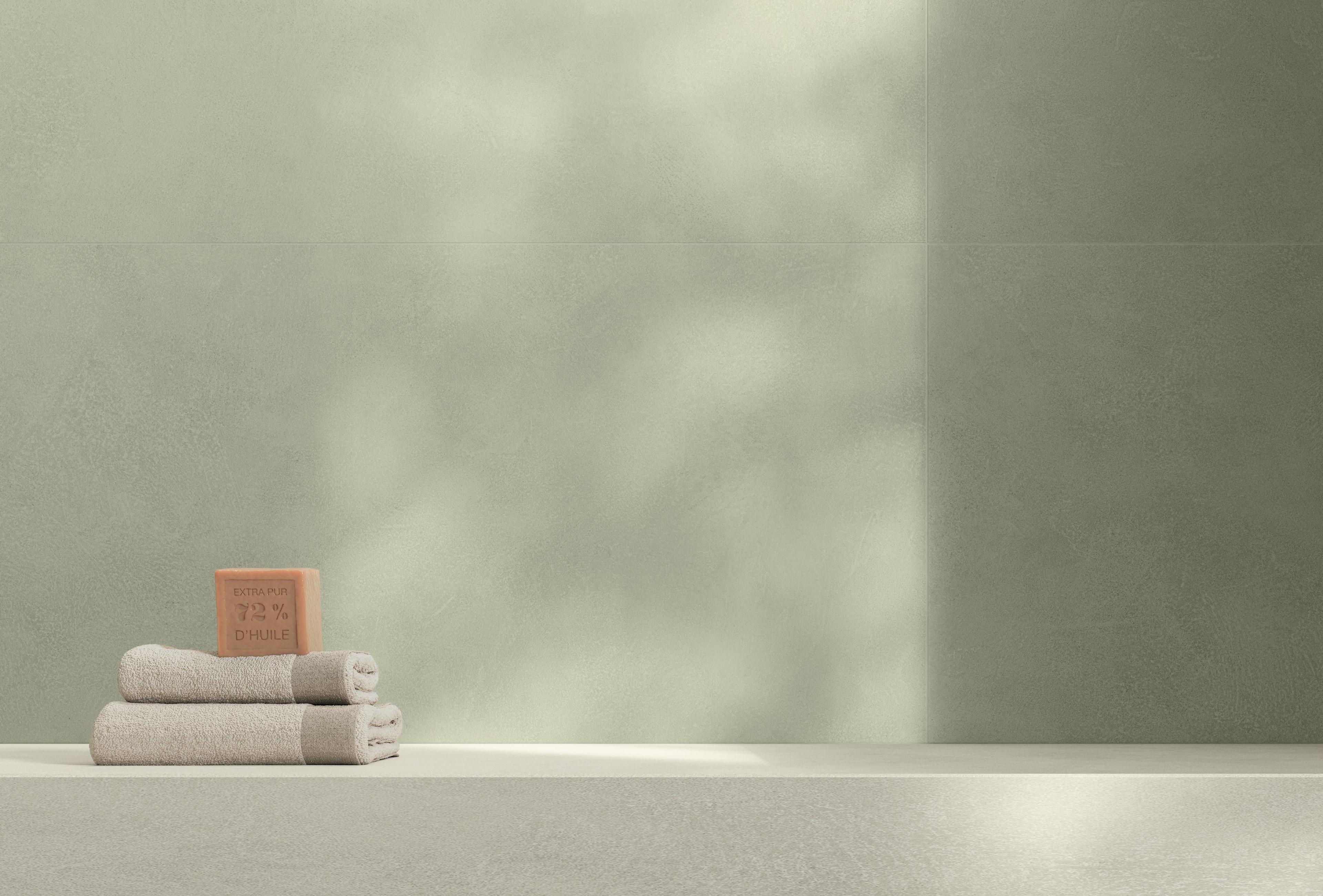
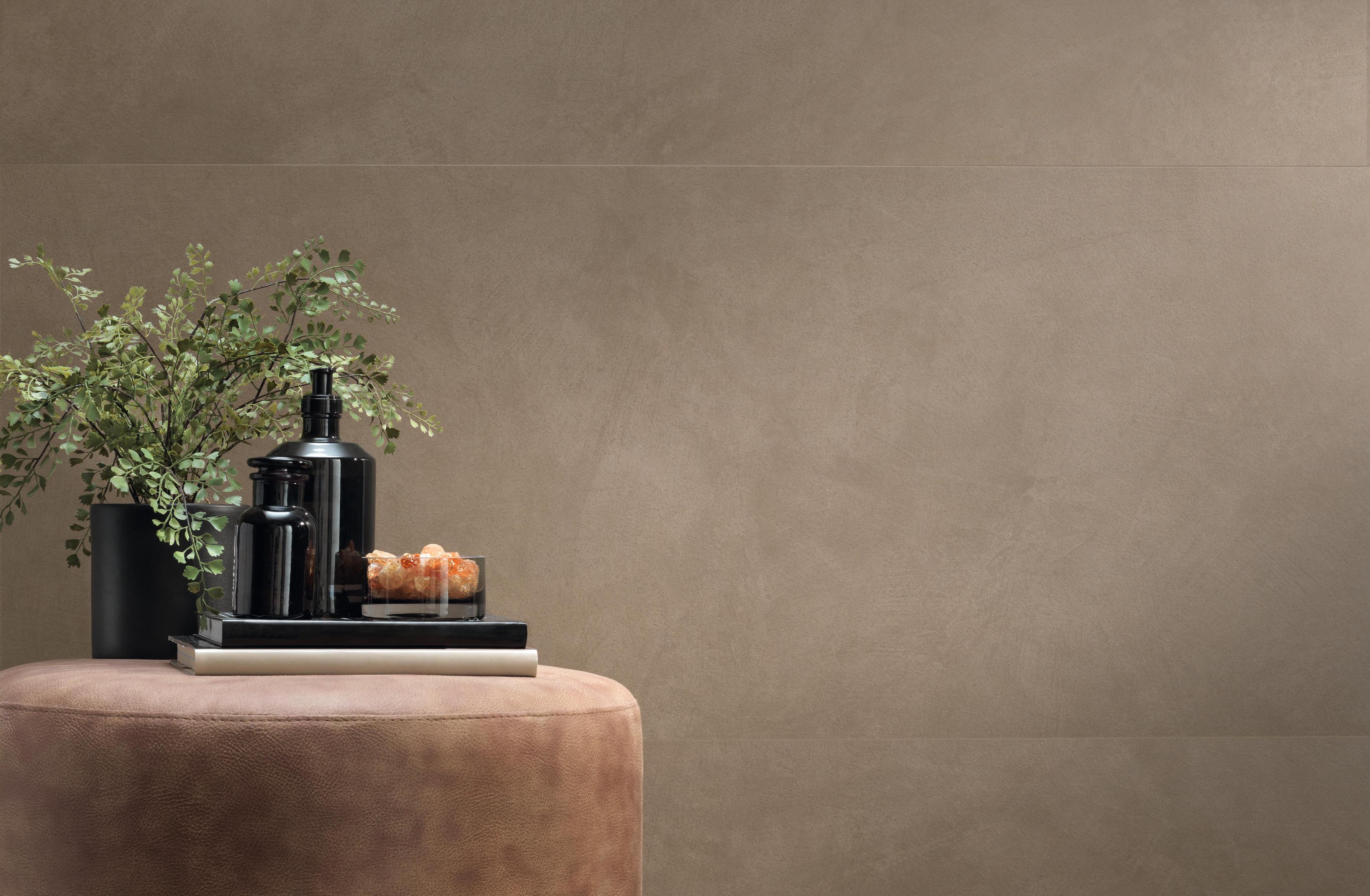
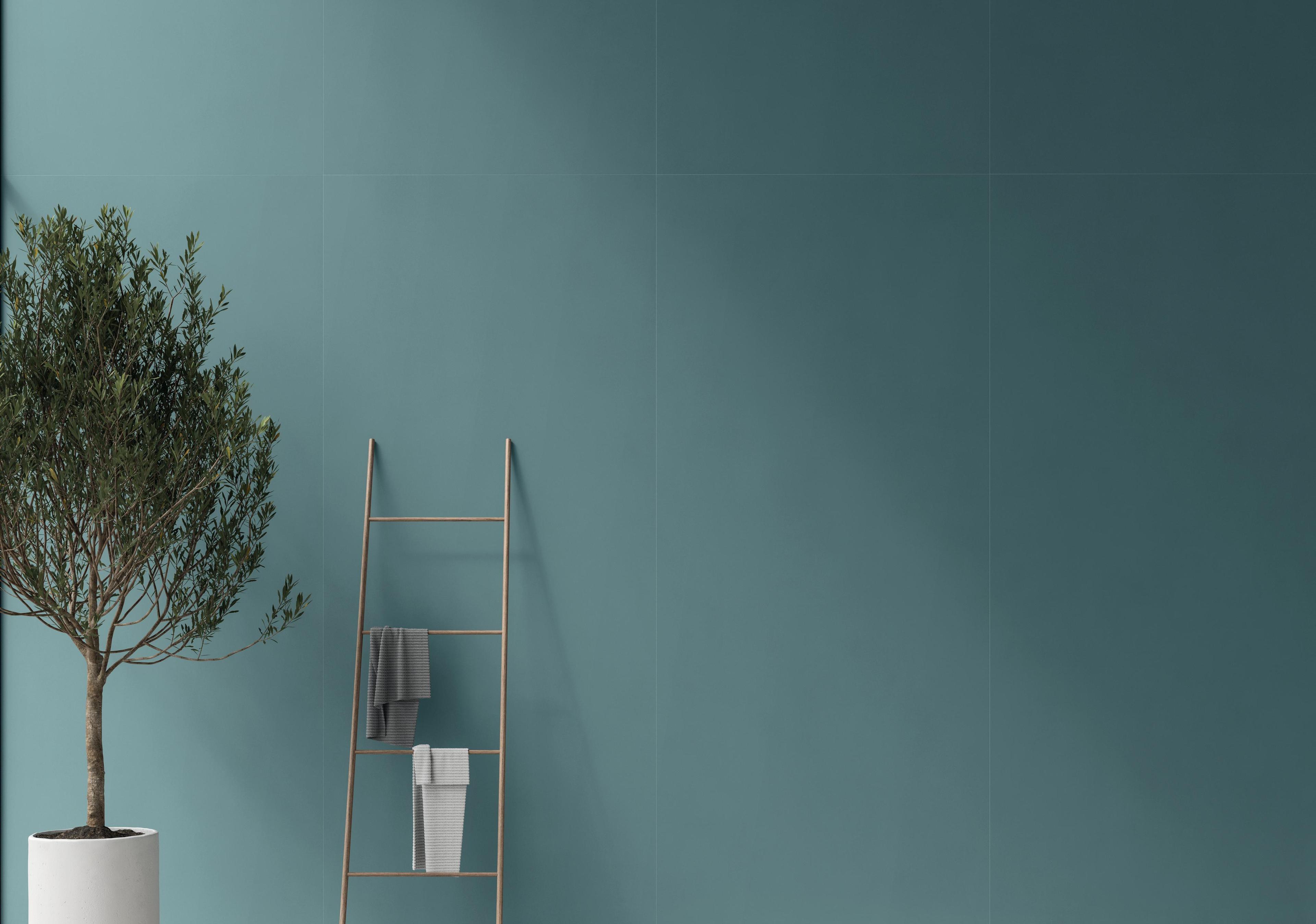
The return to the colours of the earth is the most widespread chromatic signal of 2026, confirmed by the leading international design events. Terracotta, rust, sage green and ochre build authentic, enveloping interiors: tones that evoke natural pigments, that age well, that never tire. For those working with this palette in a concrete and material key, Boost Natural and Boost Natural Pro offer the shades closest to these chromatic values: a palette of 15 nuances inspired by natural clays, with earthy tones recalling ochre, sand and raw earth, which can be combined tone on tone or with delicate contrasts. For more structured, three-dimensional surfaces, Boost Expression — with its palette of 10 shades developed with Elisa Ossino, including sage green and contemporary warm tones — allows material combinations with great compositional freedom.
Smoked pastels, mineral tones and accent colours
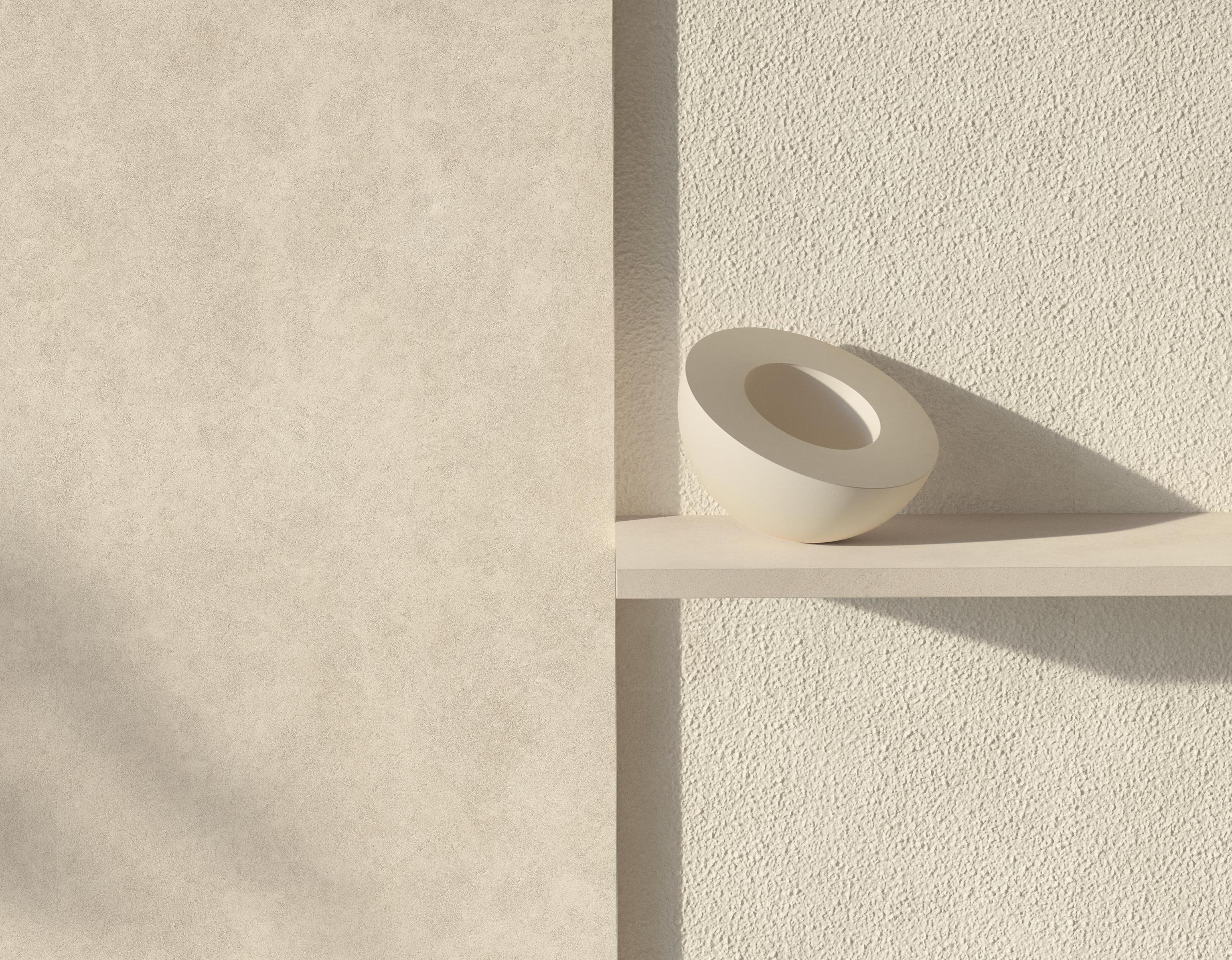
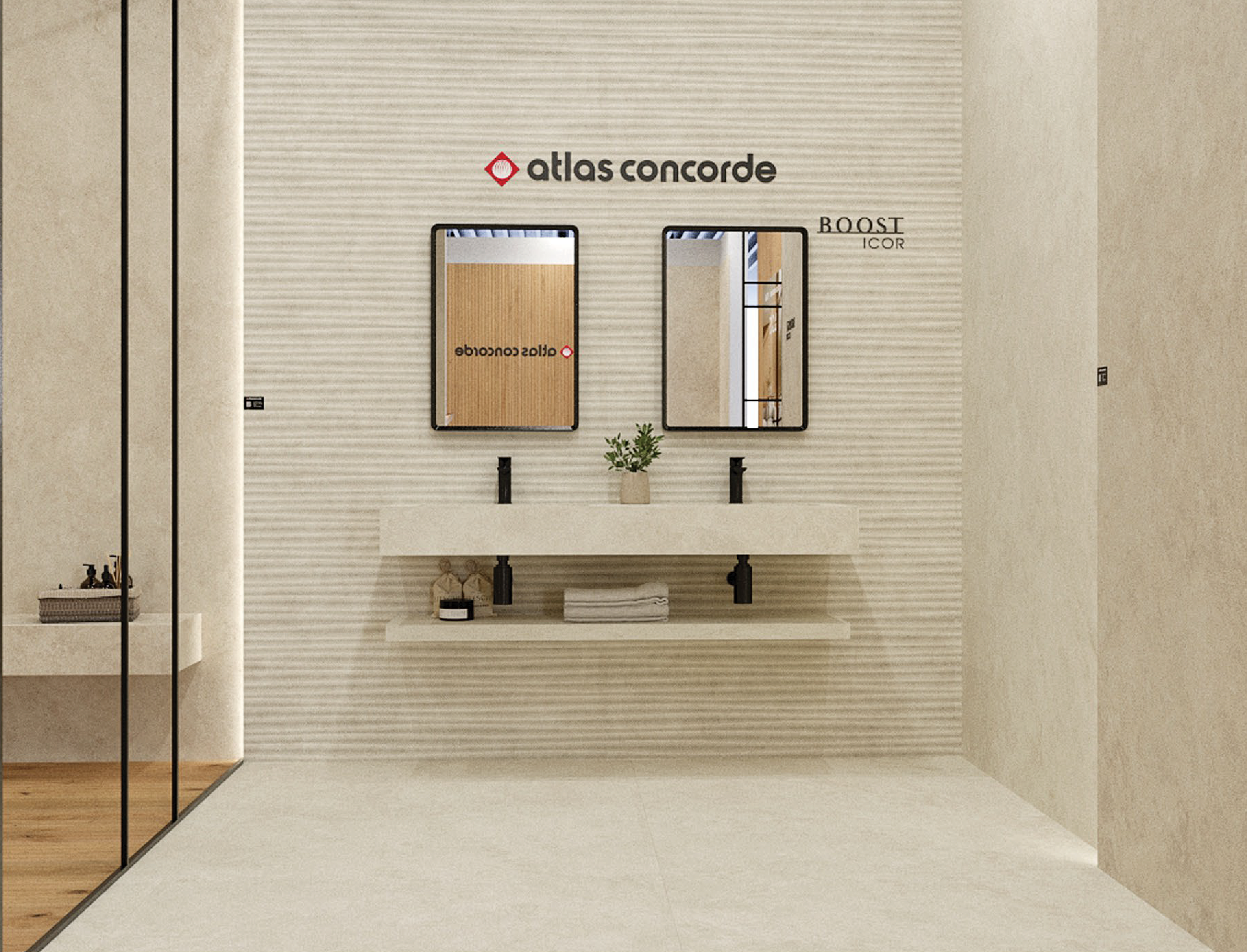
The chromatic research of 2026 introduces the concept of accent colours: an accent shade, complementary or deliberately contrasting, measured out with care to highlight details, volumes or furnishing elements and guide the eye through the space.In practice, this means working with a characterful covering that acts as a visual focal point. The colours that embody this role in 2026 are smoky tones: greys that warm towards beige and whites that shift towards ivory. Not primary colours, but slightly "dirtied" shades that introduce personality without dominating. Moving in this direction are the dusty, mineral tones of the Boost collections, where the surface carries a nuanced, non-uniform chromatic quality that builds exactly this feeling.
PANTONE Cloud Dancer, a soft and enveloping white
Pantone has chosen Cloud Dancer (PANTONE 11-4201)as its colour of the year 2026 — for the first time in the history of the award, a white. Not a cold or clinical white: Cloud Dancer is a soft, slightly warm shade that comes close to ivory without losing luminosity. Pantone describes it as a colour that reduces visual noiseand creates room for pause — a direct chromatic response to the excess of stimuli of contemporary life. In interior design, this white interprets the background as an active presence: not a simple absence of colour, but a luminous, soft surface that amplifies natural light and enhances surrounding textures, volumes and materials. The Boost Vision Glow and Boost Expression Glow colours interpret this direction with luminous surfaces that play with light in a controlled way. Nyra Star, in its lightest variant, brings the same luminosity in a stone-effect key — a surface that changes with the hours of the day and builds a living backdrop for the entire project.


From interior design trends 2026 to the project: how to choose surfaces
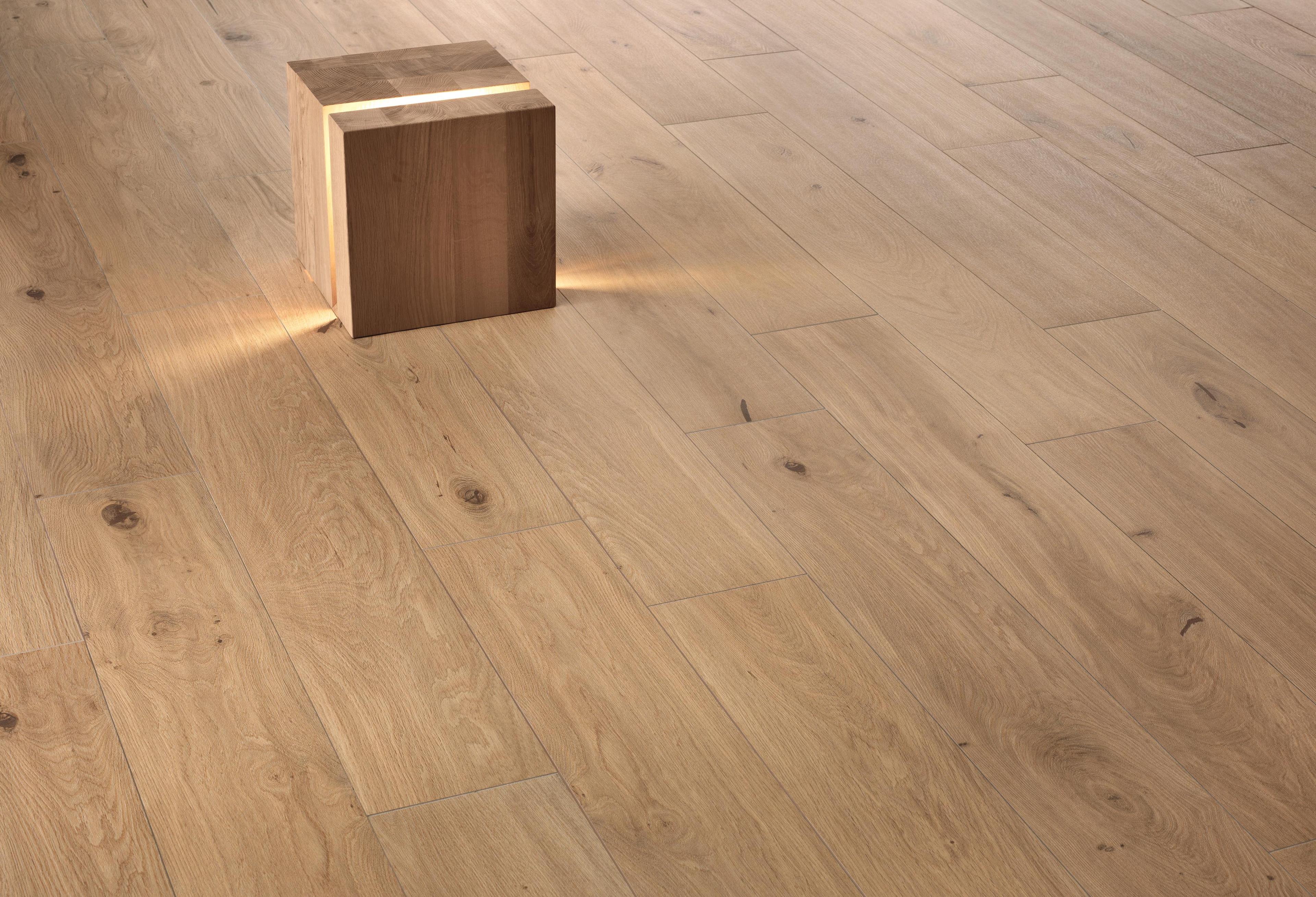
Trends are a starting point, not a destination. The designer’s work is to transform them into space: choosing the right surface means giving form to an intention. The choice of surface must hold together visual quality, technical performance, consistency in compositional languages and durability. Porcelain stoneware — in its stone, marble, concrete and wood effect versions — is the technical tool that this intention requires: not because it is on trend, but because it is able to embody it.
Large formats: beyond floor-to-wall continuity
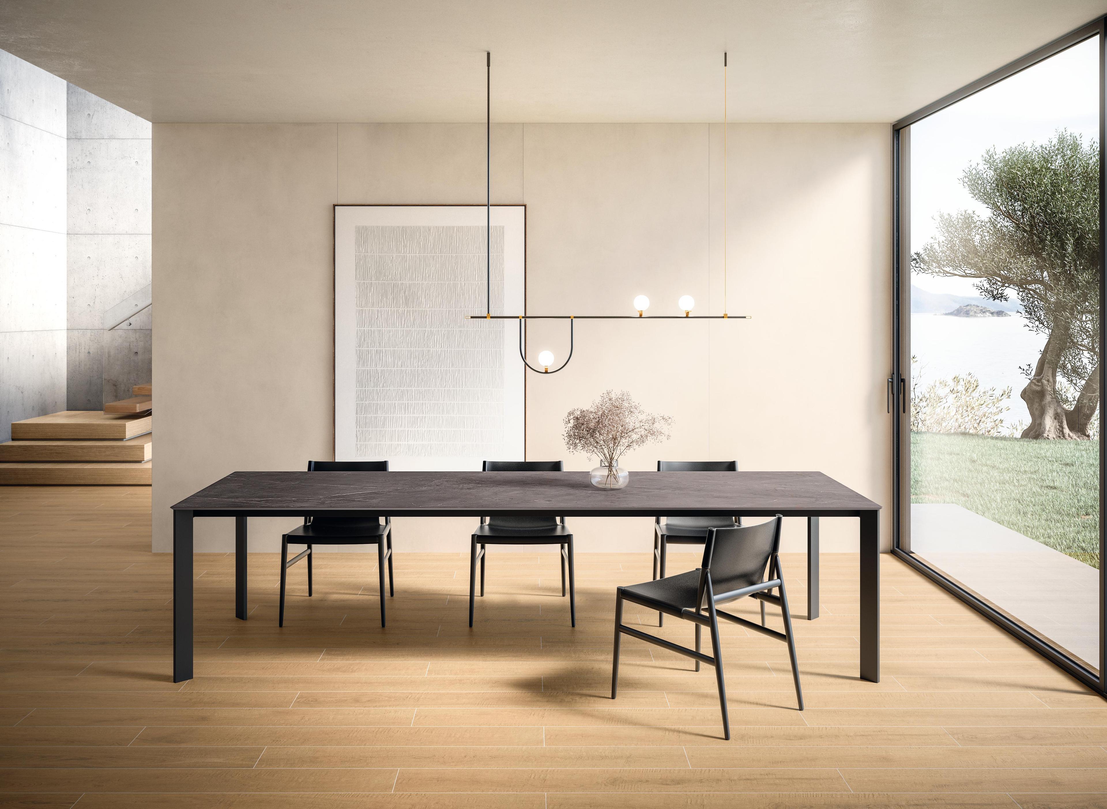
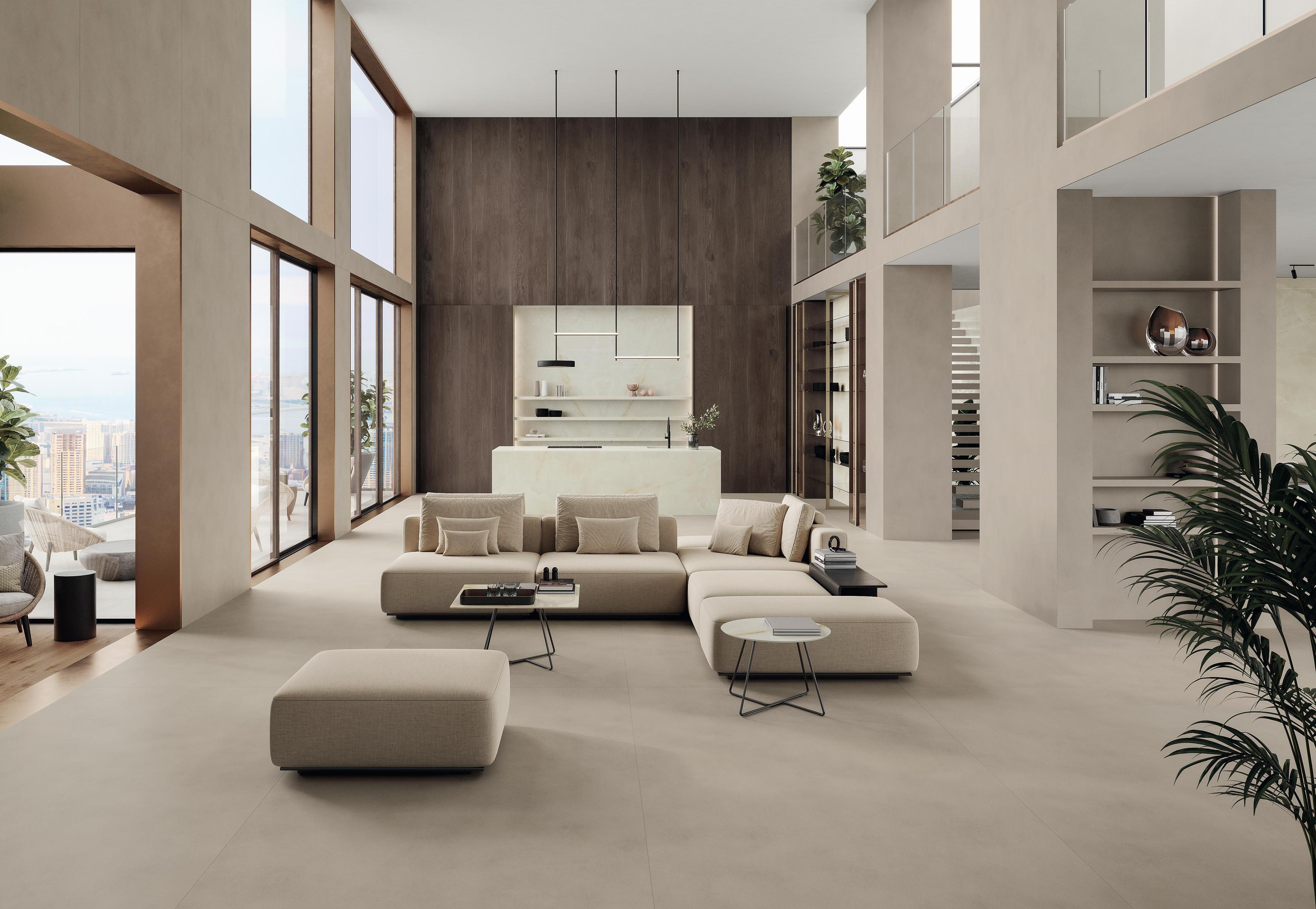
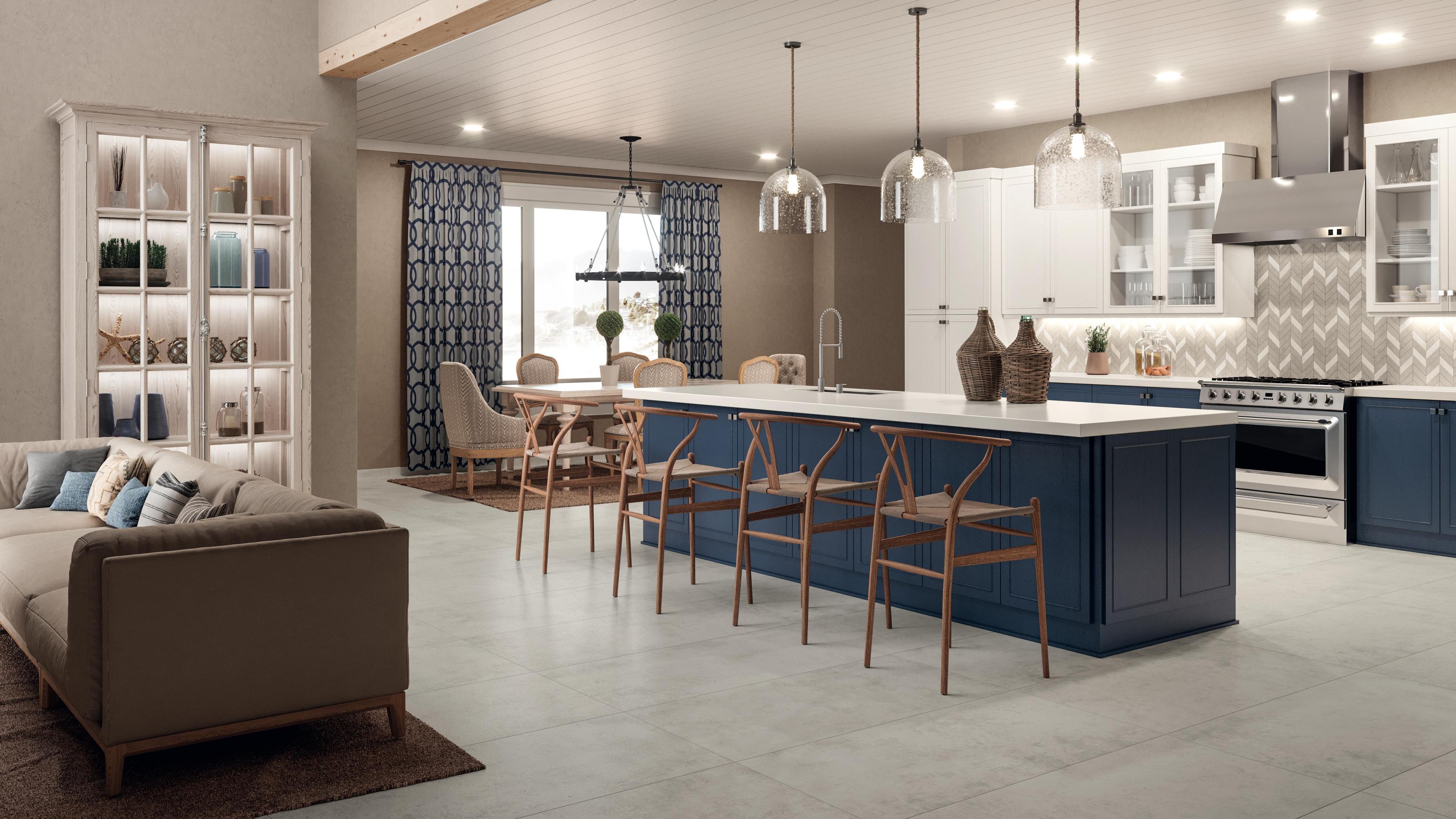
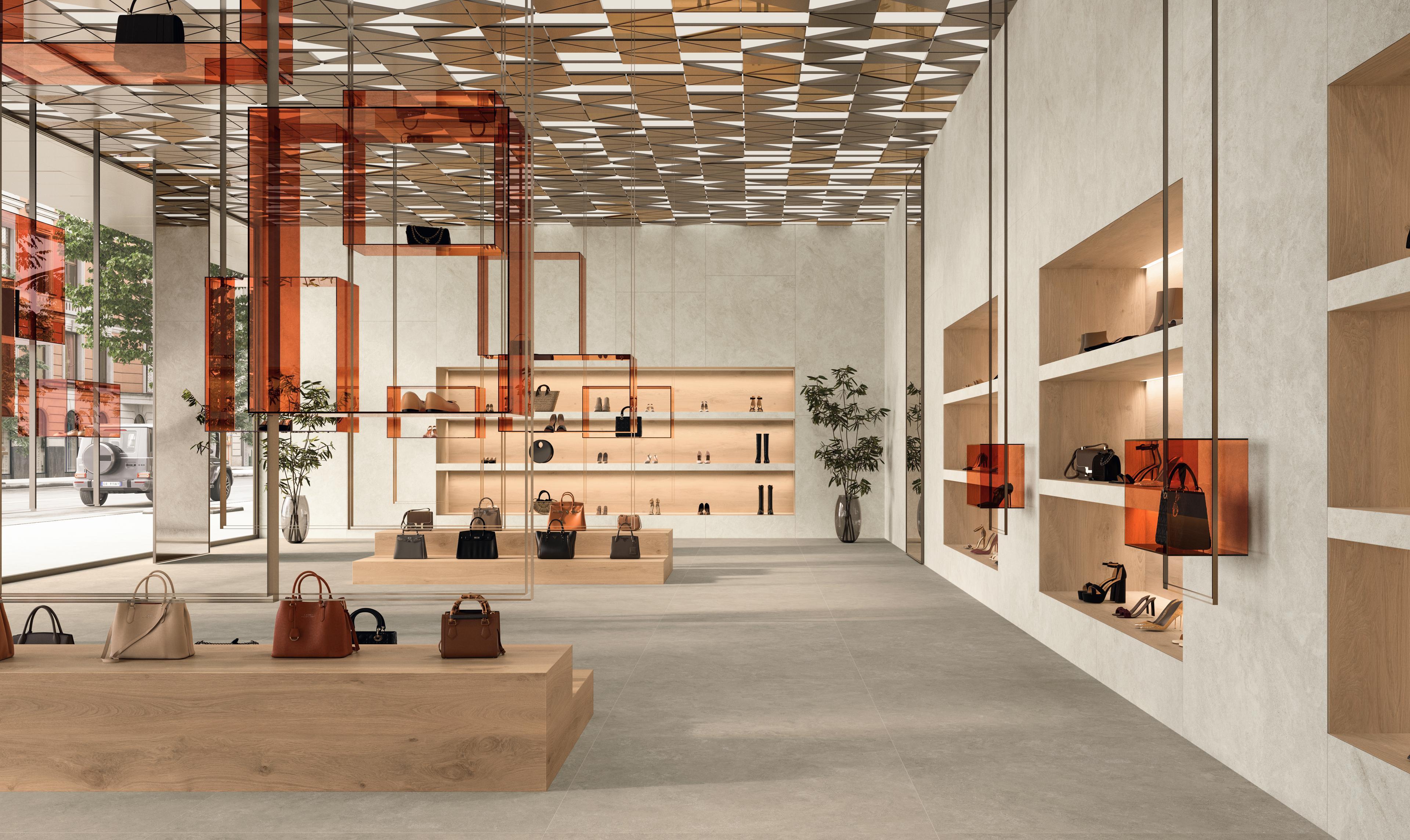
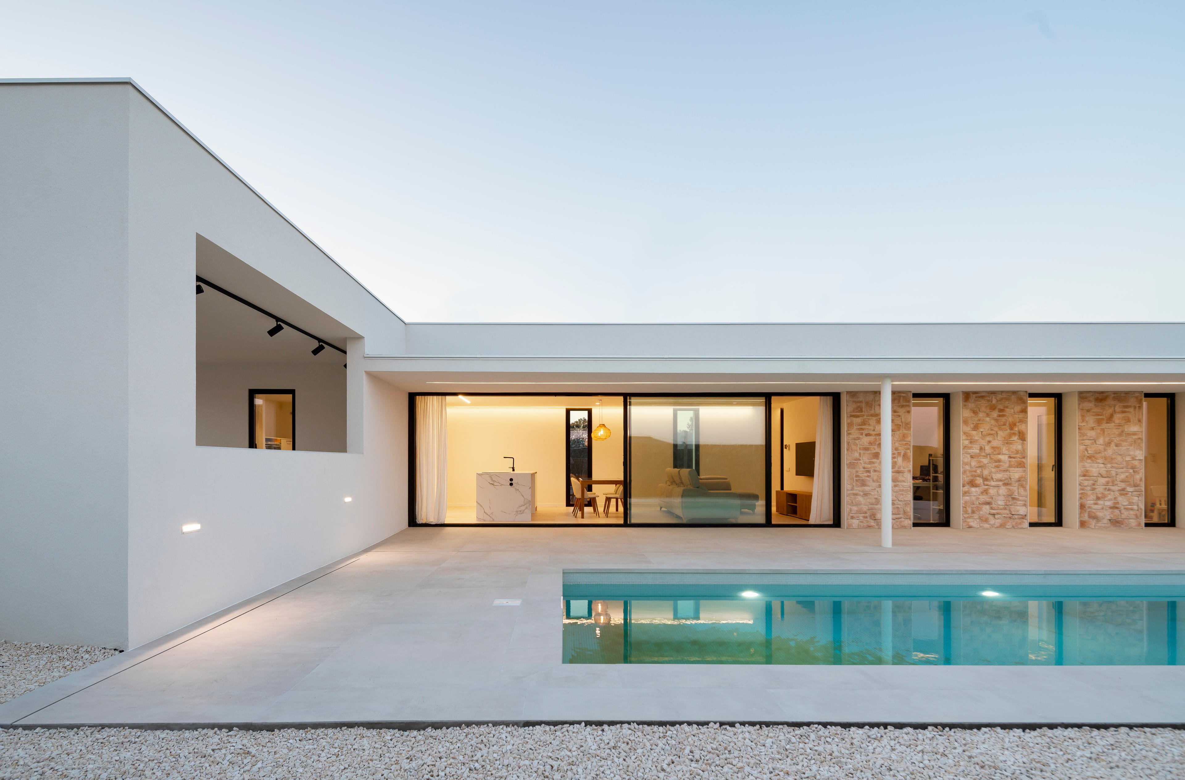
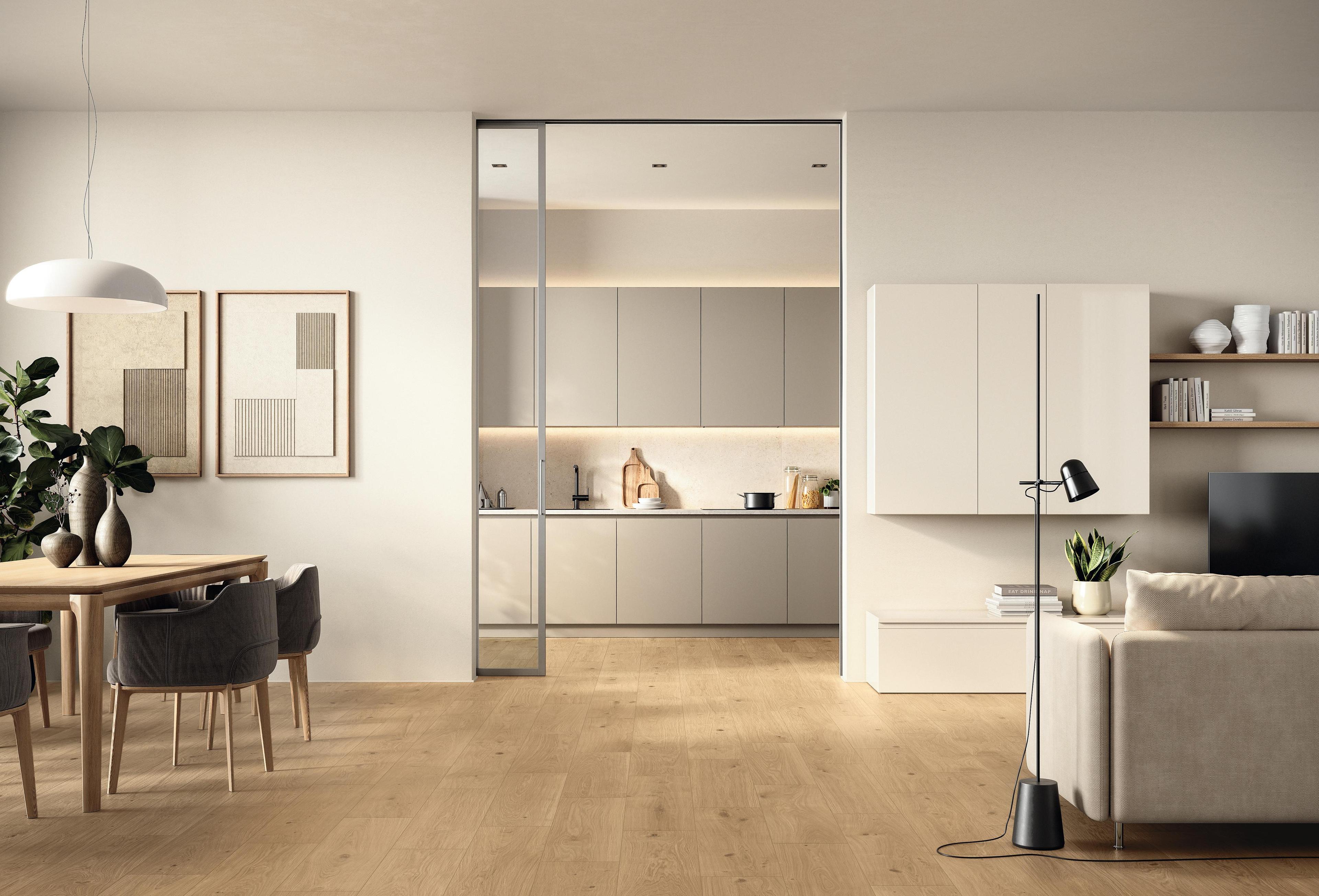
Among the most widespread trends of 2026 is the choice of large-format porcelain stoneware: slabs that eliminate grout lines amplify the perception of space and allow the visual continuity between floor and wall that transforms a room into a unified system. Atlas Concorde porcelain stoneware slabs clad walls, furnishings and vertical surfaces in continuity with the floor.
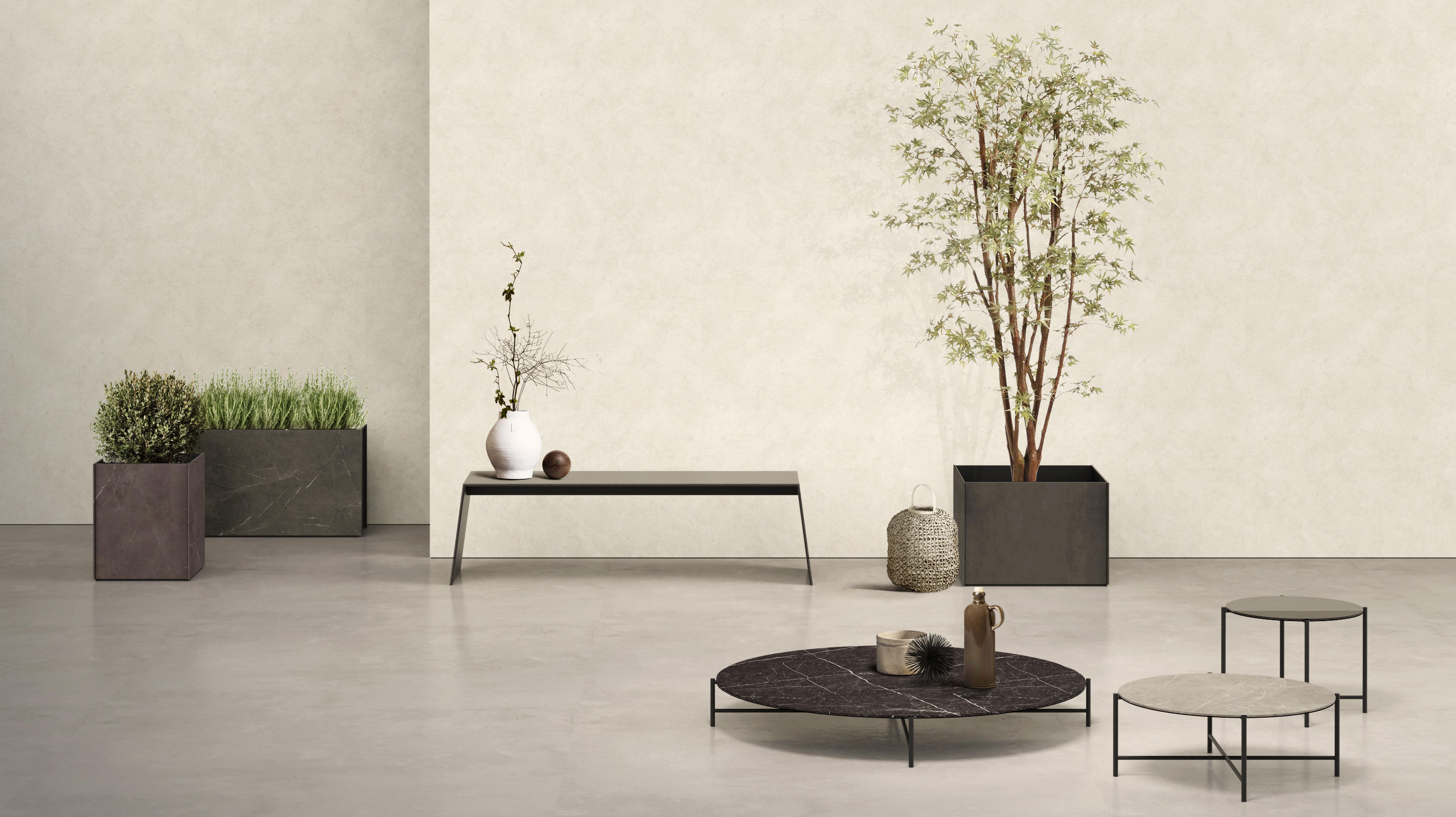
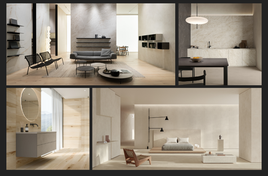
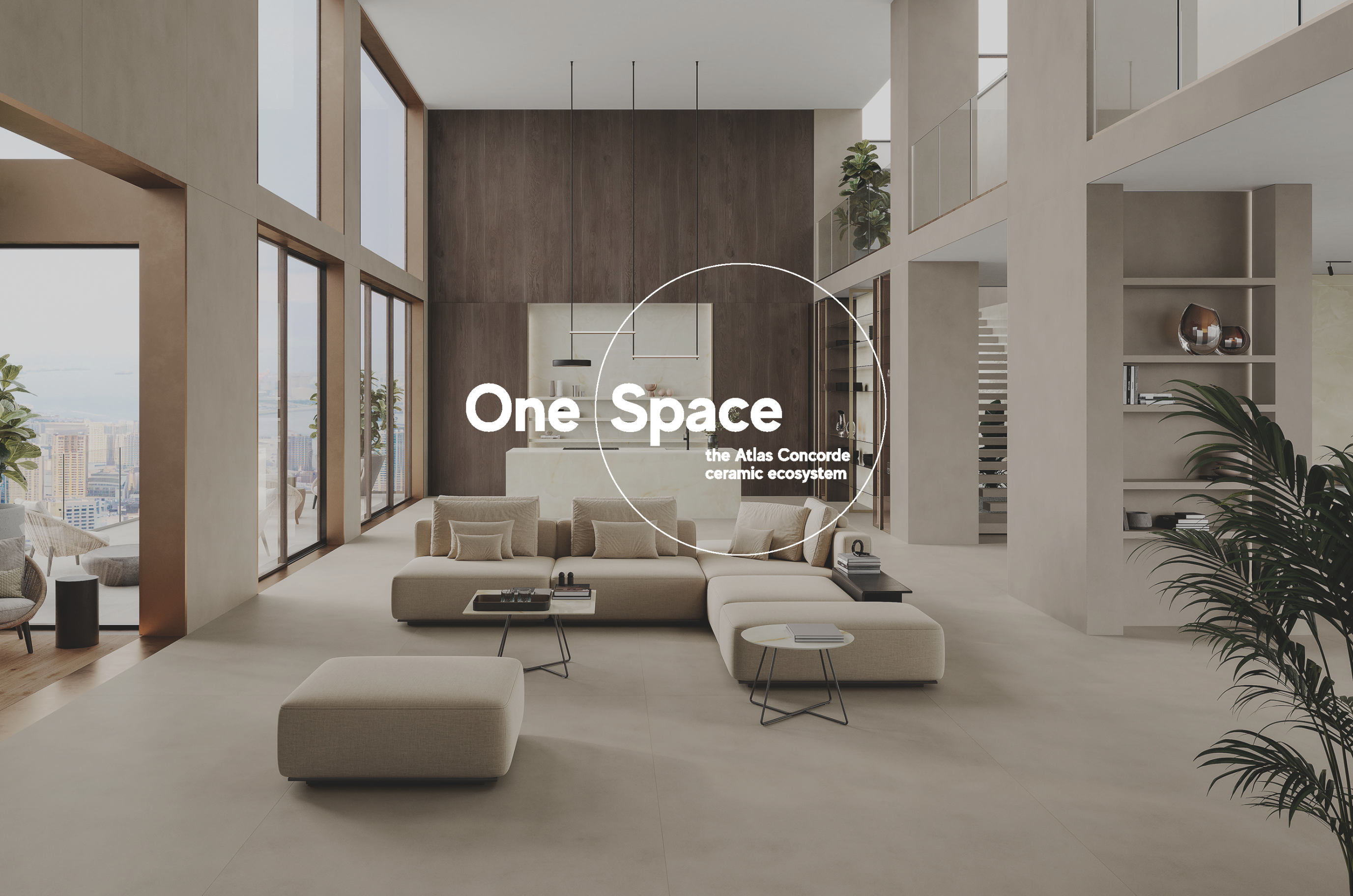
The One Space system by Atlas Concorde goes beyond floor-to-wall logic, however: it is an integrated product ecosystem that brings together floors, wall coverings, large slabs for kitchen worktops and splashbacks, tables, bathroom furnishing elements and accessories in a single language. Floors, surfaces and furnishings converse across the Atlas Concorde, Atlas Plan and Atlas Concorde Habitat brands, giving rise to projects in which every element — from the floor slab to the kitchen top, from the shower cladding to the washbasin — shares the same material identity. Not an aesthetic choice, but a complete design system for those who want to build spaces that are consistent from the architecture through to the furnishings.
Porcelain stoneware as a tool of identity in contract and hospitality
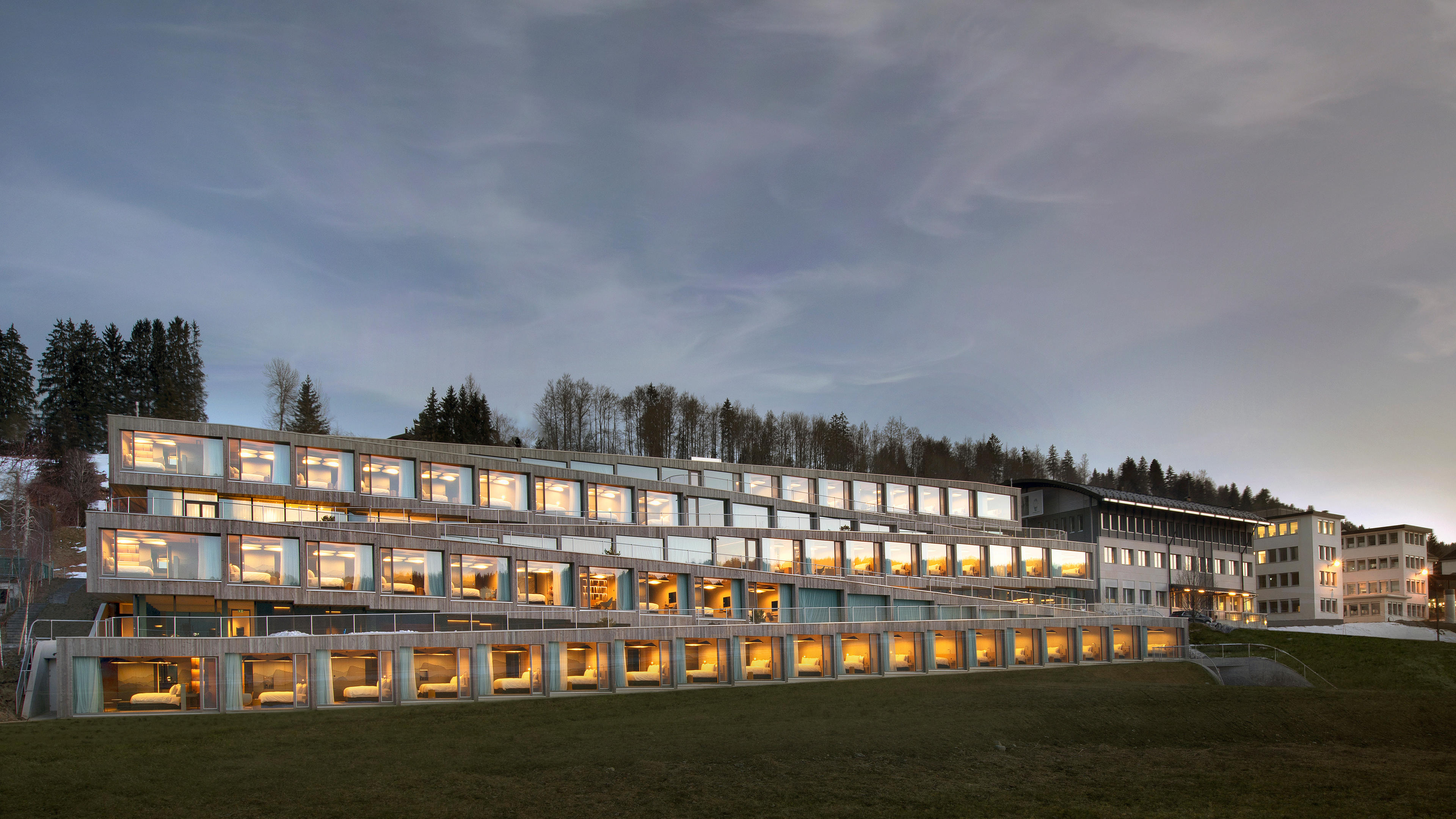
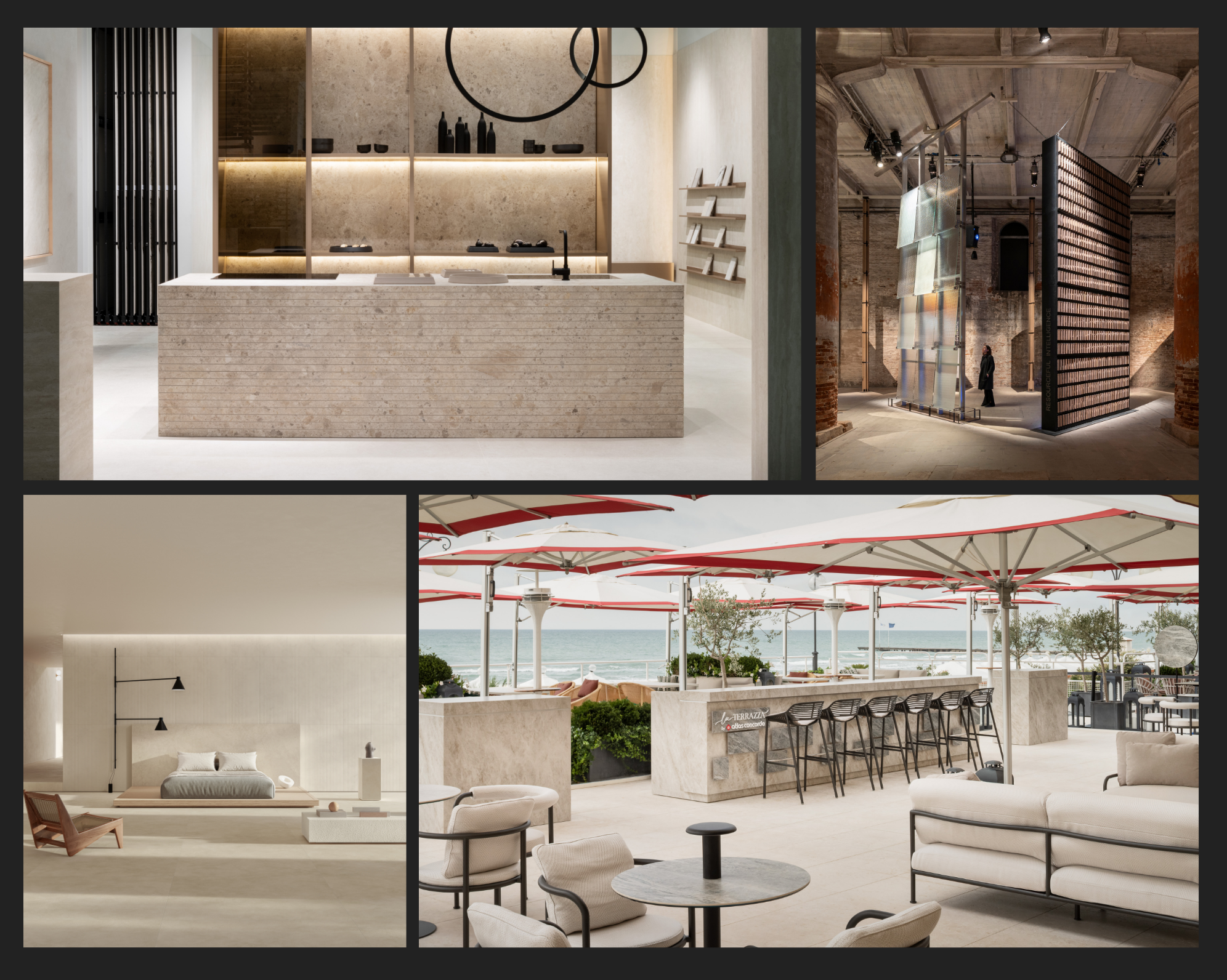
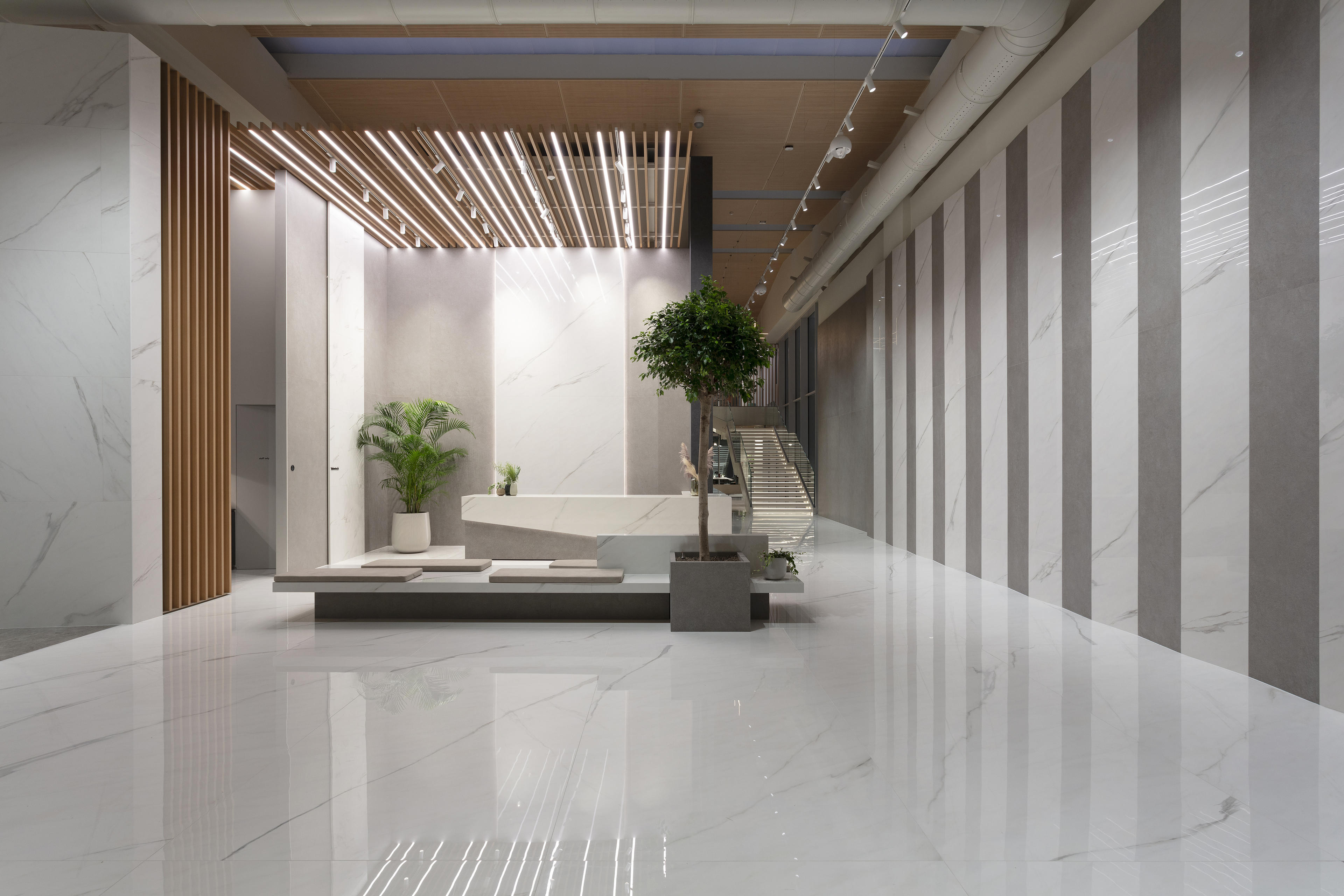
In contract and hospitality settings, the surface builds the identity of the projecteven before the furniture does. A large-format stone-effect wall with high variation, a floor extending seamlessly into the lounge: this is the visual signature of the space, the first element that shapes the client experience and makes an environment recognisable. Within this logic, differentiating the zones — reception, corridors, rooms, F&B areas — does not mean fragmenting the project: it means orchestrating surfaces, finishes and palettes that share the same material language, building consistency across the entire scheme without making it uniform.
Material, palette, compositional languages: interior design trends 2026 converge on a single direction — the return to the surface as a conscious design choice. Translating them into a project means knowing how to read the cultural demand of the market and respond to it with materials that combine expressive depth and technical performance. The surface has never been so central in defining the identity of a space.

