


.jpg?cropw=4096&croph=2654.2479700187387&cropx=9.695217308093677e-13&cropy=76.7520299812622&cropmode=pixel#)


.tif?cropw=4036.303976681241&croph=2705.4159900062464&cropx=59.69602331875912&cropy=25.584009993753906&cropmode=pixel#)
.jpg?cropw=4096&croph=2978.1919633562356&cropx=0&cropy=93.80803664376384&cropmode=pixel#)


.jpg?cropw=2733&croph=2733&cropx=636.5439718837721&cropy=0&cropmode=pixel#)


Atlas Concorde presents the new Reverse Canon collection. The collection is signed by Piero Lissoni, architect and designer known for his unmistakable style and the elegance of his creations.

Trend
Canone Inverso. The first Atlas Concorde decor collection by Piero Lissoni
11 June 2021
This is how the designer summarizes the concept: "The four compositions of the Canone Inverso collection are the variants of a model, a scheme that is composed and recomposed to create a harmonious relationship that like in a musical score is formed by the assembly of different notes, or rather the forms that make it up".
Canone Inverso reflects a combination of fluidity, materiality and interprets the vision that Atlas Concorde had given Piero Lissoni: create decorative elements for wall and floor tiles. As the company notes, "we gave the designer our range to be freely mixed and matched, to create a 'decor collection' to be presented individually or to be used in combination with our different collections and surfaces."


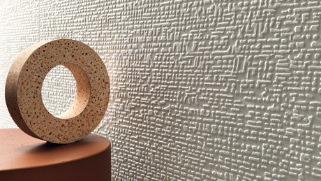
The project consists of four mosaics made with porcelain tiles and inspired by the world of cement and minimalist stones.
Each composition has its own original geometry in a single color obtained by mixing tiles with similar shades, chosen from the Atlas Concorde range of cement- and minimalist stone-effect collections.The collection ranges from warm white to beige with traces of clay and light gray, from grays in cooler and lighter tones to darker shades, anthracite, and smoke. A compositional simplicity that, like a jacquard fabric observed up close, reveals its sophisticated color design.The surfaces chosen by Piero Lissoni for Canone Inverso are: Boost and Dwell (cement effect), Raw (cement plaster effect), Arkshade (minimalist cement effect), Kone (minimalist limestone effect).Canone Inverso 1 harmoniously mixes warm and light tones.Canone Inverso 2 combines beige, clay, and light gray colors.Canone Inverso 3 is a blend of gray tones.Canone Inverso 4 combines dark gray, anthracite, and smoke.


An important added value of Canone Inverso is therefore the possibility of creating refined combinations of each mosaic with Atlas Concorde collections.
Each mosaic can be perfectly matched with all the surfaces that use the tiles incorporated in the mosaic itself.
Canone Inverso 1 matches Kone White, Arkshade White, Boost White and Dwell Off White. Canone Inverso 2 goes well with the nuances of Arkshade Dove, Kone Beige, Arkshade Clay. Canone Inverso 3 combines with Kone Pearl, Kone Silver, Raw Pearl. Canone Inverso 4 goes well with the nuances of Dwell Smoke, Boost Smoke, and Arkshade Lead.
A collection of decorations that finds its natural application wherever there is not only the need to decorate floors and walls, but above all a desire to redesign spaces with decorative elements that act as furnishing elements. A new tool to interpret ceramic surfaces in a creative and personalized way, in line with the latest demands of high-end interior design.


