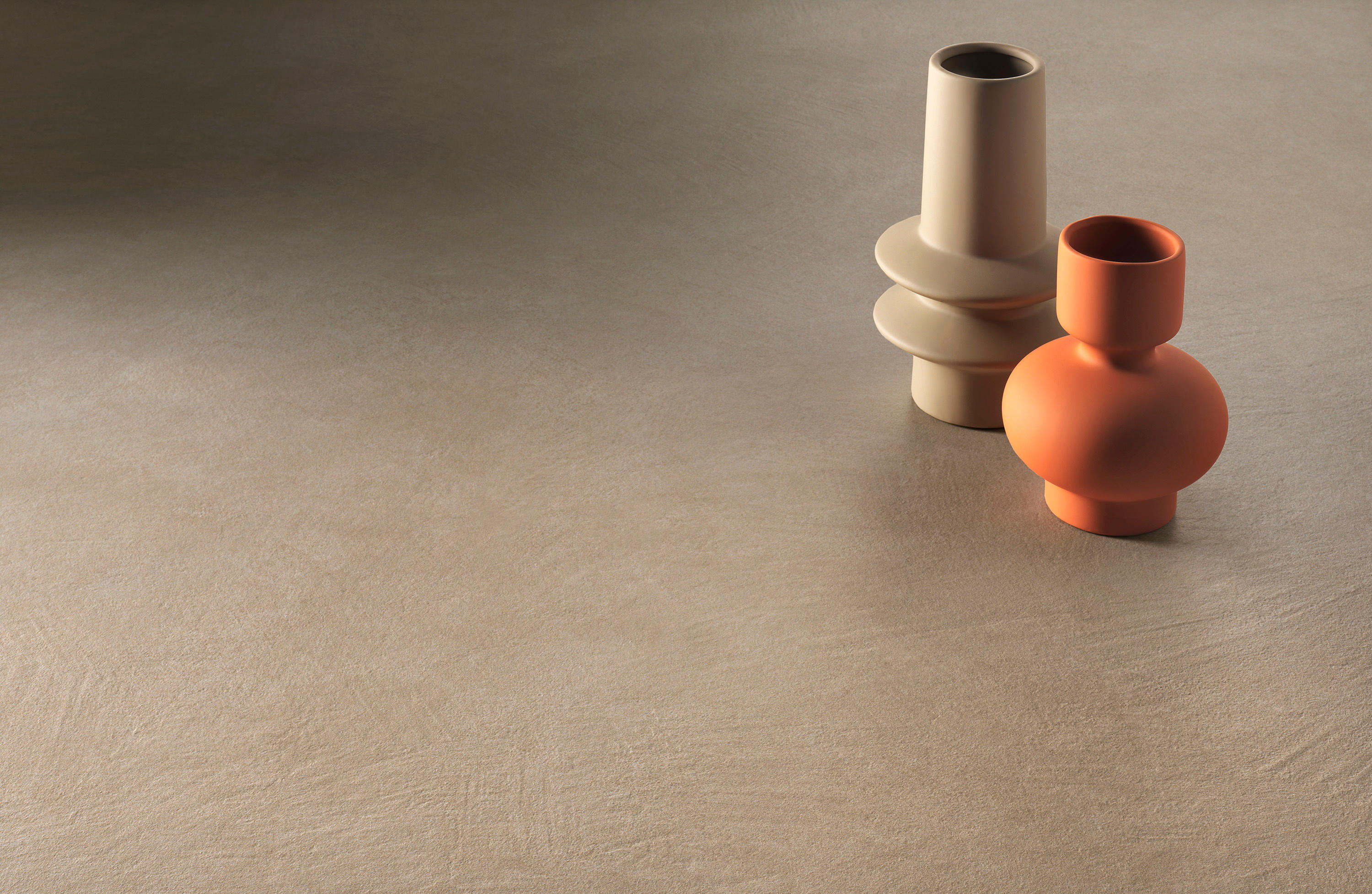
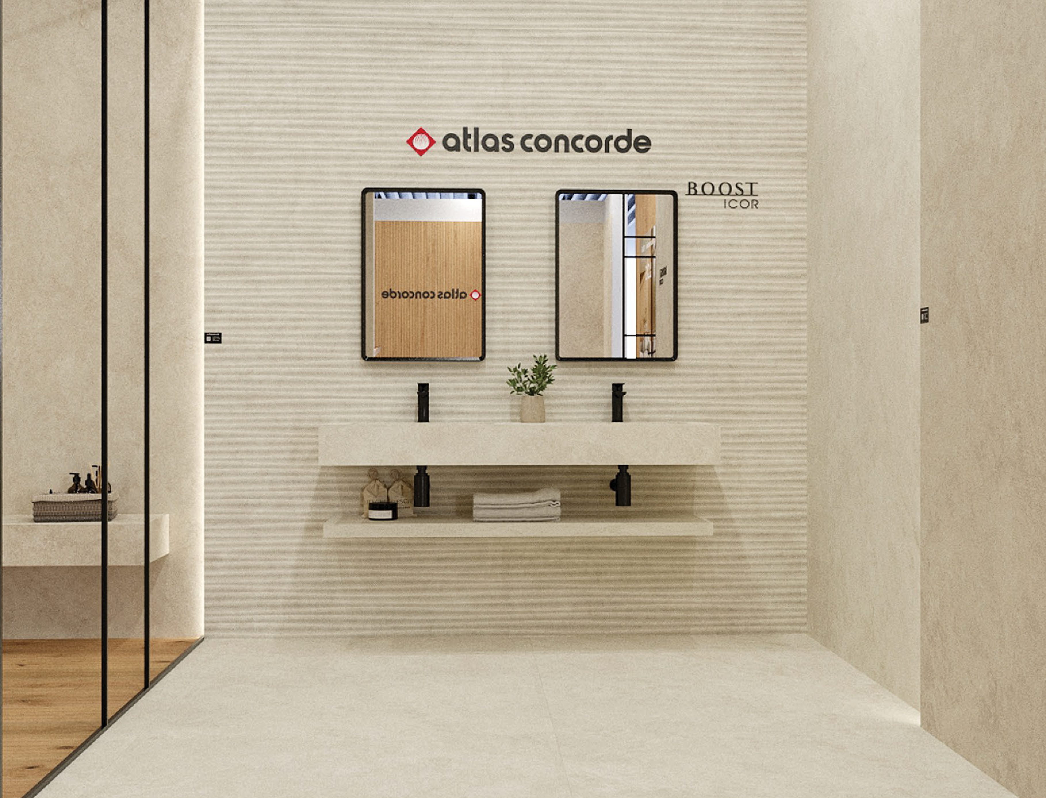
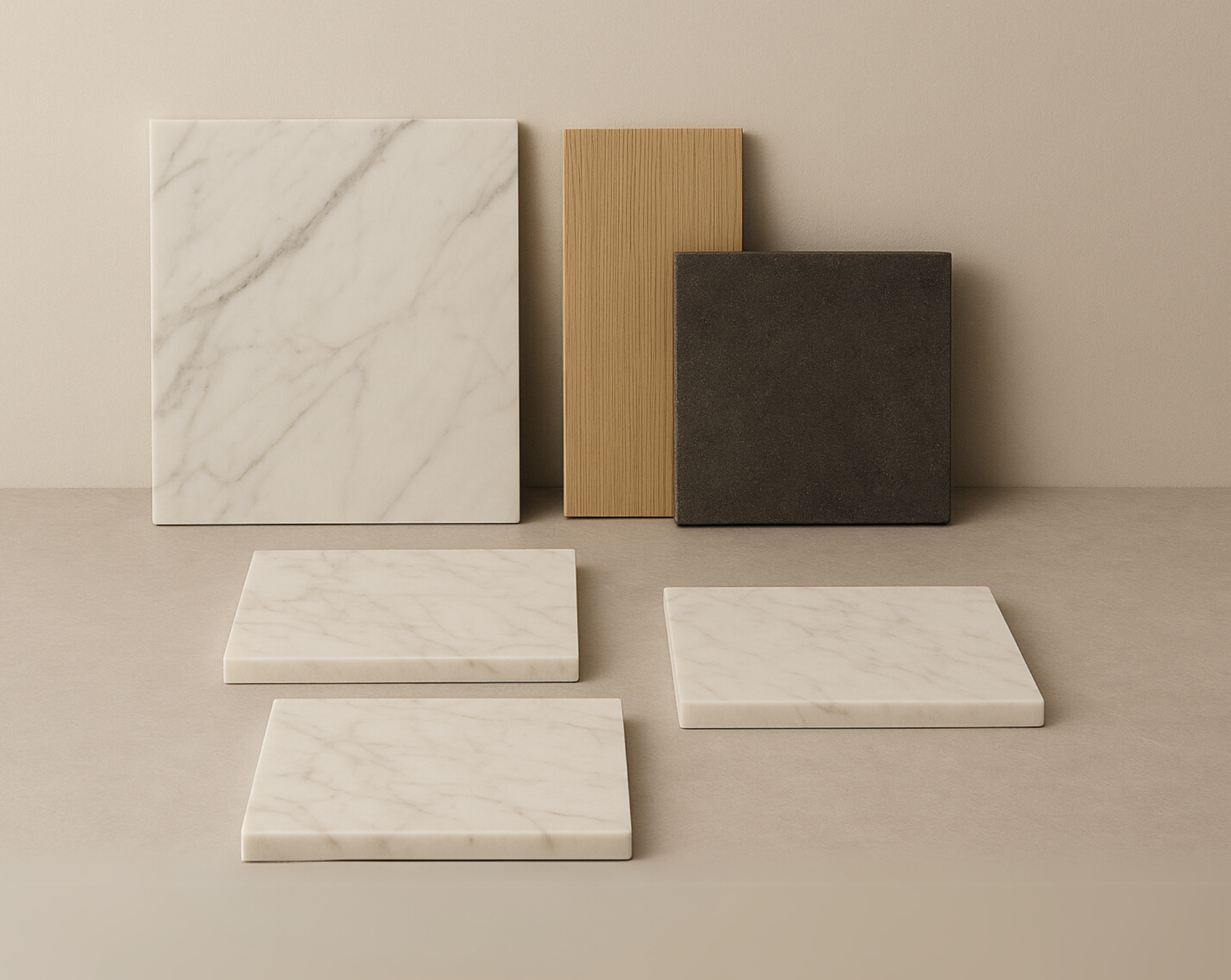
Clay with its impalpable texture, opacity, slight ripples, and delicate shading. These are just a few of the characteristics of raw earth that gave life to Boost Natural, a ceramic collection by Atlas Concorde in collaboration with Matteo Brioni.

Interviews
Matteo Brioni and the genesis of Boost Natural
03 October 2021
An architect and entrepreneur, but above all a great connoisseur of raw earth, Matteo Brioni has extensive expertise in identifying trends in finishes. A proficiency that is fully evident in Boost Natural, Atlas Concorde's new, iconic project of ceramic floor and wall tiles. We met with Brioni and he told us about his philosophy, fascinating and always open to exploring new frontiers of raw earth. For the Boost Natural collection, the starting point was something that he had in common with Atlas Concorde: clay, an excellent material that is a core component of all ceramic surfaces.
What’s the common element shared with Atlas Concorde that led to the birth of the Boost Natural project?
Atlas Concorde was looking for someone to help them express an esthetic vision of natural surfaces through an industrially produced material. I was looking for someone who would allow me to go beyond the limits of the material and convey my vision and experience in different sectors: we found each other at the right time.


What kind of surface effect did you want to achieve?
If we’re talking about surface effects it’s best to make a distinction among the mineral finishes, because lime and concrete have an esthetic that’s called "marbling." In contrast, raw earth is much more uniform. You could go so far as to say that lime and concrete are more masculine finishes or esthetics, while raw earth is much softer, more embracing, padded, almost feminine.
What are the distinctive characteristics of raw-earth surfaces that inspired the surfaces of Boost Natural?
The inspiration behind the Atlas Concorde collection starts from the definition of my work. Some people erroneously define it as artistic, but I consider it artisanal: the difference is subtle but substantial. It is said that in art there is craftsmanship and that in craftsmanship there is art. But while art seeks expression, craftsmanship seeks perfection, constantly repeating an esthetic, a movement, a gesture. So, starting from the assumption that art and nature are the sources of inspiration, in collaboration with Atlas Concorde it was important for us to get in sync on what were the terms and characteristics required. Once this facet of language and understanding had been resolved, it was quite easy, you could say, to define the collection and achieve the natural look.
How influential was this manual gesture in the creation of the "raw-earth" effect?
The techniques used for Boost Natural are exclusively manual. Several different people worked on the same panels just to avoid the same gesture, and we used a fine material to avoid flaws, surfaces that were too complex that could have created some problems at an industrial level. In fact, to do this we used some new tools: Japanese trowels, very soft, small, and elastic that I found during my last trip to Tokyo.

How was the color palette of the Boost Natural collection born?
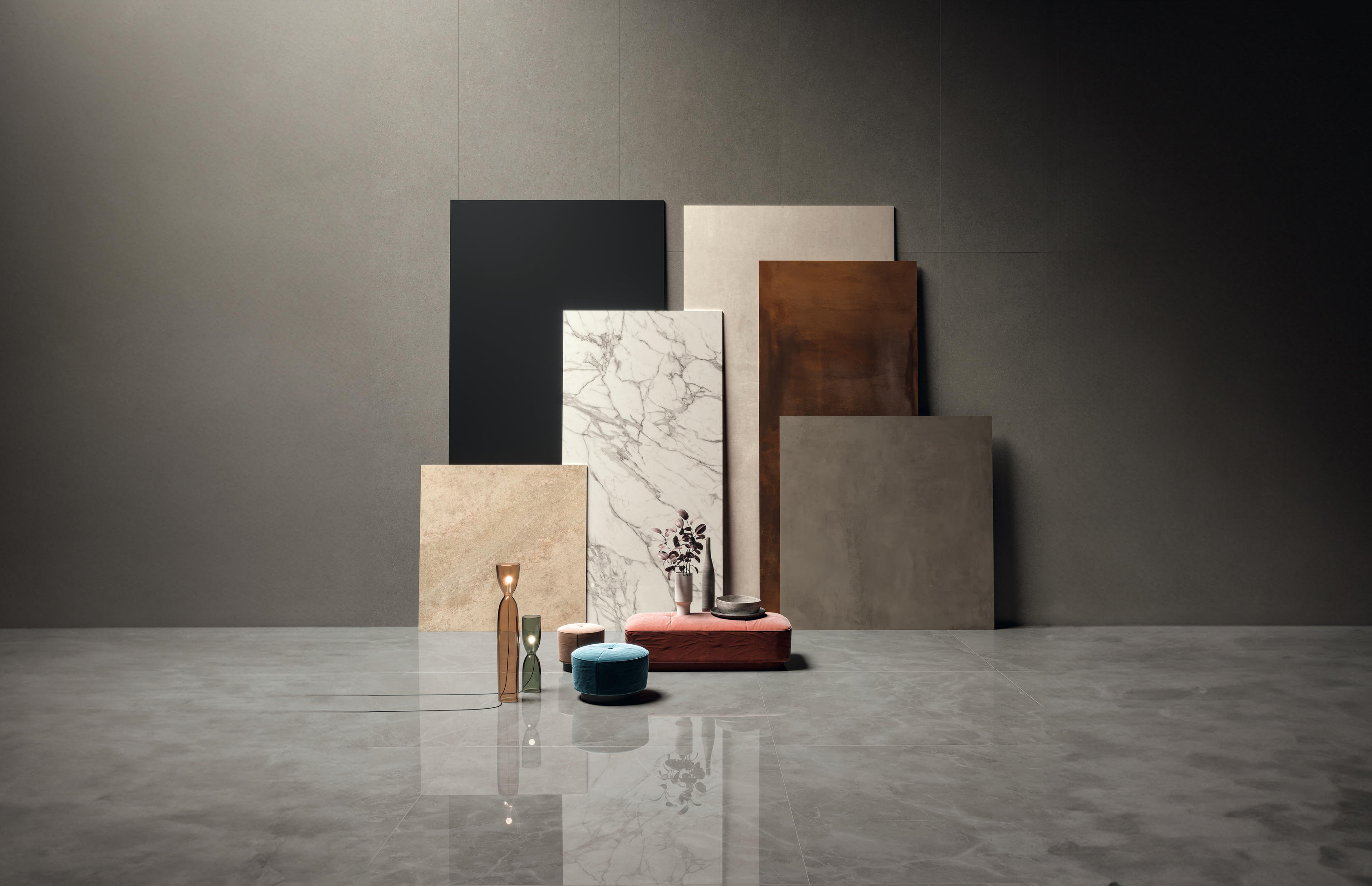
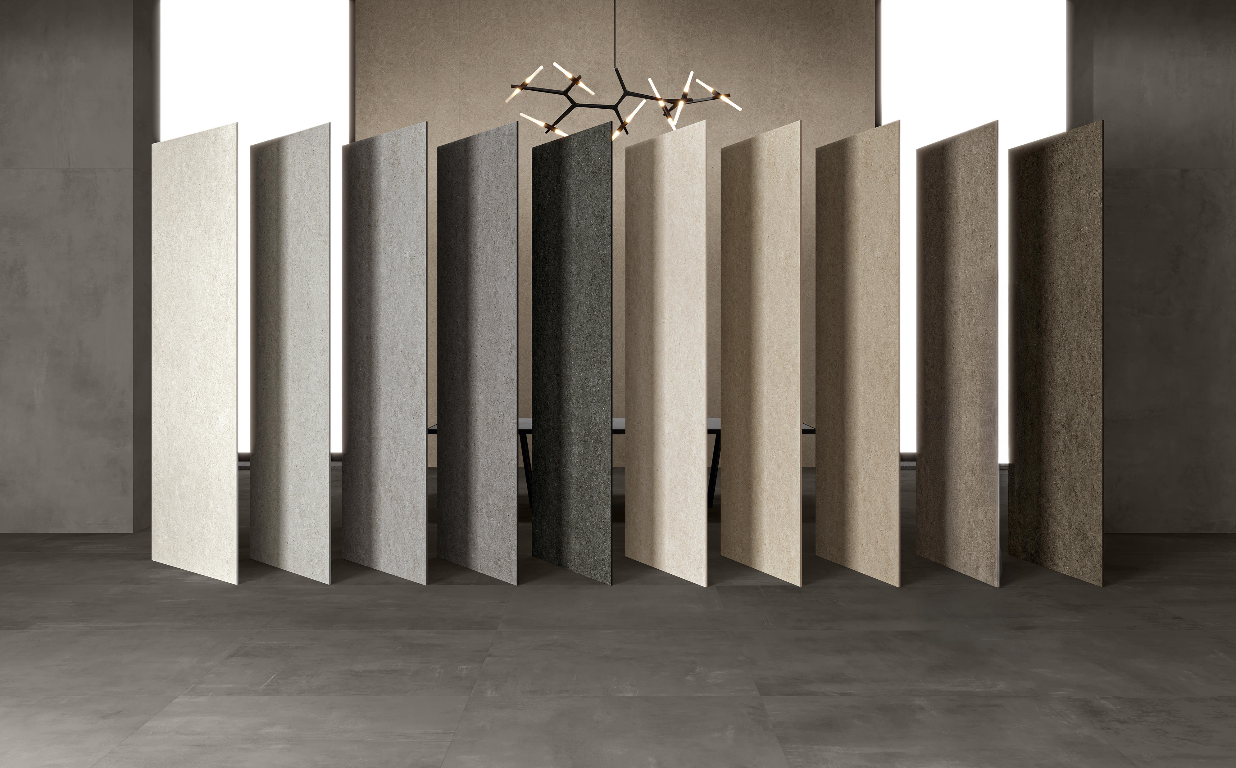
The basic idea is evident in the name of the collection: "Natural." The ceramic industry and the products we make out of raw earth have a common denominator: the use of clay as a raw material. But while the ceramic industry is mainly interested in clay’s color after firing and the its behavior in the kiln, I'm interested in its raw color. So, when we thought about the interpretation of the color for a collection where the concept of "natural" becomes the main theme, we took the six most beautiful clays we know and expertly mixed them with natural aggregates. Thus was born an authentic, appealing color palette.
How does this type of surface fit into the world of contemporary architecture and interior design?
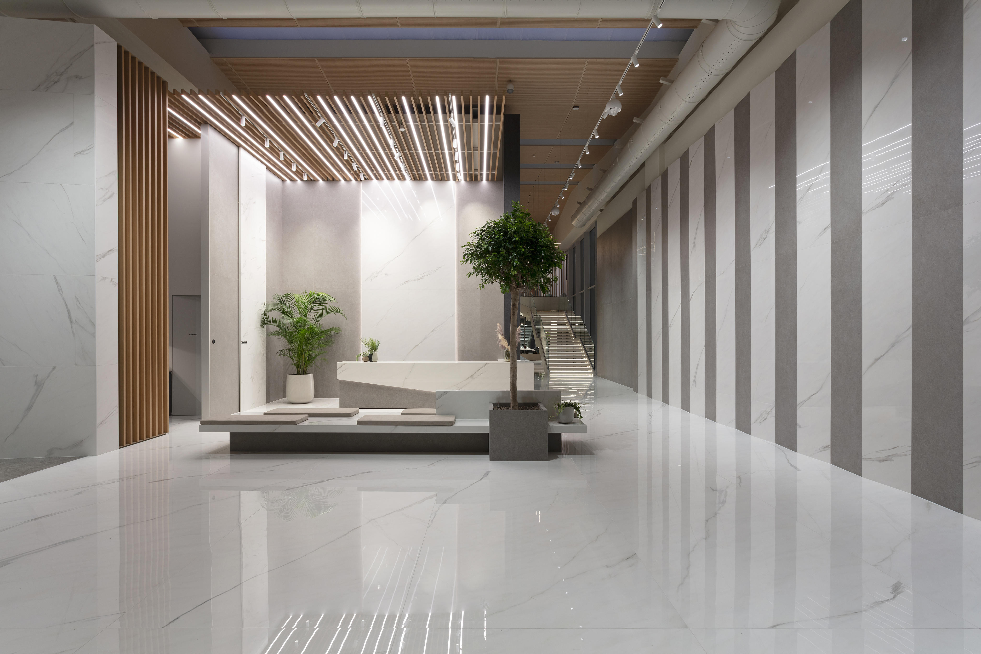
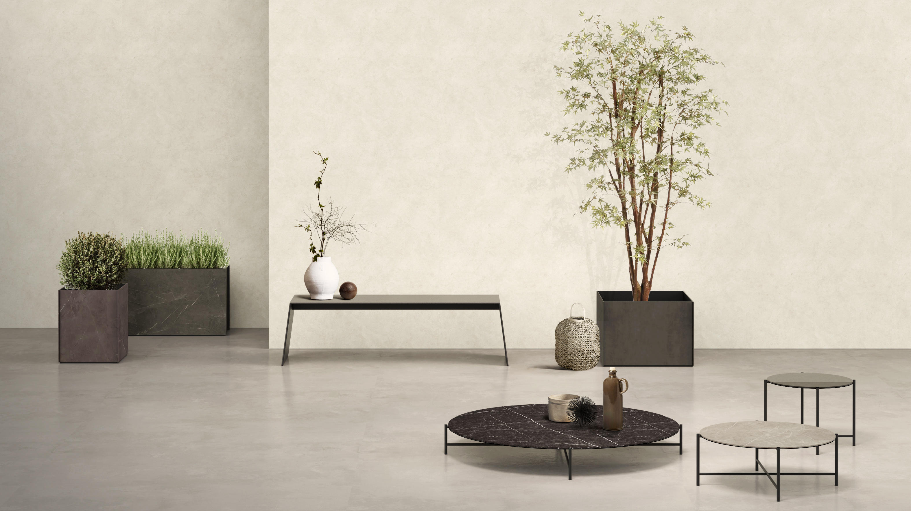
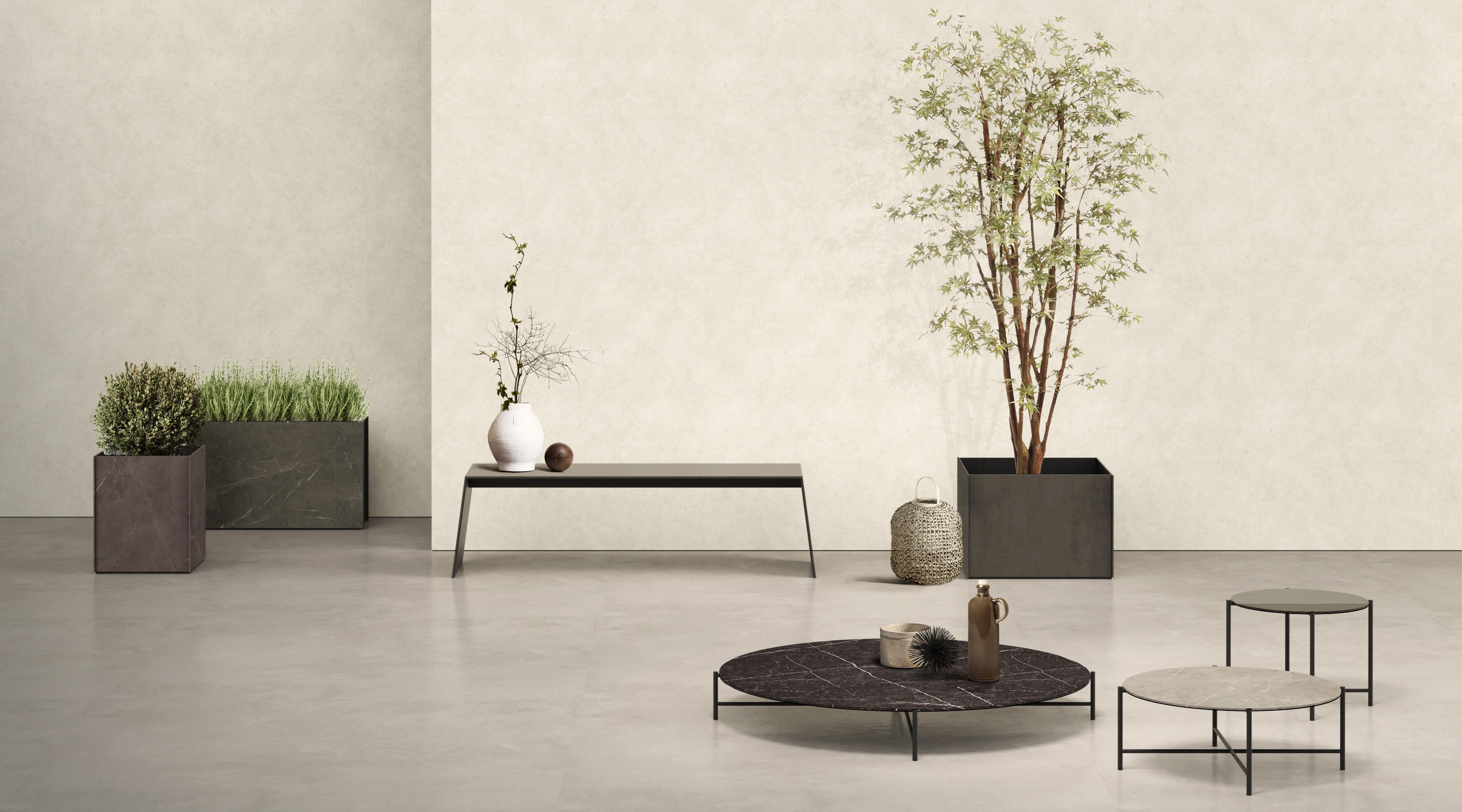
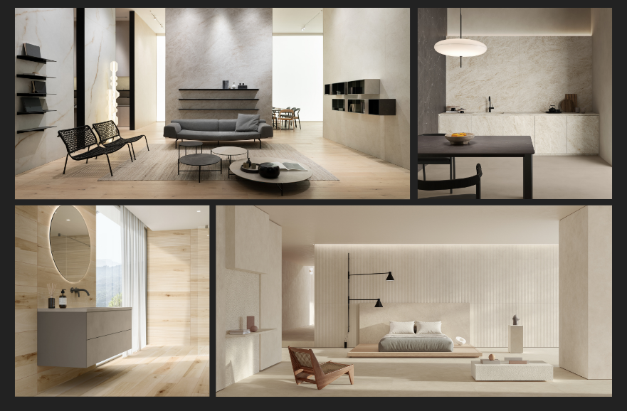
I’m convinced that feeling at home in a space is primarily a question of perception. Now, even more than years ago when the introspective trend began to spread – "warm-minimalist" and "natural” – feeling comfortable in a place is key. And this feeling starts with how the space is designed, but also depends on the choice of the materials and colors that we use to adorn the space. Boost Natural is certainly an opportunity for interior design projects to have floors and walls that help create harmony and beauty in the environments we live in.










.jpg?cropw=4096&croph=2654.2479700187387&cropx=9.695217308093677e-13&cropy=76.7520299812622&cropmode=pixel&quality=75#)








.tif?cropw=4036.303976681241&croph=2705.4159900062464&cropx=59.69602331875912&cropy=25.584009993753906&cropmode=pixel&quality=75#)
.jpg?cropw=4096&croph=2978.1919633562356&cropx=0&cropy=93.80803664376384&cropmode=pixel&quality=75#)

.jpg?cropw=4096&croph=2304&cropx=0&cropy=215.39045431878446&cropmode=pixel&quality=75#)
